HOME | DD
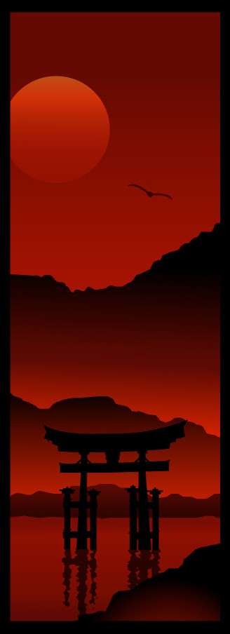
 RasheezyC — Red Gate
Published: 2004-10-12 11:50:16 +0000 UTC; Views: 3168; Favourites: 77; Downloads: 431
Redirect to original
Description
Just thought I'd try something a little different. I'm in a red kind of mood...")
Related content


Comments: 36


This is amazing! Nothing else I can say about it. I've never seen such a great picture done in this style.
👍: 0 ⏩: 0

Simple… yet very unique… nice work.
Caught my attention…
👍: 0 ⏩: 0

very inspiring ")
👍: 0 ⏩: 0

Wow.. a great piece of art!!!!!!
How do you get so many perfection in your works??????
Really amazing
👍: 0 ⏩: 0

this picture interests me probably more than any other in your gallery... the style is really... hmm i'm not sure how to descibe it really... beautiful... yeah that's a good one. maybe it's too cliche of a word. A few other's might be Balance.... or Simplicity... Poetry. All this aside i do have a few qualms about it. Firstly i think this particular piece is either too tall for the canvas or not tall enough. i think it would make a great scroll to hang on a wall or from a cieling but it doesnt seem lond enough and it's almost too long for a poster. great work though... i really like think sort of line gradients u used... i still dont know how to do that lol
P i E c E s

👍: 0 ⏩: 0

I like this version better, cause here we can see everything. The gate with the water effect makes it beautiful. And the sky is way cool
👍: 0 ⏩: 0

stunning picture. this is really very peaceful in a hot way
👍: 0 ⏩: 0


Thanks! I'm not sure which I like better....Still torn...
👍: 0 ⏩: 0

That is EXTREMELY COOL! Did you draw this from your head or did you have some reference material. If it's all out of your head I need to add Great Imagination!
👍: 0 ⏩: 1
Thank you! I saw a picture with lots of red in it and came up with this!
👍: 0 ⏩: 0


beautyfull, very original
I've got a game with gates like that
 (Smile)")
👍: 0 ⏩: 2
Giants, Citizen Kabuto
very funny first person shooter
👍: 0 ⏩: 0

A higly finnished and stunning piece I must say. Subtle shades but strong shapes, i like it!
👍: 0 ⏩: 1


Love the red, excellent use of gradients too. Good stuff!
👍: 0 ⏩: 1


Nothin' but hotness coming from this girl right here. You should do more stuff that's 'a little different'. Congrats on gettin' to the final round of the B&W Battle, well deserved.
👍: 0 ⏩: 1

like it a lot.. lovely concept and a great color to suit the theme
👍: 0 ⏩: 1


I like it...clean, simple, eye-pleasing. Red & black are always a dramatic combo.
👍: 0 ⏩: 1
