HOME | DD
 reborn07 — Invasion

Published: 2003-11-21 00:13:51 +0000 UTC; Views: 696; Favourites: 16; Downloads: 269
Redirect to original
Description
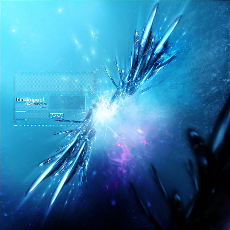
collab between me andyou can find a rotated version(another result) in [link]
hope you like... comments & favs are greatlly apreciated
 (Wink)")
please, visit , he a good artist and a cool man
 (Smile)")
Related content


Comments: 24


")


axei q ficou mt legalz, na verdade tah perfeita
i think it's cool this image, it's perfect!
Carolina Chen
👍: 0 ⏩: 0

eu particularmente gosto mais dessa versã o do q da outra, como eu já disse à vc, essa realça mais o 2d, e popr falar nisso, gostei da perspectiva deles ..
as cores tão beeeeeeeeemmm che-gays mas tá massa
vc q fez os brushes né?! ficaram bem legais

👍: 0 ⏩: 0


fiko bem rulez . so achei q c organizasse uma especie de nucleo fikaria bem mais doido mais ta mto bom assim tb
👍: 0 ⏩: 0

DAMN!!!!
Really cool, i loved it...
Great great, hehe...
Well, im on reborn07´s MSN list, and all the time he was askin for my opnion, i i aways supplied him, and there it is, a great work at all..
+FAV
👍: 0 ⏩: 0


bem lokinha aew^^ perece um continente flutuante ao algo assim
fera
👍: 0 ⏩: 0


Personally i like chaotic,eruppting,energized madness like this..
Color's are sweet,the only thing i'd change,is maybe put the 2d down on the right bottom corner(and dont take my advice on this lol i never use it).Can hardly see it.
But great work all around and i'm faving this bad boy.
Great collab.
👍: 0 ⏩: 0


se superou mas ainda axo ki ta mto misturado o acabamento opa ta fodao umas render ali e uns img pqena mto foda ta cheia d+ ao meu ver saka é isso ki kzi dizer mas ta rox e vo da um favitu pra tu
👍: 0 ⏩: 0

This looks more photomanip/grunge than 3d abstract. There is almost no 3 dimensional emphasis in this at all. That can be fixed through atmospheric integrations. Try adding more volume in lighting too. (sorry, I keep finding things).
👍: 0 ⏩: 0
Add some more atmospheric qualities to the image and that will make up for a LOT of other lacking elements.
👍: 0 ⏩: 0
Okay, first off. TOO CLUTTERED. It helps in abstracts to have some sort of definitive flow in order to design the rest of the image around. This looks like a bunch of random layers and conflicting layer modes. The linear design is way overdone. Try to base it off of a graph system, everything is even with another element in the design. I do however like the tonal qualities.
What it comes down to is the image lacks depth and focus. It looks like it was just spit out for the hell of it - thus lowering the importance of quality. It shows. Substandard image, but okay I guess. Solid other than that.
👍: 0 ⏩: 1

