HOME | DD
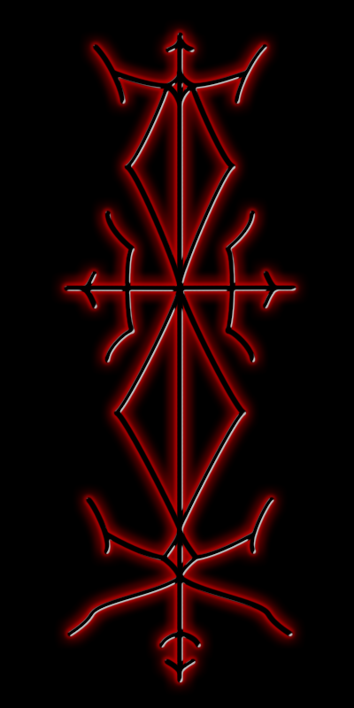
 red20 — PAGAN vector
by-nc-sa
red20 — PAGAN vector
by-nc-sa

Published: 2005-03-18 11:42:32 +0000 UTC; Views: 4041; Favourites: 45; Downloads: 251
Redirect to original
Description
This was one of my earlier submissions, as a drawing: PAGANIt's an old drawing which I thought was never symmetrical enough.
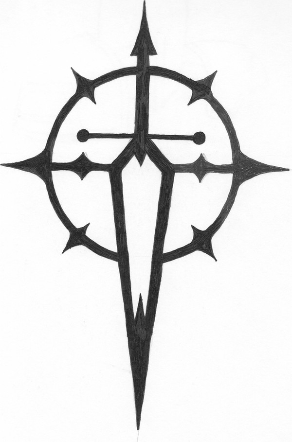
Lasse aka ~necrophagous used to mock about that and tried to get it symmetrical by simply mirroring one side, which couldn't work, because it also says something in runes, and when you mirror the image - ah, you get my point. However. His approach can be seen here: Pagan Logo
So now I finally redid it in a much better way: I vectorized it in Sodipodi and got it as symmetrical as it can be.
I quite like it, so tell me what you think.
Full View is recommended. There the background is transparent and the logo is quite large.
Related content


Comments: 45

 (Smile)")

very nice! lover the symbolism in it also! faving for sure!
👍: 0 ⏩: 1

Thank you lots for the faves.
I really appreciate it.
👍: 0 ⏩: 1


Beautiful piece, love all the symbolism tied into it.
👍: 0 ⏩: 1
Why, thank you for the kind comment and for the fave, too.
👍: 0 ⏩: 0

i love the design. (devinately on my fav list). one question though. you said you put runes in it and that it says something. i only see parthia and naughs. where are the others? could you point them out to me?
👍: 0 ⏩: 1
Hey there. Thank you loads for adding this one to your favourites.
Take a look at this link here: NOTE
I show you the runes there.
Just inform me as soon as you read it, then I will clear it again.
👍: 0 ⏩: 1
all right i saw it and i see what it means. my user name isn't just something fancy that i just thought up. it is what i am.
so i was wondering if you know what the runes mean besides their letter/sound values?
you should make this into a print, or something like that.i would buy it.
i'm gonna add you to my watch list too.
👍: 0 ⏩: 1
Thank you for adding me to your watch list, it's very kind of you.
My account isn't very eciting though, I do not upload alot. I don't know when this will change again.
Well I was raised in the Ásatrú faith, so I know what runes are - my parents tought me to write runes before I learned the latin letters.
Rune divination was done alot in my family.
👍: 0 ⏩: 1
you're lucky then. i have been studing druidry for ten years and have been trying to learn the runes for the last two of those.
👍: 0 ⏩: 1


Wonderful logo! I need a new once.. o well. I'll fav this as insperation.
👍: 0 ⏩: 1
Hehe, thanks for the comment (and also for maybe going to fave it soon).
What do you need a new logo for, by the way?
👍: 0 ⏩: 1
Your welcome.
Hum just a new logo that fits with me for signing my art. That's all.
👍: 0 ⏩: 1
Ah, I see. And I guess you want something symmetrical?
👍: 0 ⏩: 1
Hehe, hope you'll find some inspiration then.
👍: 0 ⏩: 1
A, that wont be a problem... my problem is to get it out of my head.
👍: 0 ⏩: 1
Hahaha
Such a big problem?
👍: 0 ⏩: 1
Quite,yes. ")
👍: 0 ⏩: 1
Hehe, if I can halp you in any way, just ask.
👍: 0 ⏩: 1
")
👍: 0 ⏩: 1
Sure! You can also contact me via my ICQ or MSN (the latter: willow_pixie_@hotmail.com).
👍: 0 ⏩: 0

Lo0kinG shaRp--hEy, I like how the fuLLview DiFFers fr0m the ThumBnaiL. was this inTended?
the DesiGn is eLeganT. tHat y0u mEntion iT, sYmmeTricaL, too. i wonDer what your vector wouLd lo0k Like, weRe it to Look ALive...
👍: 0 ⏩: 1

Sorry for answering in place of her. The difference between thumbnail and fullview is due to the fact that the JPG format does not allow transparency. Thus, she had to choose a background color for the thumbnail, which obviously was black.
Oh, you asked in a comment on her journal entry who "whe" are. I guess I've answered this in the last sentence, hehe.
👍: 0 ⏩: 0

Hmm I've been looking back and forth on the original and this one, and I agree with Mark on that the original already was kinda symmetric. Actually I prefer the old one, motives like this has an indisputable charm which is easily lost when symmetrizing (I made that word up right now I think). On the other hand - I'd go for this one if I was ever to get the tattoo OR the mousepad

👍: 0 ⏩: 1
Well yeah I was actually thinking about that too.
I like organic pieces more as well.
But you see I'm having my vector phase! Haha. So this was a must.
Pf course, as a piece on merchandise the vector version is better. And for a tattoo too, probably.
Who knows? maybe one day there will be mousepands with this design. haha.
👍: 0 ⏩: 1
I also think the design would look good on a whisky bottle label, make one for me if you ever get into merchandising this one, eh?
👍: 0 ⏩: 1
A whiskey bottle! You're a genius. I love whiskey.
Pagan Malt Brew, huh? How does that sound? Yeah, yo. Hahaha.
👍: 0 ⏩: 1
Haha now YOU'RE the genious - Pagan Malt Brew sounds excellent and veeery tasty nnjehehehe
Hey if I remember it I might try playing a little in PS with the idea.

👍: 0 ⏩: 1
Oh, nifty. Tell me whenever you really do that.
👍: 0 ⏩: 0

This looks very good, but I have to say I think that your original was very symmetrical already for a drawing ( I always thought that his comment was based on him missing the point that the first and last runes were supposed to be different  (Wink)")
Anyhow, I'm pleased to see that you have not abandoned this aspect of your artwork, I always liked your paganism inspired works most of all 

This would make a superb mousepad design btw 
seeing this reminds me of that tattoo design, I wonder if vectorising it would make that easier to finish off? I have no idea how vector art really works
")
👍: 0 ⏩: 1
Hehe a mousepad design, eh? Well, why not?
I'm just waaay too lazy to get things like that done (including cool cup prints and all that stuff).
But yeah, anyhow. Thank you so much for faving this.
Who knows, your encouragement might work! Hehe.
I'll quickly submit something and then I'm off to pardeee! Huahahaha.
👍: 0 ⏩: 1


Swannie malt heidnische Triiibals hrhrhr - schmarrn gefällt mit sehr gut Große
👍: 0 ⏩: 1
Hehe, Große? Na ja gut, haut hin, glaube ich. Hehe.
Danke, danke.
👍: 0 ⏩: 1


very cool, that would make a great tattoo. So, what does it say in runes?
👍: 0 ⏩: 1
Hehe, it says "Pagan". I'm sorry, I thought that was clear.
Thank you lots for your comment.
👍: 0 ⏩: 0