HOME | DD
 Remarin — Composition - schoolstuff.2

#backgrounds #composition #practice #school #thumbnail #thumbnails #exercise
Published: 2018-10-14 13:46:44 +0000 UTC; Views: 26871; Favourites: 1120; Downloads: 112
Redirect to original
Description
Some more things from animation school!
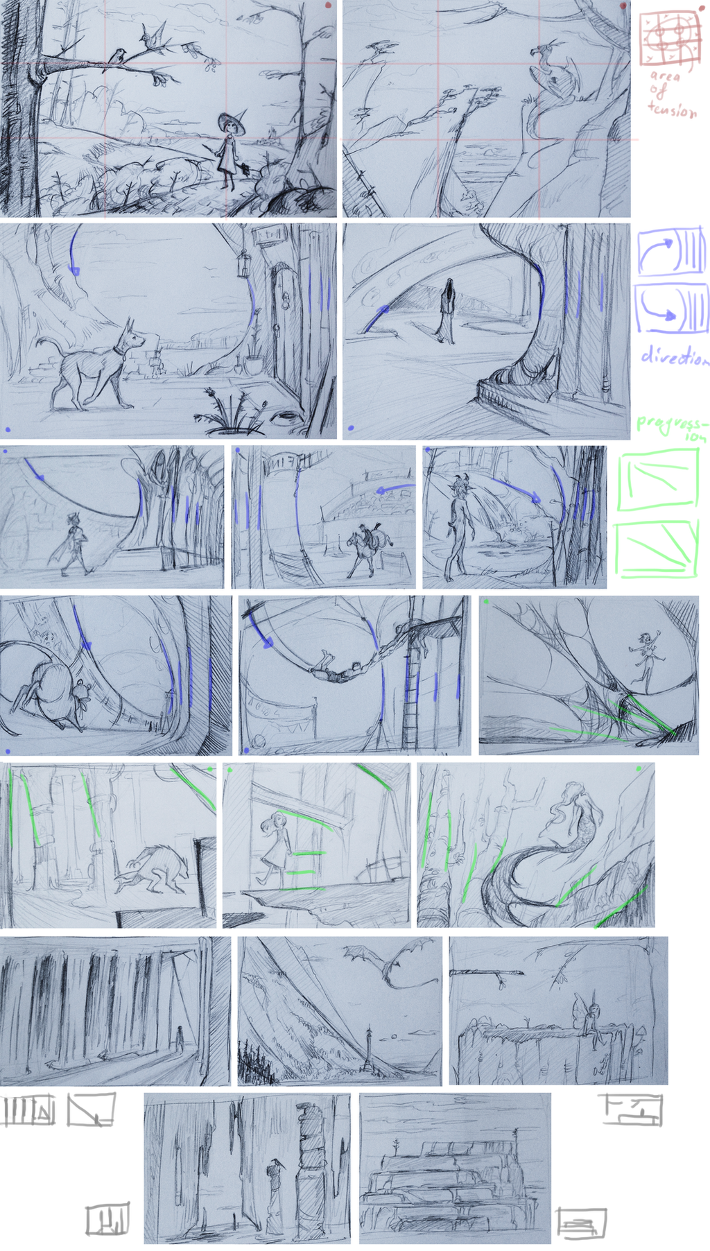
You all probably are already at least vaguely familiar with the "rule of thirds" composition thing, but I for one certainly didn't know there was equivalent tricks to cater to animation purposes as well! Though it seems obvious if you think about it.
So what is meant by that, is that you can arrange your background in such a way that it "supports", "accentuates" the movement of the character,, in quite subtle ways too. We saw examples that either enforced the direction of movement, or suggested there being "progression". Not sure how to best explain the latter without just pointing at examples like i.pinimg.com/originals/bb/9c/f… (the pillars are just very slightly inclined,, it can be very subtle,, but imagine how much more static and enclosed the image would look if they were completely vertical)
The last couple of thumbnails, we were simply asked to do a couple of examples that show a majority of either verticals, horizontals or diagonals. (curves are also an option in that category, but wasn't asked for, this time)
btw the first example for the blue-stuff (the one with the doggo) was critiqued to be too "symmetrical", i.e. it rather looks like a circle than one curve "pushing" a second one. I could raise that stone-wall a bit to make it clearer. And the second blue, the one with the hooded figure and temple, was critiqued that it would have a better flow if the character was moving away from us, since the curve of the sculptures-foot could act as a direction line, pointing thus away from us -towards the figure.
Some other points that were mentioned in general:
-With the rule of thirds, avoid being too obvious. The point of interest doesn't have to be spot-on perfect on one of the intersections.
-Don't have everything pointing towards the character, have some objects point slightly off, or away from it to make things look more natural.
Also, this exercise was completely free concerning themes or subjects, so here's me just coming up with a bunch of random stuff
Related content
Comments: 25

👍: 0 ⏩: 0

hmmm interesting... so it works but remember some teachers could be a pain on the arse and only want tease us
👍: 0 ⏩: 0

You should make this into a challenge on here 

I really love this and the little scenes you made <3
I am definitely going to attempt in researching this :3
👍: 0 ⏩: 1

Agreed. I'd like to join, too.
👍: 0 ⏩: 0

www.artstation.com/artwork/2xl… check this pls i draw robots)
👍: 0 ⏩: 0

I'm actually not familiar with the rule of thirds at all, or at least not that I know of, I'm very curious as to what it is now :0
👍: 0 ⏩: 1

Oh! It's a handy little ... "guide"(?) when it comes to putting together a composition. (It's not actually a "rule", there are many various ways you can make image compositions, and using the "rule of thirds" is just one method)
It's quite a good one, because it's simple to use but very effective and applicable in many various ways. You divide your image into 3-by-3 sections, and the intersections are the areas you can place your "point of focus", and the lines are usable too (placing the horizon line on one of the thirds is quite common for example)
www.google.com/search?q=rule+o… Having stuff vaguely align with the lines can be enough already to make a pleasent effect. And when dealing with a close-up of a face for example, you could make one of the eyes overlap with one of the intersections like www.google.com/imgres?imgurl=h…
The stuff I wrote down on my compilation here, calls the surrounding space of the intersections "area of tension", so just by keeping your focal points around that middle square, you'd be on your way to making your image pleasing to look at (((again though, it's not a rule,, just a guide)))
A different composition "guide" would be the "golden ratio", that is actually a mathematical thingie that occurs in nature and stuff,, you've maybe seen it on stuff like i.dailymail.co.uk/i/pix/2016/0… where random photos look "renaissance"-like, because the composition matches with the golden ratio. ((I've never used it myself,, feels a bit too fancy))
👍: 0 ⏩: 1

Oh wow, I'm surprised I didn't see this until now, I neglect my DeviantArt too much haha-
Thank you very much for the explanation, I definitely will start implementing this into my art in the future!!
👍: 0 ⏩: 0

these are really cool, and I love your explanation! i'd be interested in you posting more about what you learn at animation school, it sounds fascinating!
👍: 0 ⏩: 0

Neat and pretty compilation, and like the fantasy-style.
👍: 0 ⏩: 0

cuteness overload in scenery. thats amazing work lol
👍: 0 ⏩: 0

Those are looking super neat! Also your notes are very helpful! Cool things to note down!
👍: 0 ⏩: 0

wow, these are super cool! you learn something new every day :>
👍: 0 ⏩: 0

hey those are pretty cool.
must be a lot of work too
👍: 0 ⏩: 0

Awesome. Nice to know both when drawing but also making animation.
👍: 0 ⏩: 0


