HOME | DD
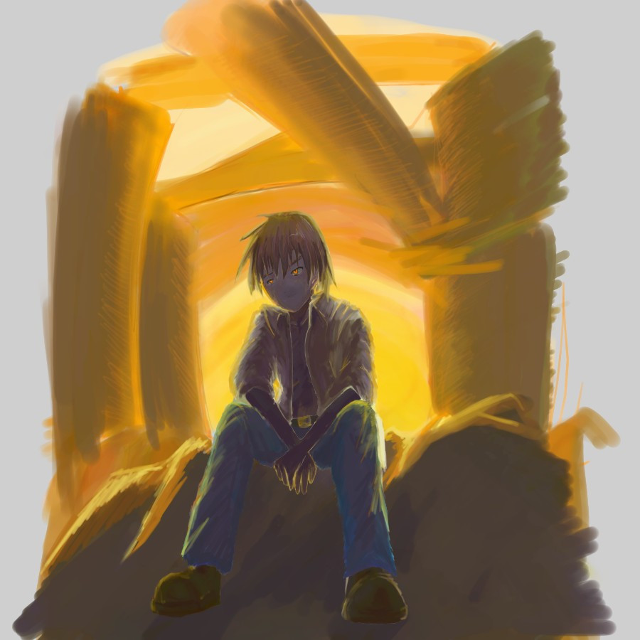
 riftgarret — Open Canvas Attempt

Published: 2007-10-06 08:49:43 +0000 UTC; Views: 820; Favourites: 4; Downloads: 32
Redirect to original
Description
update (10-9: 12:30am): Okay, I just noticed this now, but apparently when you draw facial features at 1 pixel width then resize the image to 1/4 of the actual size, those pixels dont show up. No sir. .. okay I'll have to fix that, tomorrow after soccer.. or even later, blah!update (10-9: midnight): Okay, I should seriously just start a live journal all about me drawing this one single picture lol. Anyways, I have hijacked a bit of the color palate from this picture: [link] . which mr. sir chopsticksmadness has manifested. I continuously look at his picture and mine, trying to establish the correct color palate. It blows my mind how one establishes these colors before applying them full out to the canvas.
Ok, so anyways, still going to fix up the background a bit, hopefully make some decent tweaks to the hands, and anything else that sticks out. But I think this is finally coming around for my first watercolor / open canvas eva.
update (10-8: midnight): I have messed with the colors some more to account for the advise! I also tried adding more detail to the body and skin, but I still am an AMATEUR painter, so that means, out of 10,000 paint strokes.. per detail, I keep.. one of them. lol. sigh.
I still need to do something with that damn route 55 sign, where the hell did that that thing even come from.
update: still bleeding here in Seattle. Added shoes and.. stuff! Will probably crop the sides later.
update: scrap the screenshot, here is the image. This is also still WIP, I plan to cry and bleed until I become satisfied, or dead.
So the concept of this drawing is a man in early 20's sitting on the rubble of a crumbling city. The city is in the future after post apocalyptic war. There is a sun set in the background which is making the scene very yellow (hence the enormous yellow background).
So here is my first attempt of Open Canvas. Let it be known it is almost my first attempt of any water painting. Ever.
So heres what I want you guys to do! I want.. WANT.. constructive criticism of what I am doing now.. and say what I could have been doing better. On another side note, I am trying really hard to stick with the watercolor brush for this entire painting. Ive seen some beautiful work come out from artists using the water color tool and I would like to eventually be one of those artists.
I have no idea how to start these projects other than just drawing down the sketchy line art. Although if I could spend a handful of hours of my life learning the best way through experience. I would. But I want guidance as well! Being able to hear you guys I can take what you tell me and apply it. If it works awesome, if it doesnt, well then I am exactly where I am now, except further!
plz hear my cryz 4 halp
Related content
Comments: 12

lol thanks!
Im still kinda juggling around this whole color theory idea. the alot of the super shade is colored in purple, maybe I should have used grey, since grey next to along of strong orange tends to look purplish. Or is that the colors getting to my head. WAHHHHHHHHHH im going crazy, im seein things lsjdflsd.. [link]
👍: 0 ⏩: 0

Looking better, you can definitely tell it's a sunset now.
👍: 0 ⏩: 1

blah, I missed the reply button, *see next reply*
👍: 0 ⏩: 0

Very nice perspective, and good work with the lighting. I'm still working with lighting myself... this is incredible for an early attempt. 
👍: 0 ⏩: 1

Seattle? Hay thats where I live. D:
I have to say for your 1st OC attempt this is very good. For some friendly crit lets see what i can do...
You've got the main idea shading down. 
Fantastic drawing though, love the warm water color feel to it. ^^
👍: 0 ⏩: 1

Thank you for your feedback, I will take it to heart
On a side note.. its *gasp* raining outside
👍: 0 ⏩: 1

you're very welcome.
Why yes, a shocker, RAIN.
👍: 0 ⏩: 0

The sun is in the background, so the character and the structure should be darker. Much darker.
Use grayish colors. You can seldom see bright, pure color in real life, unless there's a highlight on it.
You don't have to stick to the tool. Try many things, findout what suits you best..even the pencil tool of OC could offer the feeling of oil painting.
Feel free to spend time on your work. Even the most awesome guys spend 10+ hours on a CG.
Be sensitive in your daily life. Like the jeans, how should it look like when there's a strong yellowish lightsource back there?
👍: 0 ⏩: 1

Thank you kindly for your feedback, I never thought about the pure color reference until now.
👍: 0 ⏩: 0

I don't see a sun.
Or any pink.
And why is it a screenshot?
👍: 0 ⏩: 1


