HOME | DD
 RikkiSoup — chinese elementals

Published: 2007-09-21 01:43:04 +0000 UTC; Views: 3256; Favourites: 76; Downloads: 31
Redirect to original
Description
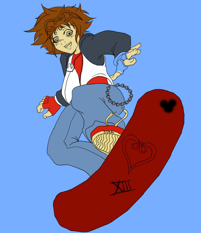
so i made a little mistake with this, the chinese alements are wind earth water air and metal, only i excluded wind and threw in two earths.while drawing it i accidentally promised to give it to a room mate, but when really it's supposed to be my brothers, oh well i'll just have to draw something else for her
Related content


Comments: 26

Beautiful colors. The blending is a really nice touch.
👍: 0 ⏩: 0

 (Smile)")


very awesome love the way you colored it and i love the way they all seem together in most element pictures there all apart so i though it was cool the way you did it!! Awesome!
👍: 0 ⏩: 0

Actually your elements are right!
Chinese elements are
Fire, Water, Earth, Metal and Tree!
👍: 0 ⏩: 0


thanks! he was the first one i did so i put the most effort into him
👍: 0 ⏩: 0

Very pretty. I like all the colors and different head angles

👍: 0 ⏩: 1

The coloring and blending is superb. You got a knack for coloring with color pencils!
Love the elemental concept too
👍: 0 ⏩: 1
thank you so much for the praise!
but, the elemental comcept was mostly my little brothers idea so i guess i should give him credit.
i love colouring pencils so i use them often, so i've gotten pretty good with them <3
👍: 0 ⏩: 0

the coloring he is nice, but i thin the whole image would be easier to view i it was resized to be a little smaller.
👍: 0 ⏩: 1
thanks for pointing that out! i didn't realize the full view was so big, i plan on editing it a bit later so i'll resize it then. thanks again!
👍: 0 ⏩: 0

Love the different variations in color. Well thought out structure imo
👍: 0 ⏩: 1
i love working in colour so this was fun, and i found it easy to make it all blend, but the structure could have been a bit better (i could have remembered to the proper elements instead of havign 2 earths and no air)
👍: 0 ⏩: 0

Really good colour, but the eye kinda stops. Try to keep the eyes moving!
👍: 0 ⏩: 1
any suggestions on how to keep the eyes moving?
or do you think adding a little bit of each element surrounding them would help?
👍: 0 ⏩: 1
Try to spread out the colors. You put two very bright (and good quality, might I add) colors on top, a medium one in the middle, and two somewhat dull colors on bottom. I seems like the drawing fades, almost.
Do you know what I mean? I hope I'm not being to critical.
👍: 0 ⏩: 0

Is this pastel? if it's just color pencil, you did a good job of applying the color hard and thickly
The metal elemental could perhaps be more reflective (as is metal) you might be able to achieve this by adding black and white highlights
the flow of the hair on the top 3 is wonderful
The overall placement of the design on the page is offset, and lack of background or any sort of editing done to the white (even if just to make it whiter or smoother) isn't too good, not sure how I feel about the very light orange around the fire.
somehow I think it'd be cool to do a black line around the entire thing, but you might not feel the same, and that's just fine
very nice!
👍: 0 ⏩: 1
it's definitly colour pencil, i find pastels to difficult to work with,
what exactly do you mean by black line, just a thinker black boarder around the edges of the pick, or more of a frame?
👍: 0 ⏩: 1
i was sort of thinking just along the edges of the fire elementals between them and the white of the paper. you know, cartoon-style. and anywhere else inside, like where there's the white around the mouth of the fire elemental. a nice dark line aroudn the edges of that
👍: 0 ⏩: 1
so between them and the white space, would simply a darker colour work do you think? like a dark red for fire a midnight blue for water etc.
👍: 0 ⏩: 0