HOME | DD
 rjsmith2007 —
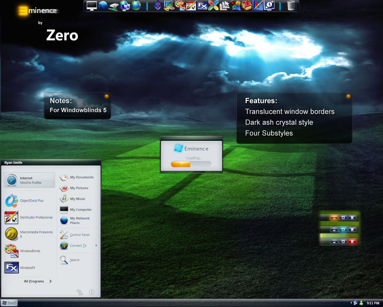
Eminence
rjsmith2007 —
Eminence
Published: 2006-07-12 15:56:14 +0000 UTC; Views: 335183; Favourites: 529; Downloads: 189790
Redirect to original
Description
Updated 12-26-06: Eminence by ZEROUpdated:
*NEW* Toolbar Icons
*4 Substyles
-Shadows
-Compact Menus
*Various fixes
*Wallpaper "Dark Bliss" Included in *.wba File
This is my 2nd skin. Eminence won 1st place in the 9th Challenge at Skinning.net. I hope you enjoy my skin!
Thanks, for downloading!
ZERO
ps: Feel free to post comments, both positive and negative. I am always looking to advance my skins, so let me know if you find a bug (preferably by email if you want to be sure that I see it).
Related content


Comments: 238

I appreciate your compliments! If you are interested in seeing my first skin, XP Format, it is here [link]
👍: 0 ⏩: 0

")

Congratulation! This is a fantastic skin! Looks like a "Future Classic Theme"! Wonderfull! Really Wonderfull!
👍: 0 ⏩: 1


Look nice, Mister rjsmith2007. I know it's hard to create a theme, so congratulation.
👍: 0 ⏩: 2
Oh and thanks for understanding how hard it is to create a skin!
 (Wink)")
👍: 0 ⏩: 1
Ok Zero, I hope that you will continue creating other themes.
👍: 0 ⏩: 0

Nicely done! On 1600 x 1200 resolution the borders are skinny. May I suggest widening them a little.
👍: 0 ⏩: 2
Would this be any better? [link]
I am at 1280 x 1024 here so I cannot see the affect. Your feedback is appreciated.
👍: 0 ⏩: 0
The same width at the start menu.
👍: 0 ⏩: 0

Hi, I really like your skin, it looks pretty good.
There is only one thing that I dislike with your theme. maximize a window and put your cursor on the complete top of the windows... the cursor looks like it wants to resize the window. This should be taken care of.
Another thing is what makes me like themes or dislike them (when they are "conventional" themes) it that I want to be able to put my cursor on the top right, the far top right, the last picel, click and the window closes. Like in windows classic theme (and maybe luna if my memory is ok).
Anyway, great theme.
👍: 0 ⏩: 1
Fixed the problem! Just download it again and install.
👍: 0 ⏩: 1
Thanks, the problem is fixed.
At first, I thought you were talking about the top right corner closing thing. Still not my chosen skin
Still nice after all.
")
👍: 0 ⏩: 1
My new update with shadows allows for you to use the corner close thing.
👍: 0 ⏩: 1


Hey, welcome to D.A. ! Nice work with the skin. If I am not wrong this is the one you won the contest with right? and if so, then congratulations, you had my vote anyways...nice to see you here.
👍: 0 ⏩: 1
Hmm... I have no idea why that post posted twice.
Anyway, let me find that wallpaper...ah...hard to find.
[link]
There it is.
I am glad you like my skin!
Zero
PS: I posted the link to the forum just in case the link changed to download the walls.
👍: 0 ⏩: 0

Sorry about the preview, it was my first upload and the page said something about 100x100px so that is what I did. I uploaded the large version (which I had planned to do in the first place).
FX and YZ have problems with perpixel skins. I tried this skin with shadows when if first began, but felt that it looked better without them. If you enable shadows in windows for the menus, it works. Though they are not as large as some you may see in 3rd party applications.
Outlook problem was fixed. It was a font issue. I had to make change the font sizes to be negative...weird. Anyone try this in Opera? My friend mentioned it before, and I thought it might be a similar issue.
PS: You guys travel in packs and attack all at once...lol. I left my computer for an hour or so and there's like 10 posts.
👍: 0 ⏩: 0

I'm sorry, I can't seem to edit my posts...
Regarding the shadow issue... perhaps another solution and request would be to include a shadowed version (both the main windows and larger shadows on the menus)? Thanks in advance
👍: 0 ⏩: 0
Hi again, I've had a chance to test the new version out and so far it seems to have fixed the bugs I experienced with the earlier version.  (Smile)")
Thanks in advance
👍: 0 ⏩: 0

very nice skin, defiantly some fresh air for the wb skins. Though I like the vista skins, it's nice to see some different skins for once. The only thing i will say is that you posted a very small preview of your skin and maybe hard for others to see a nice preview of your skin. Again great work.
👍: 0 ⏩: 0
I agree with the preview, but I remember the skin when I stumbled across it in it's earlier version and I was extemely impressed then and quite happy you are continuing to refine it. I just remembered that there were some problems with using the skin (first release) with Microsoft Office 2003 apps. I think it was Outlook. I just figured that I would have to forget this skin (sadly) as I could not find mention of further development and a fix to those issues. Until now
👍: 0 ⏩: 0


Yep...first of all ..like root-66 said..a bigger preview should be nice...but the THEME is VERY WELL done...just little things like de START MENU button too LITTLE te minence word..maybe a big E ..but all others things..i like it a lot..are you thinking to make a COLOR THEME?..changing de menu colors, less or more transparent?..and make the buttons from taskbar without border?..
👍: 0 ⏩: 0

Other that the preview image the skin looks great.. using it now.gj bro.
👍: 0 ⏩: 0

First of all you need to proide a larger preview so one can see what they are about to download.
👍: 0 ⏩: 2

And Second of all?
First of all usually denotes a list of things, if not another "of all", buddy.
👍: 0 ⏩: 0
<= Prev |