HOME | DD
 RobertMakes — Monsters Making Friends
Published: 2011-04-19 16:15:14 +0000 UTC; Views: 832; Favourites: 21; Downloads: 0
Redirect to original
Description
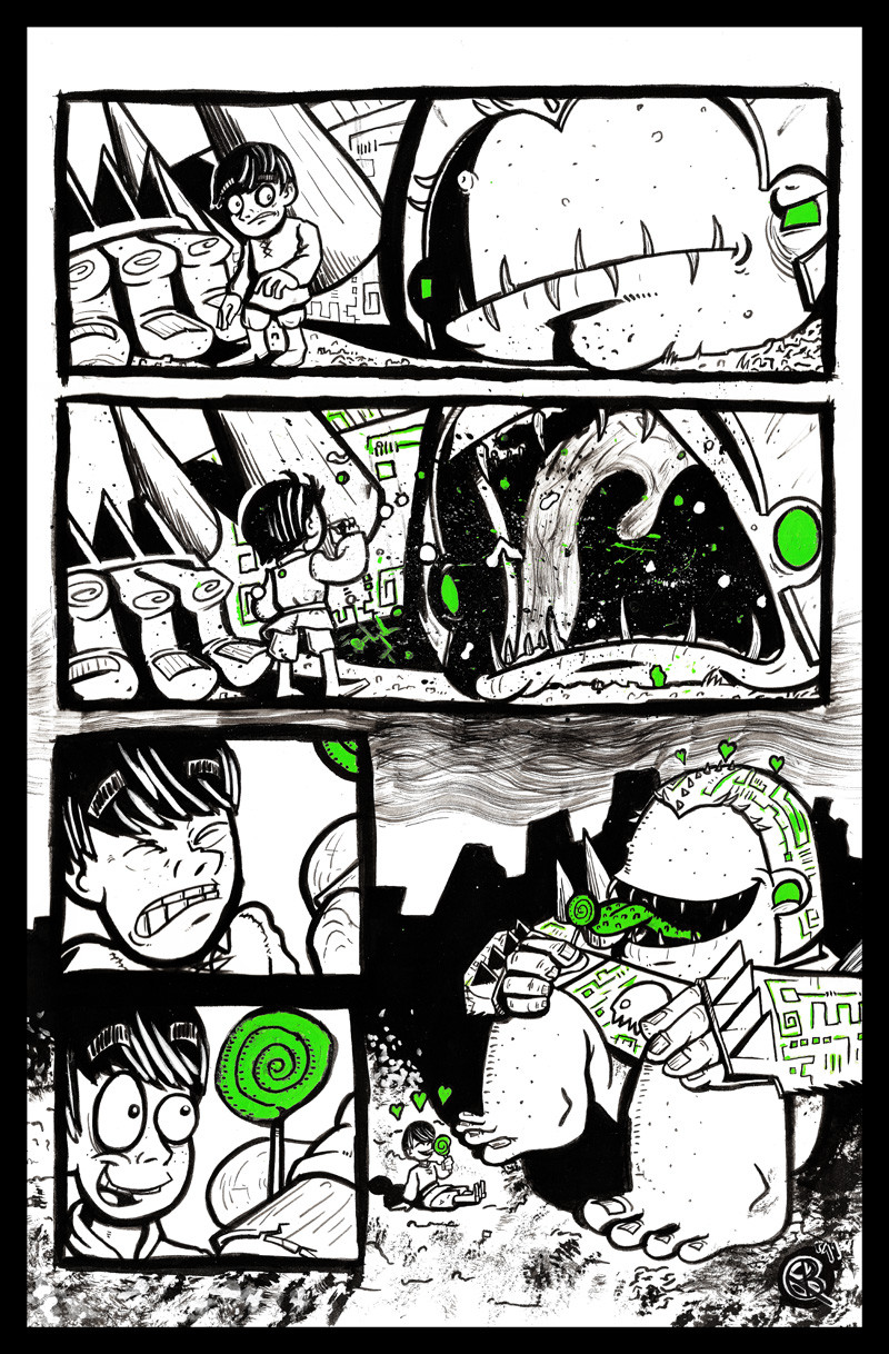
First impressions aren't always what they seem. It looks like an evil monster, it roars like an evil monster, but that thing sure seems pretty harmless, friendly, and completely un-evil. The point I'm trying to make is this: monsters like candy and they like sharing it too.The piece was composed on an 11 by 17 sheet with inks, green acrylic paint, and a few little touch-ups with a micron pen. Made special for a gallery show. I might even get it sold! I’ve framed it and it looks fantastic. Check it: [link]
Related content


Comments: 11


Great stuff, dude!
I especially love all the different textures you managed to get with your brush. The clouds, the ground, and the spit effects... Really fun to look at. Great expression work, too.
The storytelling of the first panel feels a slight bit awkward though. If the monster only just appeared (or looked down to inspect the boy), the boy doesn't look shocked enough. It feels like there's something missing, but maybe that was the intention. Splitting it into 3 smaller panels where at first the monster isn't seen, then the boy notices something behind him, and then looks back as it is now, might have worked better.
Nevertheless, this is really fun, and I hope you'll be able to sell it.

👍: 0 ⏩: 1

Thanks. Yeah, I was having trouble at first on the layout. I almost jam packed this page with panels including the lad walking out of a village towards the wastelands, getting lost, monster appearing from almost nowhere, etc. But then I slapped myself and did something simplier. I love the out come, but you're right, it could use maybe one or two extra panels.
👍: 0 ⏩: 1
Oh, I agree - for one single page, scarcity in terms of panels definitely is a good thing (unless you maybe go completely overboard in terms of a Chris Ware kinda thing with tons of tiny panels).
And overall I think the outcome definitely is great too, it's nothing I got majorly stuck up about, or anything. The action you wanted to convey is conveyed nicely.
 (Smile)")
👍: 0 ⏩: 1
Like have you ever read Scud: The Disposable Assassin? Most of the action scenes are on tons of tiny panels. It has a neat effect.
👍: 0 ⏩: 1
Can't say I have! Action scenes I think work well if the panels aren't too big. If an action scene has like... three panels stretched out over one entire page it always feels rather "slow" to me.
👍: 0 ⏩: 1
So then...The Matrix would do fine if it had mostly big action panels then.
👍: 0 ⏩: 0

ah the infamous one color bandit strikes again! this is an awesome page. i like the different textures and effects you got from the brush and looks like some toothbrush scraping on the bottom as well as spatter. NOICE
👍: 0 ⏩: 1
Thankyoumuchsir. The best part about this one color is that it's really on the page! Johnny Samurai's red is digitally colored in.
👍: 0 ⏩: 1