HOME | DD
 RobotsWithCookies — Commission for TheoryCraft

Published: 2012-08-11 16:19:53 +0000 UTC; Views: 108; Favourites: 2; Downloads: 2
Redirect to original
Description
Commissioned by !
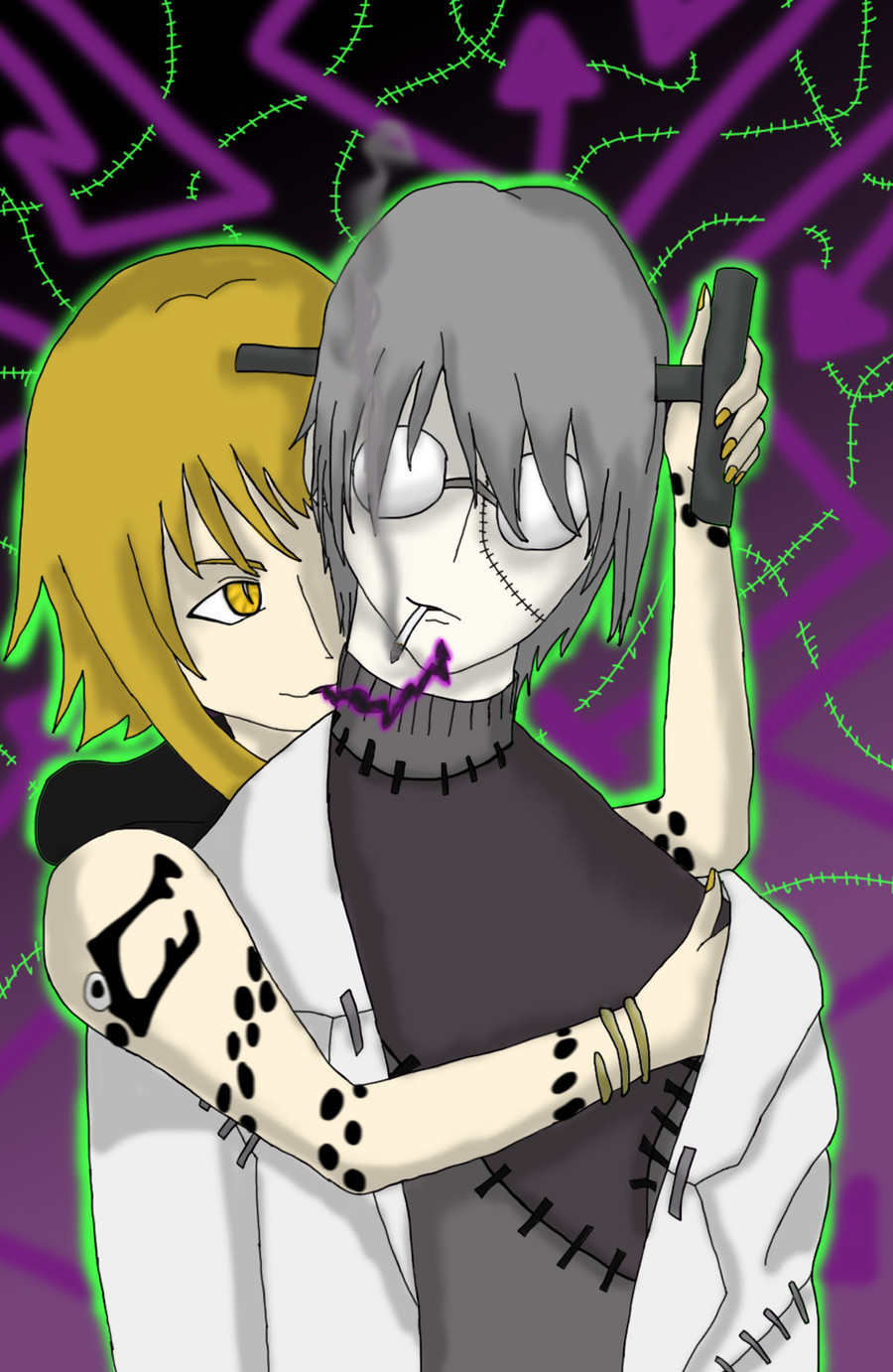
They wanted a steampunk themed character annnd... I hope I got it alright!
Also, hopefully him holding the letters is okay, it's a 't' and a 'c'.
So yeah, you can add a background, or words to it, whatever you like.
")
And I've had to change the way I do outlines. I inked the traditional picture and then scanned it using the 'text' option which made it picelated and HUGE. Making the picture small got the lines more blurry-ish.
My only problem is that the lines may be too think?
But it's definately soooo much easier.

So tell me what you guys think.
Related content


Comments: 8


Very nice, I appreciate it a lot
The letters are fine, and I must say the T and C were clever. Thanks a lot.
👍: 0 ⏩: 1

Thanks, I'm so glad you like it!
👍: 0 ⏩: 0

nice! his hair looks so nice those letters, I wouldn't've recognized a t in it! 
also don't worry about the lines, I think they look fine

👍: 0 ⏩: 1
Thanks a lot!
👍: 0 ⏩: 0