HOME | DD
 RonaldSanchez — You didn't realize
Published: 2011-01-03 16:49:52 +0000 UTC; Views: 696; Favourites: 28; Downloads: 21
Redirect to original
Description
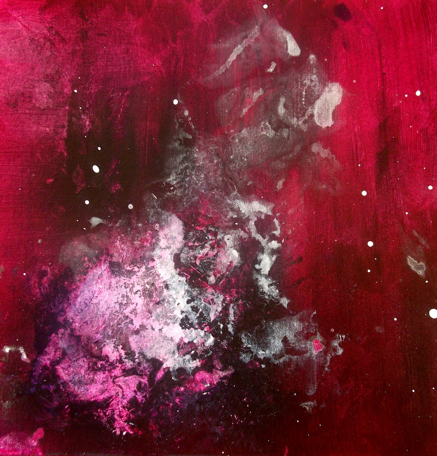
Mixed 6"X6"Related content


Comments: 20


Thankyou so much  (Smile)")
very kind of you!
👍: 0 ⏩: 1


Nice color combination. I'm new at this, can you please tell me (at least hint me
👍: 0 ⏩: 1
Thanks for the comment
This is done with spray paint and paint dripping
and medium gel, you apply these things in the end then
absorb them with a sponge
👍: 0 ⏩: 0

You have some really nice colors in this. I love the deep reds.
👍: 0 ⏩: 1

Haven't seen anything from you in a while, but loving this one. got real presence bottom left, fading outwards. Real good.

👍: 0 ⏩: 1
Thanks for checking it out!
👍: 0 ⏩: 0


Oh well done! I see some glazing techniques being applied here and it gives the piece depth. I like the focal point being off centered. The crimson red has enough weight to balance out the white giving the piece a nice asymmetrical appeal. I think it was a good idea to limit the color palette. It unifies the whole piece.
I really like this one. Well done!
👍: 0 ⏩: 1
Thanks!
Yep. Im glad I limited the color palette, I was afraid of doing too much,
and not have enough balance... you're right. Thank you for pointing that out!
👍: 0 ⏩: 0


this is really good...the colour blend is really nice and thought out well.
i really like this one !
👍: 0 ⏩: 1
