HOME | DD
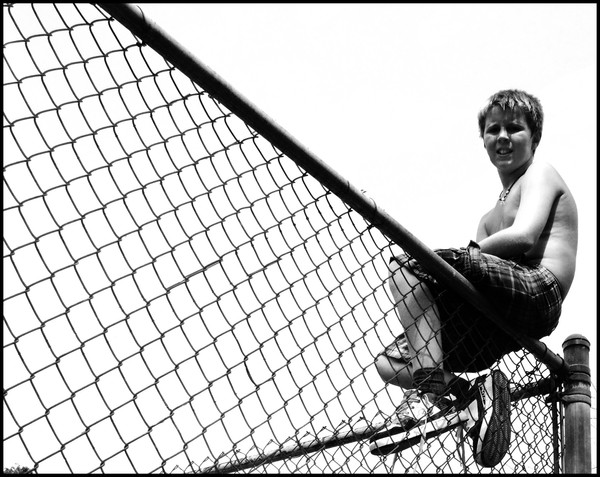
 RunningDevil — on the fence
Published: 2008-08-30 22:48:54 +0000 UTC; Views: 928; Favourites: 20; Downloads: 83
Redirect to original
Description
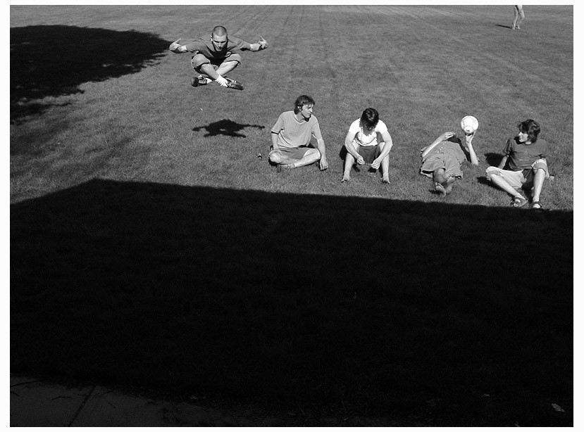
The third version of this particular shot. A cropped version of this deviation:[link]which was an edited version of this deviation:[link]
tell me which is your favorite!
Related content


Comments: 18

pointblankstudios [2008-12-30 04:53:04 +0000 UTC]
Another image that shows exactly what I was talking about, lines moving toward your subject.
Only thing I would do is brighten his face up a bit.
👍: 0 ⏩: 1


You did a great job on turning a decent enough shot into this; awe-inspiring image. Makes me want to go snapping right now.
 (Smile)")
👍: 0 ⏩: 1

Hi! Your photograph has been featured in a news article here : [link]
Please fave the article if you liked it/to give yourself more recognition
👍: 0 ⏩: 1
this one is definitely the best. Its strong lines really give it nice visual impact.
👍: 0 ⏩: 0

The first is still a nice shot, but the wires were distracting.
The second seems a bit cluttered, but better than the first.
But to me, personally, the third is most aesthetically pleasing. And the contrast is lovely. It's a good useage of space, if that makes sense.
That's all. :]
👍: 0 ⏩: 0


you cropped it!! my favourite one is the one i already favourited..
👍: 0 ⏩: 0


I'd say this is the best as well. It looks better without the wires.
👍: 0 ⏩: 0

")