HOME | DD
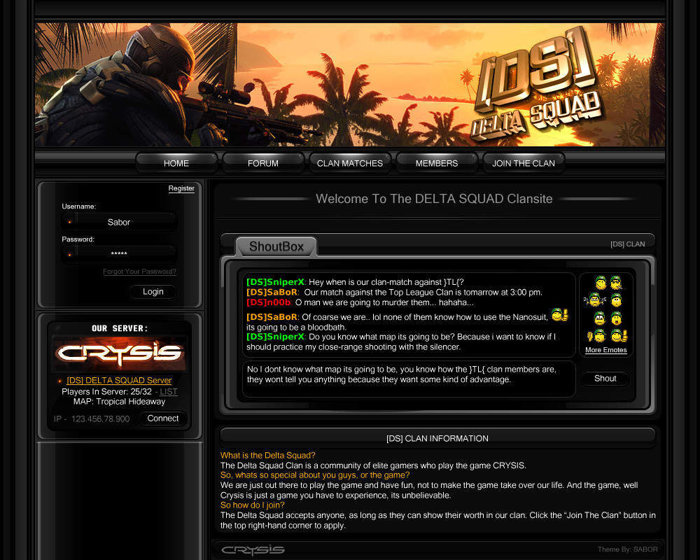
 Sab0r — Clan Template

Published: 2008-03-07 21:45:56 +0000 UTC; Views: 11776; Favourites: 16; Downloads: 2971
Redirect to original
Description
Heres a template that I made in about 3 hours, which is pretty sad compared to what some people can turn in an hour. Although I haven't touched photoshop in a while, so this was good practice. I hope you like it.")
And YES I know, it kind of reminds you of that alienware theme, but what can I say? Black, White, and Blue are amazing together...
-SAB
ps. Comments are always welcomed... and fav's lol....
Related content


Comments: 25


Im new in this site and i like this one very much but i dont know how to download it
")
👍: 0 ⏩: 0

Professional With a Side of awesome gr8 job dude.
👍: 0 ⏩: 0

 (Wink)")


Looks great and yea identical to the way some alienware themes are made. It would look even better if the menus and all that stuff at the sides were slightly smaller though.
👍: 0 ⏩: 0

Sab0r,
very nice and a clean design.
My compliment to you

👍: 0 ⏩: 1
 (Smile)")


Thanks Raider, I've always wanted to make a white template because they're usually "clean" designs. So thanks man.

👍: 0 ⏩: 0

Ops: "I like it! Congrats!^^
👍: 0 ⏩: 1


pretty cool man. We may be able to release this on Xenicore if you want
👍: 0 ⏩: 1
Heh, I don't know if anyone would want to buy it, but hell, if i can make money off of it - I'm all in... lol.
BTW whats up with the funky animation in your icon? I can barely see it.. -_-
👍: 0 ⏩: 1
ah, I was bored when I did it, just added a satin effect and a lame transition ")
👍: 0 ⏩: 0

I like it a lot!
I agree w/ cf though, the content box fonts should be smaller, it would compliment the rest of the design much more.
Great details on the gloss and shines!
👍: 0 ⏩: 1
Thanks Tim! Ya I only realized that I made the content boxes ginormous later on, I had to shift those content boxes 20 pixels to each side... I really didn't feel like remaking them, so meh...

👍: 0 ⏩: 0

i like it
one thing you should change, the font..
but the rest looks pretty decent
👍: 0 ⏩: 1
Thanks CF.
I myself have mixed feelings about the font, but I dont know, I think I like it because its something different, not the same old Times Roman or Veranda... Thanks though man.
👍: 0 ⏩: 2
np
its great to see some new designs from you
👍: 0 ⏩: 0