HOME | DD
 samborek — Flawless
Published: 2010-04-07 14:17:01 +0000 UTC; Views: 17457; Favourites: 162; Downloads: 697
Redirect to original
Description
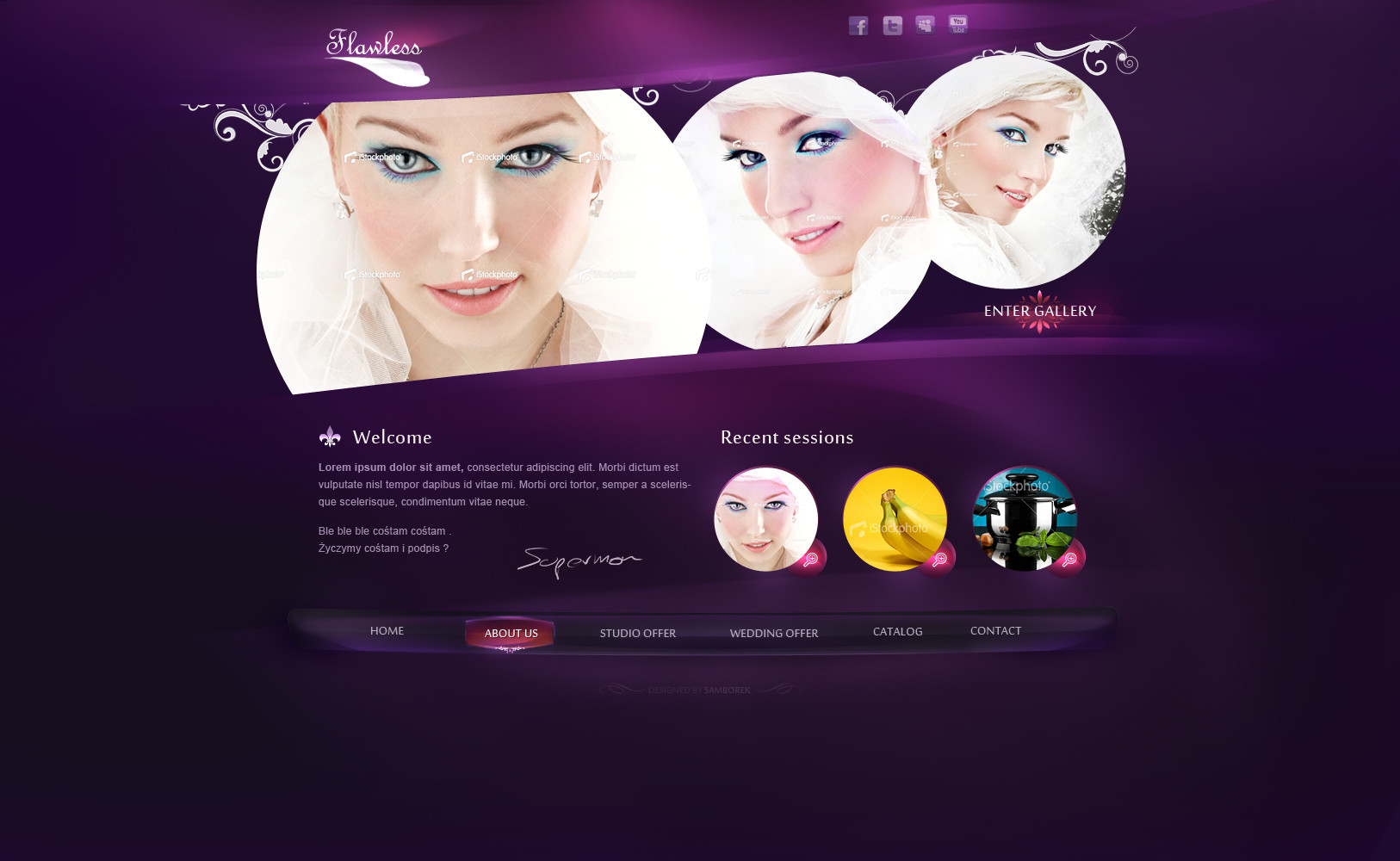
I'm baaaack
Sorry for my absence but I've got crazy about learning how to draw , and just few days ago I've finally decided that I don't wanna fully sacrifice my other skills to be good painter.
But I hope I'll develop a little bit more skills n DP for y further projects.
How do you like it ? Any suggestions cause i think it's 90% of what I could get in this project :]
aiwai
*****Project is FOR SALE :] ******
Related content


Comments: 43


Hi! Your work have been featured here [link] . Hope you don't mind.
👍: 0 ⏩: 1

thank you very much for feature
👍: 0 ⏩: 0

Congratulations your work now in " Great photo & Design Of The Week " in your group we hope to see your best work in group and make the best
👍: 0 ⏩: 1


O popatrz nie zauważylem, że cos wrzuciles
Cieniowanie i światła fajne, ale kompozycja mi sie nie podoba, no i te 3 kolka dupne
ps. Zrobisz keidys design w innych kolorach? xD
👍: 0 ⏩: 1
sto lat za ")
👍: 0 ⏩: 0


wiem no babeczki jak babeczki
a te ikonki i mnie się nie widzą xD
👍: 0 ⏩: 0

nie znam się ale ten napis enter gallery jakoś mi nie bardzo :<
👍: 0 ⏩: 0


Główny stock(top) do wymiany i typografia leży i kwiczy, ale w sumie ok
 (Wink)")
👍: 0 ⏩: 0


Samborek, mistrzu! ")
Jeszcze muszę Ci napisać (bo wcześniej o niczym nie wiedziałem :<) że wychodzisz z dobra inicjatywą robiąc tutki na swoim kanale vimeo, ludzkość Cię potrzebuje! : D Pozdrawiam, jeszcze raz dobra robota.
👍: 0 ⏩: 1
spoko, dzięki
tutków będzie coraz więcej  (Smile)")
noo i powoli to się rozkręci bardziej mam nadzieje
pozdro
👍: 0 ⏩: 0


Nice and clean.
Tylko ten fiolet mnie juz wnerwia, ale menu seksowne ;d
👍: 0 ⏩: 0

Very good details. I like specially the details at the button. Congratulations
👍: 0 ⏩: 0

you are the king of buttons and menus! its always looks so beautifull and special!
👍: 0 ⏩: 0

well done, menu is excellent and those 3 images arent stereotype
👍: 0 ⏩: 0


Love this, especially the navigation, awesome hover effect there
👍: 0 ⏩: 0


Wszystkie najlepsze webdesigny są ... polskie
niezły poziom mamy w tej materii a ten projekt bardzo inspirujący jak dla mnie. Prostota i efektowność aż miło
👍: 0 ⏩: 1
i jak tu was nie lubić i nie wracać na stare śmiecie za takie opinie
dzięki wielkie
jeśli jesteś zainteresowany tutkami na podobne rzeczy wbijaj na tutninja.com
powoli się rozkręci i tutek na to menu wrzucę w tym tygodniu
👍: 0 ⏩: 1
Bóg zapłać dobry człowieku
Brakuje takich dobrych polskich tutoriali więc napewno przejże ten materiał
Zapraszam też do moich prac, chętnie poznam twoje zdanie na temat mojego webdesignu!
👍: 0 ⏩: 0

nice colors and nice detailed effect on the about us button !
👍: 0 ⏩: 0


👍: 0 ⏩: 1
też bym zmienił ale na nich to ja się nie znam xD nie chce mi się myśleć , ważniejszy laj
👍: 0 ⏩: 0

Lmao, I'm working on this project for a photography website for a client, and it looks a lot like this. Purple, large header, some shines here and there and flower patterns -_-
Looking good man!
👍: 0 ⏩: 1
you bastard
thanks
👍: 0 ⏩: 1
I actually finished mine a few days ago. Just working on changes! LMAO.
Here's mine: [link]
👍: 0 ⏩: 1
ahhh not similar to mine
but You are better than this and you know that
👍: 0 ⏩: 1
I know, I know. It depends on my mood and flow.
That rhymed!
You've got two spelling mistakes. It's "FOLLOW" at the top and "OFFER" in the navigation at the bottom
👍: 0 ⏩: 0

Good layout but you should work inside top 3 images like some bevels, inside shadows and outlining to stand out more....
Cheers
👍: 0 ⏩: 0