HOME | DD
 samborek — TurboColor
Published: 2010-12-30 11:22:09 +0000 UTC; Views: 18173; Favourites: 159; Downloads: 823
Redirect to original
Description
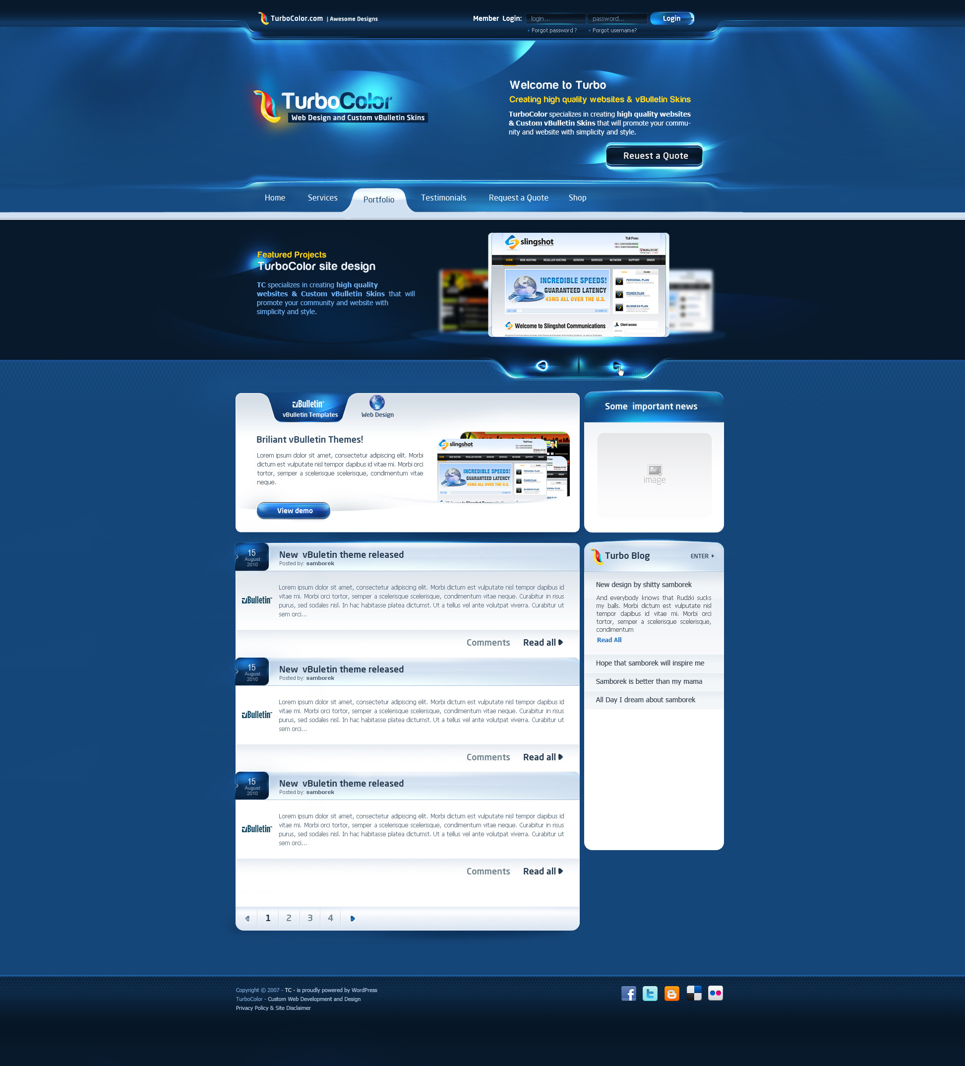
Old one , not much to say about it")
I have fev such project's and maybe Ill thorow some of them here
")
Related content


Comments: 47

Nie strasz mnie takimi starociami, już myślałem, że Ci się skill ulatnia.
👍: 0 ⏩: 0


Żeby wszystkie layouty w sieci takie były. ehh...
fav
👍: 0 ⏩: 0


@A@ If the internet looked like this..... Streamlined awesomeness...
Actually... I've seen concepts like this everywhere, so... question... Why aren't a lot of pages like this? ouo
Certain technical difficulties?
👍: 0 ⏩: 1

actually seo/usability standards etc
 (Wink)")
👍: 0 ⏩: 0


")


very professional and fresh
added to #DesignSpot & twitter [link]
👍: 0 ⏩: 0


OMG , thats amazing  (Smile)")
👍: 0 ⏩: 0


jaki ty masz ten monitor xd ze na szerokosc musze przewijac i przewijac, wkurwiajace projekty twoje bd mi sie snily po nocach

👍: 0 ⏩: 1
no bo ja tenn ee mam 2 xD i nie lubię prezentować na wąskim tle
👍: 0 ⏩: 1

Ale i tak trzeba docenić taki porządny blink
👍: 0 ⏩: 0

Looks very nice. I like the "next" and "previous" arrows that the hand cursor is over.
Why do you not crop out the sides of the design when you upload it? It would look much better IMO, and we wouldn't necessarily have to "download" image to view it in true full-size!
👍: 0 ⏩: 0


Looks nice, man.
It's astonishing what a couple of gradients can add to a header.
👍: 0 ⏩: 0

xD
Cała szerokość to 2x moje monitory
👍: 0 ⏩: 0


I like it. Clean Layout, decent use of Effects and Interfaces, with a eyecatching Header. But I would have filled the Blog Module on the right entirely. Too much space there that could used for functionality.
👍: 0 ⏩: 0


Lol wow, dunno what to look at first!
pretty much eye-candy in here

👍: 0 ⏩: 0


No widze, że wkońcu zaczynasz się martwić o koderów
Schludnie, ale ładnie
👍: 0 ⏩: 0


