HOME | DD
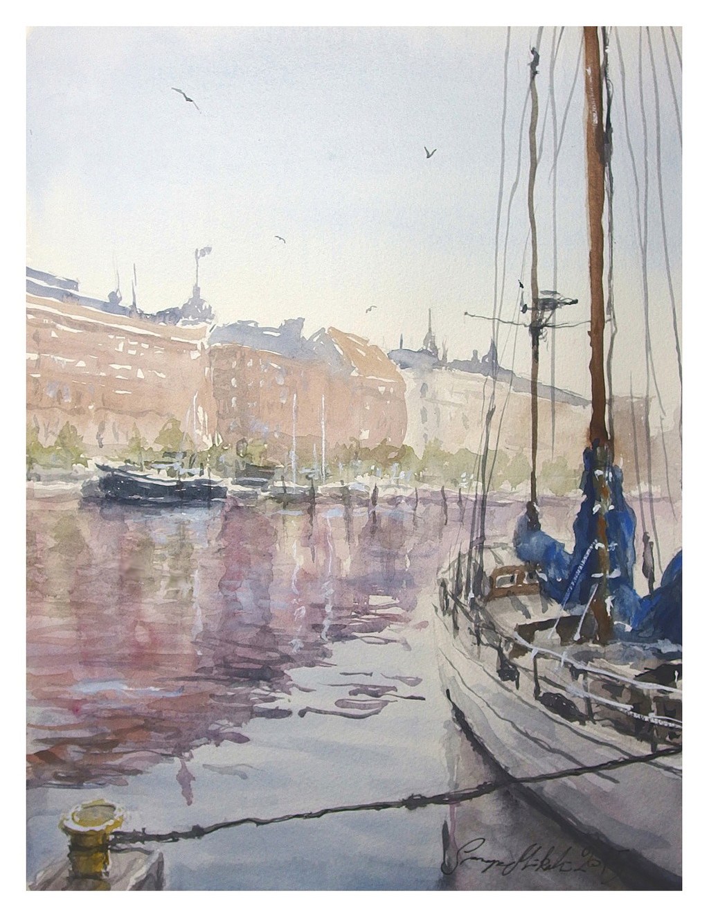
 sampom — Boat Place2
Published: 2015-11-11 07:34:01 +0000 UTC; Views: 332; Favourites: 26; Downloads: 0
Redirect to original
Related content


Comments: 11

I really liked your paintings, I just found them. Great stuff!
👍: 0 ⏩: 0


i'll start calling you "water master"
"with *water* color"
👍: 0 ⏩: 1

Well, if you like it, thanks
 (Smile)")
👍: 0 ⏩: 1
No, I have painted over 4 years, but I am a professional graphic designer, so it maybe helps.
👍: 0 ⏩: 1
which color do you like the most?
which color do you use the most?
👍: 0 ⏩: 1
I think most important colors are: Ultramarine Blue, Cobalt blue, Violet, Payne´s Grey, Sepia, Yellow orange, Golden ochre, Cadmium Red, Rose, Cadmium Yellow, Sap Green.
Additionals are Burnt sienna, Raw Umber, Cerulean blue with red shade, Phthalo Blue, Crimson Lake.
👍: 0 ⏩: 1
Larger palette than I'm used to. That sounds like a nice array. Those blues are important.
I honestly don't know how you do this. It's a pretty special human power you have.
👍: 0 ⏩: 1
Haha, I think it´s a gift from upstairs. You have to be humble with that.
👍: 0 ⏩: 0