HOME | DD
 SanguineLaw — Using fonts - Experimenting
Published: 2011-07-30 12:39:40 +0000 UTC; Views: 80; Favourites: 0; Downloads: 1
Redirect to original
Description
To show ~Tchael how I used fonts.Related content


Comments: 6

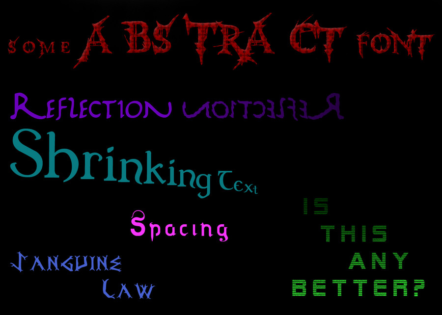
For signature graphics Reflection would never really be used. Neither would shrinking text. Although the concepts there are still good to know.
some A BS TRA CT Font shows the idea of playing with spacing and sizes, Spacing plays with different padding between the characters. Sanguine Law is a rather interesting font choice, but Law is a bit too far for it to be on it's own.
Is this any better is getting better. ")
It's hard to judge out of context of signatures a bit. I'll see if I can grab a few from my old +MW group.
[link]
Notice the effect on the R: [link]
I'm trying to get you to avoid placing text like this: [link]
And place it more like this: [link]
Did you even notice it wasn't a part of the signature that time? I blended it to look like part of the shirt. Was probably the best text I've done
The left is well-blended into the signature, the right is a bit thrown on:
[link]
This text is too attention grabbing - it takes away from his focus and ruins an otherwise good signature:
[link]
This one took some care to try and match it - but the text still ruined the signature: [link]
Not sure if you have this or not:
[link]
[link]
GAGA out of "lady Gaga" was blended in really well: [link]
Also look at Large Arts - they tend to have the best blending text.
Sorry if I sort of rambled on and on. I just woke up.

👍: 0 ⏩: 1

Hmm I think I understand what you mean. You want the text to be visible, but you don't want it to distract the viewer from the render by making it too potent? It's a good point really, since the render is what I want people to notice more than anything. I'll try to blend my text INTO the image next time rather than find an empty space that looks big enough to fit large text. This is helpful to me thanks so much

👍: 0 ⏩: 1
Exactly. Always keep in mind your focus point. You want your text interesting enough to be glanced at, but you don't want it going HEY LOOK AT ME LOOK AT ME I'M BORING AND BLAND AND I STAND OUT
Same thing with how you have your effects. You generally want them to flow with the render, to guide ones' eyes to the render. Composition is important.

👍: 0 ⏩: 1
Yes it is, I really am trying now with fonts to add spacing, effects and even the unique styled lettering (like the P in Harry Potter) to add to things. I recently made a forum signature for myself on another forum. Here's a link: [link] I know it's not A grade stuff, but I think I managed to make the lettering a bit more unique than before. I had nothing for it to blend into so I kinda just made it in the corner as to not bring total attention to things.
👍: 0 ⏩: 1

[link]
[link]
[link]
Better yet is I finally found the MASTER tutorial! (Which also shows good text use, colors, flow, depth, etc.)
[link]
^ Bookmark that beautiful piece of art.
This covers easy-depth creation:
[link]
👍: 0 ⏩: 1
I never thanked you for these, so thanks! I have stopped making art for the moment, but I will surely resume it later on when I'm in the place for creativity again
👍: 0 ⏩: 0