HOME | DD
 saphariadragon — Proud
Published: 2008-01-31 03:00:39 +0000 UTC; Views: 210; Favourites: 3; Downloads: 1
Redirect to original
Description
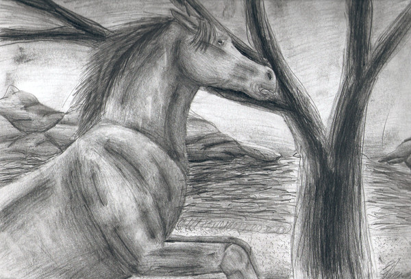
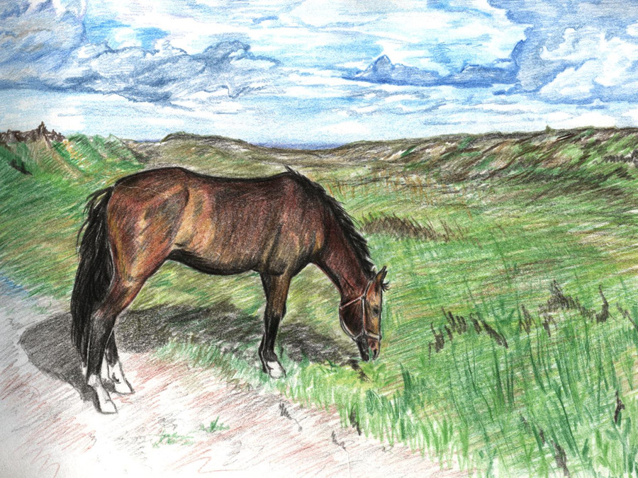
Its a horse. I am really proud of this, i used no reference ^^. Um it took about 5 hours i think give or take. I really like how the shading turned out and am happy how the anatomy worked ^^. The background is one of my better ones which makes me happy ^^Related content


Comments: 10

You certainly like using black and white. Im just wondering if the dot on the near top left side is accidental. Nice horse by the way (my zodiac and what not)
👍: 0 ⏩: 1

yep accidental and thanks ^^
👍: 0 ⏩: 0

I have a few suggestions for this...  (Smile)")
And now, 'cause this comment sounds so mean, I gotta say some nice things about this. Not only 'cause the comment sounds mean, but because there are some things I do really like about it.
The composition: the tree leads your eye into the focus point-the horse.
The rocks are really well shaded, and the water is really cool; I like how it seems like the sun is reflecting off the water behind the tree so that you can't see all of the reflected light, and the tree looks like it's glowing.
Sorry for the novel!
👍: 0 ⏩: 1
thats okay
Thanks for the input thats really nice of you. I do usually use references but at the time i didn't have any so i drew from memory. I do realize there are some anatomical flaws but i am pretty happy with it cause its the most accurate iv'e ever been without a reference. As for the face, blame the scan.
👍: 0 ⏩: 1


I'm glad I didn't seem too mean about it.

👍: 0 ⏩: 1

I love the background on this. Very nice. The details looks excellent in it. I really like how you did the rocks and that tree. The horse looks good too, lovely shading. I like the pose you used as well. You did a really pretty job on the mane, the details to it are very nice. I really like how you did the muscles and the shading overall. Well done.

👍: 0 ⏩: 1
That's a pretty good horse, definately an improvement.
👍: 0 ⏩: 1