HOME | DD
 sarahpicklesdill — Distillum 3-4
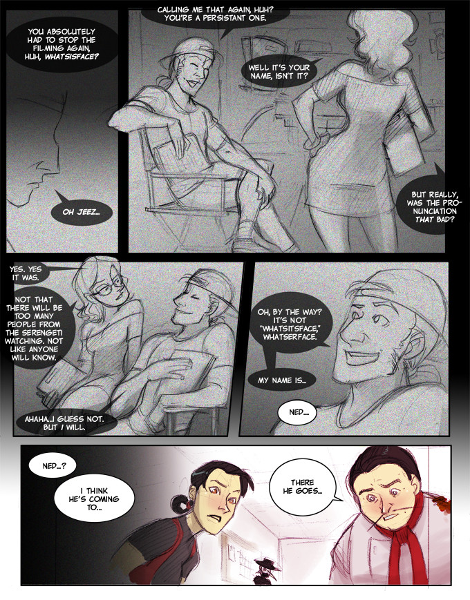
Published: 2011-08-24 14:04:23 +0000 UTC; Views: 744; Favourites: 22; Downloads: 9
Redirect to original
Description
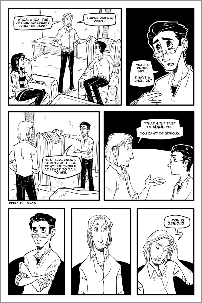
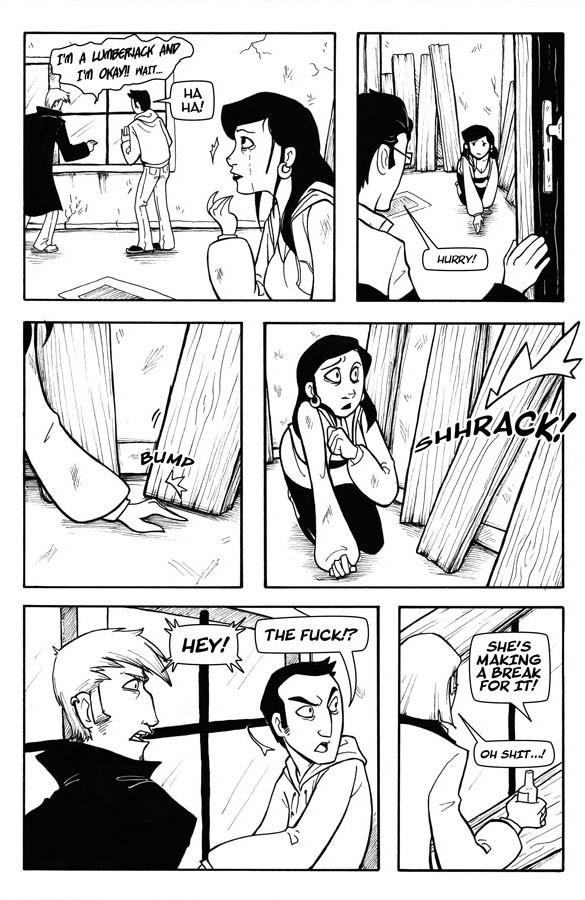
I’ve decided to make my pages a little bit bigger for web viewing. Is this okay? Is the text readable? Feedback would be much appreciated.PaintTool SAI, Photoshop
Distillum © Sarah Dill
Related content


Comments: 19


👍: 0 ⏩: 1

Oh man. I am laughing so hard right now.
👍: 0 ⏩: 1
And I am LOVING it so hard 

👍: 0 ⏩: 0


omg just like super natural.
they fight.
one puppy eyes
the other has nothing to do but agree.
👍: 0 ⏩: 0

Rob's serious face is so. Cute. vhjghvkjjh 
👍: 0 ⏩: 0

Lol! Love it, the bigger view is good! Lol, I love his pouty/serious face! So cute~~~
👍: 0 ⏩: 0

The size looks good, very readable, all is well! Also I love Jamie's face in panel four xD
👍: 0 ⏩: 0

The pages looks tons better for me.
And Rob's srsface is too cute for words..
👍: 0 ⏩: 0

the text is very readable, that will do pig. That will do
👍: 0 ⏩: 0

Pouty determined face of cuteness is cute. Rob makes all the girls swoon.
And in terms of the page being bigger, it's very easy to read :3
👍: 0 ⏩: 0

This is very nice! I like that I can read the font on the non-upsized version now, though of course I still blow the page up to look at your linework. Mmm, linework. Look at those solid blacks! And the lumps in that old furniture! And the way those shirts crinkle!
> off to my happy black and white fanplace <
Oh yeah also glad someone's calling out the whole "hosebeast" issue. X)
👍: 0 ⏩: 0


