HOME | DD
 sashander —
Artyso
by-nc-nd
sashander —
Artyso
by-nc-nd
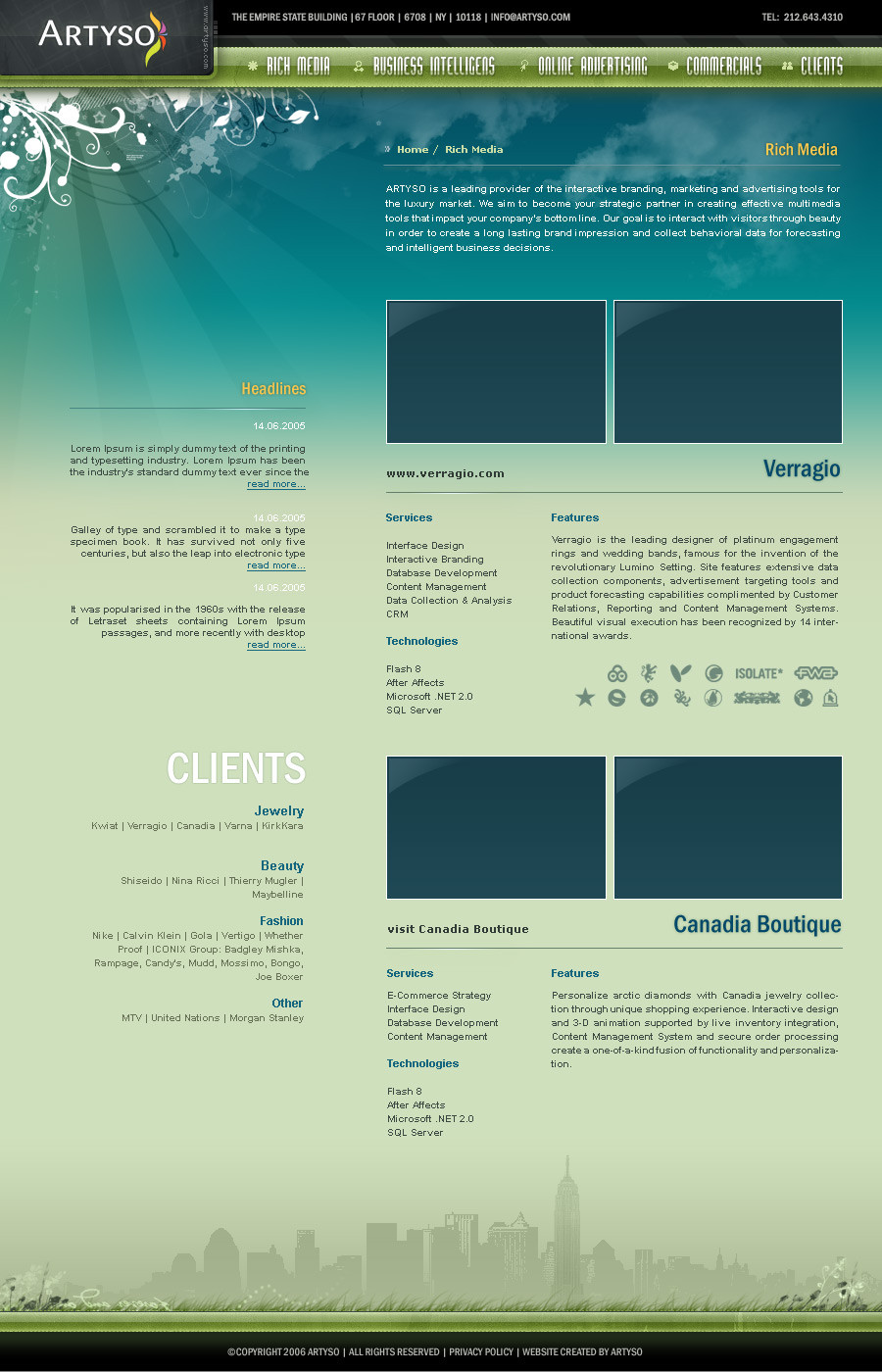
Published: 2008-11-06 23:45:40 +0000 UTC; Views: 23516; Favourites: 341; Downloads: 799
Redirect to original
Description
artyso webpage final november 16 2006Related content


Comments: 33


I love the colors and the footer just awesome. The vector art header is a little cliche but nice.
👍: 0 ⏩: 0

lovely and clean- easily accessible. a winner, really. (:
👍: 0 ⏩: 0


I dont agree with the DD text. I think its really easy to go wrong with these unusual colors, especially if overused. The orange especially.
But you pulled it of nicely. Well done!
👍: 0 ⏩: 0

What a beautiful presentation! The color scheme and layout are masterful. I am inspired by your use of space. I have been stuck in a rut lately when it comes to my web-design techniques. I have been thinking of going vertical for my own site, but for some reason it trips me up and then I cave and go back to my tired old horizontal layout (I actually know the reason why...it's because I haven't practiced enough with that format...I know I know). Thanks for the push.
👍: 0 ⏩: 0

")


Oh, god....
It's reall lovely! tnx a lot for designing,and now i'm

👍: 0 ⏩: 0

There are better pieces in his gallery who deserves the DD in my opinion. Sorry!
👍: 0 ⏩: 1

FAQ #873: What do I do when I disapprove of a Daily Deviation feature?
second paragraph.
👍: 0 ⏩: 1

I know you know that. Because I've told you.
Don't do it again.
👍: 0 ⏩: 0


Great work! But what about the resolution, did you think about it?
👍: 0 ⏩: 0


")
Grats on the DD
 (Wink)")
👍: 0 ⏩: 0


 (Smile)")


