HOME | DD
 SatouKenta — Project MetroUI III - Windows Media Player 13

Published: 2011-12-04 09:54:20 +0000 UTC; Views: 18569; Favourites: 25; Downloads: 2892
Redirect to original
Description
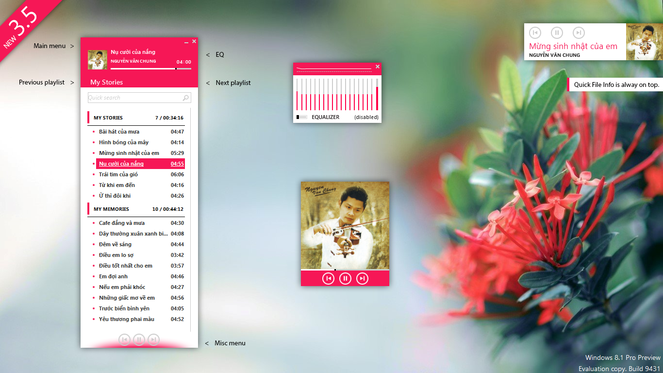
Yyyyea! It's finished!I've told you earlier about WMP 13 right? [link]
Okay!
- Metro'd. Also my first Metro Window test, though. I believe you'd like it. Well, I got a little problem to determine which style suits best the panel, contents, or white areas. So here, I just styled them with simple and narrow inner bevel. Looks better than just simple stroke border.
- Ribbon UI. Not fully Ribbon UI though, it's more like Tabs, which already available on WMP12, but now I include the Library into it. Active (current) tab will show it's name inside the breadcrumb addressbar. (currently the active tab is Library)
- User friendly. Unlike WMP12 which shows everything 'difficult' like Sync, Play, and the worst is they excludes Menu Bar. Now, the contrary.
- HEy hey hey, New Icons! I did the design, looks beautiful right? Combined with dominant Metro colors, light blue, green, and some Zune-flavor reddish yellow color.
")
-------------------------------------------------------------------------
Tools: Adobe Photoshop CS, Windows Media Player 12, Microsoft Paint, WinAMP
Credits goes to Microsoft
Copyright 2011 - Satou Kenta
Related content


Comments: 13

If this were real, it would have been nice if they made a Windows Media Player 14 (14, not 13, since Microsoft often tends to skip version number 13) that would've came with Windows 10 back in 2015. They could've used a new logo like in this concept (with the multi-colored layers), a new interface, and new visualizations alongside the usual Alchemy, Bars and Waves, and Battery. It would be nice to have a new Windows Media Player, since its last version, Windows Media Player 12, came out a little over a decade ago.
👍: 0 ⏩: 0

👍: 0 ⏩: 1
It's not real, only a concept.
👍: 0 ⏩: 0


Well it's perfect! But can you tell me if it can works really or just photoshop conception?And can you share the PSD?
👍: 0 ⏩: 1

Thanks! Yup, this is just concept, about the PSD, I'll note you soon.
👍: 0 ⏩: 0


 (Smile)")
 (Wink)")
👍: 0 ⏩: 1
'course you can. I will be really thankful for it.
👍: 0 ⏩: 1
very nice then..already done buddy !!
👍: 0 ⏩: 0
Perfect..i like it so much.brilliant colours and arrangements !!!!!!!!!!!
👍: 0 ⏩: 1
Thanks
WAit a second,
do you think it's nice if I apply the same style for my next concept about Windows Explorer?
👍: 0 ⏩: 1
positively..i think its very good..u can play with colours too to see what people will prefer or how u prefer it too..as a style i like it and u can make also plenty of arrangements and see what works best..usability and design counts but i think u can do a great work
👍: 0 ⏩: 0