HOME | DD
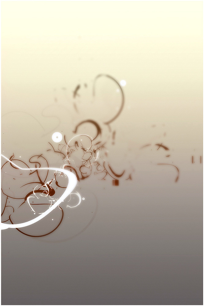
 sc3L — Another Place II
Published: 2004-09-28 14:53:14 +0000 UTC; Views: 14741; Favourites: 219; Downloads: 3443
Redirect to original
Description
..my brain, some nicotine and of course music!*removed the font
 (Smile)")
Related content


Comments: 94


Hi ..
Nice graphics! Looks awsome ..
We're on the hunt for talented graphic artists and illustrators, who has interest in earning money on their graphics, by letting us sell these on our online portal.
We're developing an online webshop, selling state-of-the-art T-shirts with graphics specially made by such as you.
Should you be interested, then please have a closer look at [link] or email me at charlie@teebee.dk
I'll be looking forward from hearing from you and hope that you find our project interesting enough!
Take care
// Charlie Nielsen
👍: 0 ⏩: 0


the gradient of colours is amazing..
then the blur creates various levels of depth..it's very floating...
congrats!

👍: 0 ⏩: 0

solid smoke thats been neatly cut wit scissors drifting this way
👍: 0 ⏩: 0

AWESOME shapes man. this is sick how you did your perspective on the shapes
👍: 0 ⏩: 0


bah... a bit deceiving from what i know you can do,
but still very good
👍: 0 ⏩: 0


")


Damn, I always think to myself, what is the point in anything and then I see work like yours, the caliber of your work is amazing!, I have just one question, which program do you use to create the backgrounds for your pieces?
P.s. I have added one of your pieces as a favourite, hope you don't mind!, I love it!
👍: 0 ⏩: 0


I think it's even better without the font, good thinking! Now there's nothing to interfere with the flow of the lines. It's truly beautiful
👍: 0 ⏩: 0


I like this work...excellent structure and beautiful colors! Congrats
👍: 0 ⏩: 0

Straight to the point and it's blurred too.
me likes.
👍: 0 ⏩: 0

Wow, this one is fantastic. I really love the contrast between the focused and blurred sides, it gives a special touch to this piece. Simply great.

Great job!
👍: 0 ⏩: 0


" ..my brain, some nicotine and of course music!" - that's great.
👍: 0 ⏩: 0


very nicely done.. the colors are great, and the shapes are nicely put together, they give some depth to this pic. great job
👍: 0 ⏩: 0

the blur gives it perspective. using minimalistic vector design to represent a 3D vision!


👍: 0 ⏩: 0


defently going to have to agree with most of the people here, and say, that its awsome!.. and yes, the blur affect does rock.. gives it much more deapth 
 (Wink)")
👍: 0 ⏩: 0


man, u're so good u should be illegal...
which program(s) do u use?
👍: 0 ⏩: 0

damn, i love this piece. everytime i try to make somethin abstract it looks like someone elses but way worse
👍: 0 ⏩: 0

awesome. i love the downtoearth colours and the composition. maybe some of those curls look a bit too randomly arranged, but the overall image is ace.
👍: 0 ⏩: 0

was that structure completely made in illustrator? i'm really curious about it...
👍: 0 ⏩: 0
was that structure completely made in illustrator? i'm really curious about it...
👍: 0 ⏩: 0

lovely! the depth of field in this is amazing and really just makes this work soo well. Great colors too. Good work
👍: 0 ⏩: 0


great job!
can tell me who make the pattern or the lines texture ? you use illustrator?
👍: 0 ⏩: 0

I love this peice, thats why its in my FAV, but after looking at it again I notice something that i dont like. The circle, 3/4 top left doesent seem to work for me. Its a little out of place, and doesent work with the rest of the composition harmoniously. Ditch that and it will totally wicked.
👍: 0 ⏩: 0


Looking at this, I'm stuck between wondering whether or not the blurred effected shapes are either far away .. or too close up that they're out of focus. However, either way though, it's very pleasing to look at. I enjoy muchly (yeah .. muchly!) the soft gradient as well as the ever prevalent angular lines.
")
👍: 0 ⏩: 0
| Next =>