HOME | DD
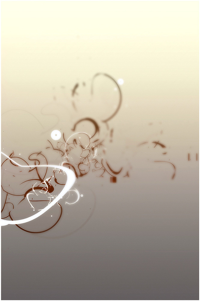
 sc3L — Another Place II
Published: 2004-09-28 14:53:14 +0000 UTC; Views: 14729; Favourites: 219; Downloads: 3443
Redirect to original
Description
..my brain, some nicotine and of course music!*removed the font
 (Smile)")
Related content


Comments: 94


Hello
I really like the blurryness to this. The design reminds me of smoke and I love the colors. I think what makes me like it so much is the simplicity of the design and that it still looks sophisticated.
")

👍: 0 ⏩: 0


beatiful David! so abstract and minimalistic, yet thoughtfull and conceptual
👍: 0 ⏩: 0

What the hell. It's so simple but it's awesome. I need to learn how to do that
👍: 0 ⏩: 0

oh..very nice.
i love those random shapes and the blur looks good too, though i wouldn't have minded a bit more focus towards the lower left. (just to emphasise the depth of field some more)
as has been said the typography isn't sitting quite comfy, but it's probably only a question of making it medium instead of thin and maybe a bit bigger.
i'm faving this.
👍: 0 ⏩: 0

You and your blatant randomness! i know you must be getting really tired of flattery, but this is good work!
👍: 0 ⏩: 0

Wow you're better than me as a person just bceause of that
*bows down*
👍: 0 ⏩: 0

the illustrated forms flow great over the background colour choice.

👍: 0 ⏩: 0


 (Wink)")


hmm.. like the depth this has, the depth and the shapes/form are nicely executed. Lovely caffene colors
👍: 0 ⏩: 0

It looks like you've dumped typo into water, and then pulled out the drain plug
Nice.. but you're better than it
")
👍: 0 ⏩: 0


Looks fine! Good composition! Like the colour combination and the shapes. Well done
👍: 0 ⏩: 0


like alexian noted the blur gives it a nice depth,nice job....not ur best but make some more of these lol
👍: 0 ⏩: 0

this is lovely. it makes me think of autumn, and debree flying through wind in a forest.
👍: 0 ⏩: 0

lovly! the colors are nice and smooth and the shapes are just so random! lol Awsom job!
👍: 0 ⏩: 0

excellent piece man i love ur choice in colour with this one, nice how you have used the shapes and added blur to give the piece a real sense of depth, well done man as usual!! +fav!
👍: 0 ⏩: 0

I dont like the typography/placement of it. Overall its a nice image. Certainly not one of your best though.
👍: 0 ⏩: 1

hehe i was waiting 4 someone to say that, im also not sure about, i really dont like doin this typo stuff, hehe maybe i shouldnt do it..i think the main attration is he structure...
👍: 0 ⏩: 1
yeah it sure is. I'm not too fond of Helvetica Neue's Ultralight Condensed (?27) . Its soo fragile, and doesnt really go with the overall solid feel.
Im not really fond of placing typography too, for me its most of the time just some basic labelpushing.
👍: 0 ⏩: 0

great background, colors, shapes, and d.o.f. work man
👍: 0 ⏩: 0


The two lines on the right should have more blur, don't you think?
damn nice work bro, btw.. congrats on the dd.
👍: 0 ⏩: 0

this is great! another great conpecept of depth of view! love the concept really
👍: 0 ⏩: 0


My mind likes to wonder when I listen to music as well. I get the same feeling when listening to techno. Great Piece!
👍: 0 ⏩: 0


Nice, I like the blur, gives some nice depth to the piece
👍: 0 ⏩: 0
<= Prev |