HOME | DD
 Scharle — The Wild Thing

#digitalpainting
Published: 2019-01-12 13:53:40 +0000 UTC; Views: 455; Favourites: 50; Downloads: 0
Redirect to original
Description
Is the painting too dark? Some other critique?Youtube
Related content


Comments: 19

Overall
Vision

Technique
Impact
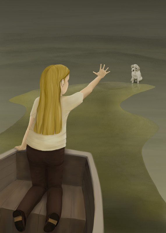
There is a certain level of stiffness/passiveness in the dynamics, even though the boy is intended to be running. Because he is directly facing the viewer, it's hard to detect the direction of motion. The chest should probably be pointing forward while the pelvis is further back, but angling the torso in the depth dimension is pretty hard. The division of light and shadow is pretty even all the way across the shirt and pants, which makes it read as if the surface is by average in a 90-degree angle in terms to the ground. What adds to the passive illusion is that the opening in his shirt is almost completely straight, when even walking, let alone running, causes diagonal distortion around the waist area of the shirt that alternates with each step. I remember observing this as a child when I was walking home from school and noticed that a fold would appear on my jacket and keep moving with each step. I felt that I wanted the zipper to remain straight and not bulge because I thought it looked stupid, but it was physically possible for the fabric to remain flat because the movement of the lower abdominal muscles creates an upward force that pushes the lower part of a jacket or shirt towards the waist.
The eyes spread too far to the temples. The components of the face are mostly good in detail and expression, but the temples look too narrow. Even if they were more sharply angled and affected by foreshortening, this would affect the curvature of the surface and currently, the shading suggests a more shallow curvature than what would be required to cover the illusion of realistic thickness.
The mouth looks glossy and there isn't enough depth at the corners, bringing to mind a blow-up doll. Reducing the glossiness and redefining the shape so that it looks like the middle part of the lips curves outwards and the corners curve inwards (in the depth dimension) would help it look more realistic.
The hair is very static and straight. It displays very little hints of mass and the curvature of the surface doesn't completely match the lighting. I get the impression that you were going for relatively short, somewhat rigid hair that isn't long enough to flow with motion, but in that case, we would be seeing a lot of ends of forward facing spikes, rather than longer strands.
Observe the first photo in the reference below. Even though the front of the hair is combed differently than in your picture, you can observe the general shape of the shadows and highlights in the top part of the hair that is closer to the scenario in your case.
www.menshairstyletrends.com/bo…
The main appeal of the picture comes from the use of green light and blue shadow, with a deeply sloping hill environment that displays a brilliant use of perspective. I also really like some of the texture patterns on the ground, especially near the boy's foot. The pairing of bright green on a blue background has a very effective level of contrast. There might be a bit too much uneventful clear ground on the bottom left, so introducing more large, dark patterns in that region could help guide the viewer's eye towards the boy.
I agree with ubernoner that the text doesn't contribute to the image and the expressions are readable enough not to require the addition of text.
The dog is clearly huge but it seems intentional and doesn't read as a flaw in perspective. I think the size of the elements is mainly in balance, so the main problems stem from the angling of surfaces on the boy's body and some issues in anatomy/dynamics.
👍: 0 ⏩: 1

Hello Ilona,
nice to read from you again, here in the comment section. I can always count on you  (Wink)")
Maybe it's interesting to you that I already uploaded a second refurbished version a minute ago:
But you made some very good additional points and perhaps I will work on the piece again. Especially the mouth of the boy still concerns me a bit
👍: 0 ⏩: 1
It took me a while to write the critique so I had started writing it before you uploaded the second version. Thanks for letting me know an updated version exists, although I would have spotted it from the notifications tomorrow at the latest. It's cool that you were already able to fix so many things even without my input. I would have to look at the pictures side by side to spot all the changes but I can instantly tell the mouth has more depth, and somehow the eyes also look more real and soulful, even though I can't tell for sure what you changed.
👍: 0 ⏩: 0


Technique
Impact
I'm from a.deviantart.net/avatars/p/r/p… " alt=" " title="ProjectComment" />.
This piece reveals your strengths and weaknesses clearly, making them apparent in an instant. You are really, really good at creating and painting backgrounds and landscapes. The lighting adds to the mood and the trees all have the "personality" that one would expect from a creepy forest. The puppy also looks very nice, though I noticed that since it is right in front of the light it would be covered completely in shadow. However, I assume that you fudged this on purpose for artistic license, since otherwise it would not be as clear that the dog is harmless, because a silhouette would look too menacing.
Unfortunately, the way you draw the boy needs some work. It's stylistically quite different from the rest of the picture and detracts from the work, since it is right in the foreground in a place where it cannot be ignored. Indeed, the viewer's eyes are drawn directly to his face, which ordinarily would be a good thing, except that his face is probably the creepiest part of the painting, and this was not intentional. He doesn't look convincingly afraid; the eyes and mouth are wrong. In a case like this, you probably would want to exaggerate features, like in a cartoon. Really, the eyes themselves would probably be fine if it were not for the rest of the face making them seem so very unrealistic and uncanny. The other issue is that the boy's right leg is bent the wrong way. His shin is foreshortened so much but the thigh does not match.
But all that aside, the scene is funny. The boy is running away terrified of what looks like somebody's pet. Strays are dangerous, of course, but this looks friendly and confused about the whole thing. It's just a shame that the human figure isn't up to the same quality as the rest of the piece.
👍: 0 ⏩: 1
Thank you for this detailed and helpful critique. I uploaded a new version of the piece where I tried to fiy at least some of the issues. I hope there is an improvement
👍: 0 ⏩: 0

Overall
Vision
Originality
Technique
Impact
I like the concept behind this piece, but as someone else stated, I'm not sure who the focus should be.
The lighting also comes across as off to me - not sure how the boy in the front has so much light on him, when everything around him is darker. To me it just comes across a little off.
The other thing that bothers me is the position of his back foot. Even in running, it seems unnatural and brings it into focus when it should not be.
If the boy is supposed to be the focus, I think the lighting around him should be picked up and the background dropped off a little more, or you need to darken him more and lighten up the dog.
👍: 0 ⏩: 1
Thank you very much for your comment
👍: 0 ⏩: 0

Impact
This is a really lovely piece, there is a lot of attention to detail in the foreground and background. you're understanding of perspective is also very good! I only have a few suggestions that could improve the piece.
I'd say that the body language of the boy could be more expressive, and have more movement, this would improve the impact of the piece, however you understanding of anatomy is very good. On the same note the facial expression looks slightly off. The mouth doesn't quite look right. I think, again, having him being a bit more expressive would help. His hair somewhat looks like a helmet that's not a part of him and some of the lighting designs you made with it should be looked at.
I'm not a huge fan of dialogue on being a part of the work, but it doesn't really take away from the art, so it isn't a big thing
Overall, your strengths definitely lie in colour and perspective, you've done a very good job with them and they help build the atmosphere of the scene. I think you just need to work on movement and expression.
I look forward to seeing more from you, this really is a lovely piece of art ^^
👍: 0 ⏩: 1
Thank you so much for your nice and helpful critique. I tried to incorporate the things that where pointed out in a edited version I uploaded
 (Smile)")
👍: 0 ⏩: 0

Overall
Originality
Technique
Impact
There are three areas of interest to me on this piece: the palette, the focus and the expression.
I very much like the palette; the tonal shift between yellows, greens and blues, especially how they seem to run down the center of the work like a stream.
The focus is somewhat less tangible to me; as the child is moving out of the center of the frame, it leads me to believe the dog is the focus. However the dog is in the background and minimized compared to the child. Personally, I find this slightly distracting, but it could very well lead to interesting dynamics in focus if this were intentional.
The expression is where I find the most difficulty. First and foremost, the inclusion of text in this piece, to me, detracts from the whole. Your style is more than good enough to convey the emotions of the two characters: the child and the dog. There is no need for the text.
Second, is the actual expression on the child's face; I have difficulty classifying it, but it reminds me of a child that is going through the motions of being upset in order to get something, not because they are genuinely upset. This is compounded by the text, and it's removal might resolve that matter quite well.
I would suggest studying some face models a little more, or even making the face you want to present and then take a selfie and work from that.
Over all, I don't think this piece is any where close to being, 'too dark'.
👍: 0 ⏩: 1
Thank you for critiquing. You made some good points and I tried to fix them in the second version I uploaded just now
👍: 0 ⏩: 0
he's trying!! The biest should not get him!
👍: 0 ⏩: 1

He’s not trying hard enough
👍: 0 ⏩: 0

No it's a wild boar with dangerous long teeth!! He needs to run for his life
👍: 0 ⏩: 0

He reminded me that as a child I was frightened by a dog that had no intention of attacking me
")
👍: 0 ⏩: 0