HOME | DD
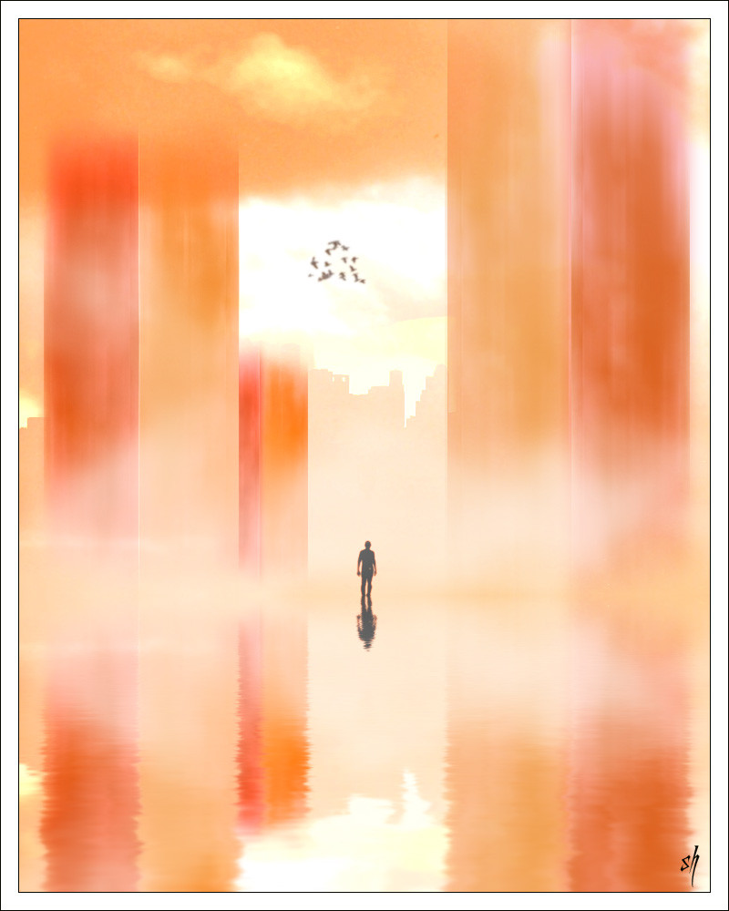
 sergiofx — Wayfaring Stranger
Published: 2005-10-08 18:29:36 +0000 UTC; Views: 2117; Favourites: 27; Downloads: 113
Redirect to original
Description
" I am a poor wayfaring strangerTravelling through this world of woe
There is no sickness, toil or danger
In that fairy land to which I go
I'm going home to see my mother
I'm going home no more to roam
I am just going over Jordan
I am just going over home"
Wayfaring Stranger - Jack White
---------------------
I have always loved this song, for me, it's more personal and deep than taking it litteraly. For me, I am a stranger of my own self. How many of us try to find our way "home". to find ourselfs, to find why are we here, what makes us happy.... So, I thought of portraying that, and I wanted to draw a city that looked sureal, strange, yet peacefull, and in this, I tried to give a mood of a far far away place, a place not known to man, yet, this stranger has reached it.
Is he finally home?
------------------
hehe, first ever entry with NO stock photos whatsoever!!! I BRUSHED the whole thing, using my all new less then 24 hrs old digital tablet
") (yes, I finally got one!)... I am seriously happy with this, it's not my usual style and when I first started using the tablet, it gave me a bit of problems, but I got used to it really quickly!
(yes, I finally got one!)... I am seriously happy with this, it's not my usual style and when I first started using the tablet, it gave me a bit of problems, but I got used to it really quickly! comments, critique and fav!
EDIT: I listened to my friends tips and I changed it a bit.. made the man smaller, that way, he looks smaller in face of this HUGE city (metaphorically speaking), removed the grass (they were bothering a lot of people) and added a mist... sorry for those who fav. the one before and dont like this one....)
Related content


Comments: 54

hehe well, i like this one
but SERGIO its pink
hehe doesnt that make u think
but i like it dnt worry....lol
though part 2 was better, but not bad

👍: 0 ⏩: 1

where do you see pink ya 3ayneh? its all orange.... try to fix that screen of yours
 (Wink)")
👍: 0 ⏩: 0

there isn't a single thing that i haven't loved about this pic.... absolutely beautiful!!!
👍: 0 ⏩: 0

a kickass one... awesome concept with awesome excute.. u got it

👍: 0 ⏩: 1

I love it.......I like to see something different from ppl. I think it shows more of your talent.
👍: 0 ⏩: 0

Pretty cool, this is totally my kinda thing, huge landscape / tiny human figure.. reaaally my kinda thing. Great choice of colours, keep making these!
👍: 0 ⏩: 1
Hehe, am glad you liked it...
as for the tablet, it's a 5'4' MousePen genius thingie
👍: 0 ⏩: 1
alright! that's the one I have. But without a mouse. It's pretty good, cheap, and I like the little hotspots on the edges. But beware of damaging the pen, I tried to open it once to change the battery and it didn't work, instead it's all wobbly now.
👍: 0 ⏩: 1

probably not actually, i just thought i was supposed to. i'm pretty sure there is no battery inside the pen, but at the time it was "attesh"ing a bit and it seemed thick enough to contain a battery so I thought I had to change it.

👍: 0 ⏩: 0

nice usage of space, through colors. it did create the feel of perspective in it. i like the effect of the fog in the whole area. but the birds.. i think they needed the feel of more motion in them.
👍: 0 ⏩: 0

I like the watercolor look you achieved in this image. And although is very minimal, it's says something to the viewer due to your choice of color and the way you placed the figure and birds.
👍: 0 ⏩: 0

Wow Sergio, this is really beautiful work, I'm very impressed! I hope you'll do more pieces in this style - btw the color scheme is just perfect, well done!
👍: 0 ⏩: 1
thanks  (Smile)")
👍: 0 ⏩: 0

My God. You brushed this whole thing?! Incredible!
👍: 0 ⏩: 0


a radical change in your art i see (Yoda style)
👍: 0 ⏩: 1
hehe, thank you master HC
👍: 0 ⏩: 0

This is so beautiful! I love the colours you've chosen...they remind of me sunrises. This picture makes me think of being lost in dreams...the kind of dream where you think you've woken up but then you realise that you still don't really know where you are and everything around you is kind of hazy. Like being lost, but not in a scary way. The comfort of anonymity.
Yay for the new tablet!
👍: 0 ⏩: 1
hehe, thanks for the comment
I also tried to go with a dream like picture, so I guess my point is made
👍: 0 ⏩: 0


DEEEEP!What a mood!
And good luck with ur new tablet
are u a left handed?
👍: 0 ⏩: 1
hehe, thanks ")
👍: 0 ⏩: 1
well i'm left handed and i put my signature on my left side as u did
👍: 0 ⏩: 1
ohhh, i never thought of that ")
👍: 0 ⏩: 1


I. Love. This. 
The grass in the foreground however I just can't decide. It's a bit distracting without having anything to add. When I look at the rest I get the feeling like the signature should be in that corner, to create a presence that wouldn't interfere with the composition. I think if you removed the grass and put your signatrue there, a bit larger than you have it now, it would be perfect.
Kudos for not being bound to a single style
Congrats for the tablet!!
👍: 0 ⏩: 1
and I love your artistic critic, it really makes my day when I read something like this... 
👍: 0 ⏩: 1
Yes 
Always happy to help those who sincerely want to grow!

👍: 0 ⏩: 0

wow very different to ur tradtional dark art i still like it just as much i think u should of blurred it a little to make it look a little more dreamish sort of thing meh just an idea well i still think its awesome! i gots a tablet now too! its pretty and green and see threw! heh well i have heat stroke so im goin to go get some rest!
👍: 0 ⏩: 1
hehehe, thanks
👍: 0 ⏩: 1

I don't know why, but this is just fucking blowing my mind. So smooth. I love the style, colors, and details. Nice quote, as well. You should try more paintings of this style.
👍: 0 ⏩: 1
hehe thanks man
👍: 0 ⏩: 1
Good to hear, amigo.
👍: 0 ⏩: 0

The colours in this are excellent, and the different shades of orange look really good in contrast with the black of the person.
I love the overall look of this... I Like it a lot
Congrats on getting your tablet darlin!


👍: 0 ⏩: 1
thanks sweetie... I'm glad you liked the colors, cause I was going for a purplish color at first, with all the different shades of course, but then I saw that it was used too much, so i changed it to this..
thanks
👍: 0 ⏩: 1
cool... I think purple may have been a little bit strange. Surreal, but not quite in the mood I see with the orange.
I pictured it all in purple, and I like it in orange better
👍: 0 ⏩: 0

"Home is where the heart is".
Wonderful layers of colors.
The only thing you could improve are the (weeds) brushes to the right.
👍: 0 ⏩: 1

what do you mean? what can I improve about them?
👍: 0 ⏩: 1
...well, whatever it takes to help you on the journey.
They just don't blend well with the background, they should be a bit "smoother", blurrier, or maybe not there at all.
The rest of the composition is in perfect harmony.
👍: 0 ⏩: 0
"Home is where the heart is".
Wonderful layers of colors.
The only thing you could improve are the (weeds) brushes to the left.
👍: 0 ⏩: 0

sergio usualy I dont comment on your work since dark art doesnt usualy interest me but this piece opened my eyes to the fact that you are a very good artist and should be appreiated for any kind of work you do. Nice work.
👍: 0 ⏩: 1
why thank you
👍: 0 ⏩: 0

Absolutly astonishing, I love how you have captured this. It really plays with my mind.
You've inspired me.
A question though. How did you get the ripple effect in the water with brushes?
👍: 0 ⏩: 1
| Next =>