HOME | DD
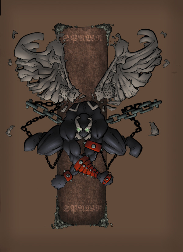
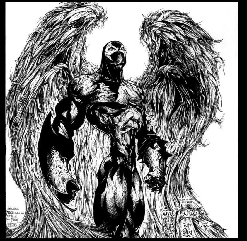
 shalomone — spawn by dev colored
Published: 2003-10-26 17:29:54 +0000 UTC; Views: 2124; Favourites: 25; Downloads: 428
Redirect to original
Description
pencils: dev-nullinks: fuse
colors: me
Related content


Comments: 15

That's incredible. I love Spawn and I never thought he'd look this awesome in this type of style. Great job, all of you.
👍: 0 ⏩: 0

Damn! I hope you have other Spawn images on the way. This one is rather impressive. Keep up the good work!
👍: 0 ⏩: 0


It's definitely different from most Spawn pics I've seen.
👍: 0 ⏩: 0

this is vary cool, i like the texture on the square in the BG, in the character i think stronger shadows would help him pop out and be more notorious, right now the BG is eating him.
")
👍: 0 ⏩: 0

Spawn looks too....light. He doesnt look very convincing as the art. The feathers in the wings lok like plastic also.
👍: 0 ⏩: 2

hmmm I dont think I get your crit?...are you talking about the lineart or the colors?
👍: 0 ⏩: 1
Why would I talk about the lineart? devnull is one of my good friends. I color for the comic he draws. I meant spawn is so light and all. I cant even remember what I wrote, but anyways. It looks good, just doesnt convince me of spawn's creepy style. I thought mayb eyou could innovate with the BG more, but I noticed its not something you do often...
👍: 0 ⏩: 0

bad ass shal bout time you put some colors on my inks byotch
")
👍: 0 ⏩: 0

You are an awesome colorist man! Great lighting and the background rocks.
👍: 0 ⏩: 0


👍: 0 ⏩: 0

im still trying to figure out how you do the gradients for the lghting effects.
👍: 0 ⏩: 0