HOME | DD
 SharPhoe — Go Go Grumps

Published: 2013-09-08 06:31:08 +0000 UTC; Views: 991; Favourites: 31; Downloads: 0
Redirect to original
Description
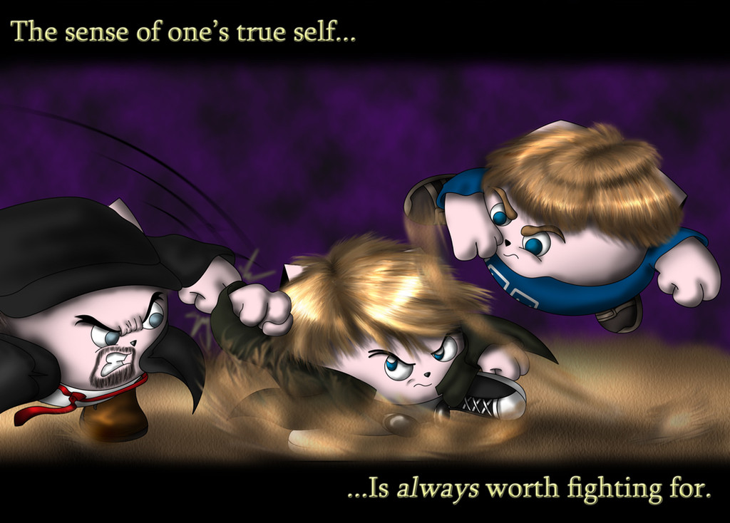
"Steam Grumps"? "Game Train"? Personally I’ve taken to calling the full gang the Grep Drump Gorp.I spent a lot of time deliberating on if I should have Jon be translucent like a ghost to signify his departure, but then I was like “Fuck it, this is a happy picture of Grumps both past and present, everyone should be shown in full splendor! …Plus I spent way too much time on Jon’s hair to have it be barely visible.”
So there you have it, my newest contribution to the Grumps and the Train. Enjoy!
Related content


Comments: 8

The lack of sunglasses on Barry saddens me, but whatevs.
👍: 0 ⏩: 0

I saw this on the Game Grumps subreddit but I don't have an account there (I just browse occasionally really) so I thought I'd post a comment here. I think this looks really nice! I have to say the hair is amazing and I love the expressions of everyone, they're definitely very in character (especially Barry, haha!) I don't quite understand the creatures that they are, but seeing as though your gallery is filled with them I assume they're some sort of original creature of sorts.
The only thing I may suggest is there's a definite lack of color here. Everyone's hair is essentially the same color, and though it's true all the Grumps are brunettes, they each have different hues. I think you nailed down the textures perfectly and it's very clear to see how much time you spent on them. The main issue though is that the obvious effort in the hair completely outshines everything else. The rest of the shading looks incredibly flat. There are no highlights despite there being so in the hair. The styles look very much inconsistent since you have hyper realistic hair and yet the rest is not. I'd either try "blocking out" the hair and making it look much more painted to match the cartoon look or go hyper realistic on the rest, which I would not recommend as realistic cartoons are almost always uncanny valley. Continuing with that, try shading with colors instead of black or a darker shade of the base color. It looks like you're using dodge and burn in which case abandon that habit right now oh god trust me because you will never, ever get any depth from using those tools. Depth comes with painting in color, which in turn makes the piece much more interesting and fun to look at. You've got a good set up for a color scheme in the background with blue and orange, I would definitely recommend bringing that in and painting it into the values. Some of the best advice I ever received that I wish I had gotten sooner is to paint instead of using dodge and burn. If you're serious about improving your art it will help SOOO much!
Just as an example, here's a cartoonish thing I did in 2006 when all I used was dodge and burn: candy-ice.deviantart.com/art/S…
I haven't really posted art much in the past few years because being a college student is eating up all my time, but here's a cartoon thing I did a few months ago that I still quite like: candy-ice.deviantart.com/art/B…
As you can see the latter is farrrr more colorful and far better looking! In addition, the hair texture was kept minimal so as to match with the rest of the image and not overshadow it. I learned from my professors here that you should try shading by using the complimentary color to to add more depth, and so I used red as a main color and a slight tint of blue to really bring in the shading (admittedly I'm awful with values and this is old so that's still noticeable bleh.)
Anyway. I like what you got here and am excited to see more ")
👍: 0 ⏩: 1

Thank you very much for your comments and suggestions. Someone in the subreddit touched on the the same points that you did, but whereas I felt they came across as being rather condescending, I feel you voiced it much better.
This piece, as you can see by the upload date, is months old, and I've been looking into all kinds of coloring tutorials and such in the hopes of finding a technique that will help me get out of the "dodge & burn" habit I've been in for years. I'm going to take your criticism to heart and try these new methods on my next big piece I'm working on at present. Hopefully reception for that will go much better on Reddit than this one has.
Thanks again!
👍: 0 ⏩: 0

This was actually done before Suzy ever made her first appearance in Steam Rolled, that's why I seemingly left her out. If I do another big piece like this (which is likely), I'll make sure she's present in that one.
👍: 0 ⏩: 0

This is great! They all look amazing but Barry is just so freakin' cool in this pic.
👍: 0 ⏩: 1
I had to do something special for Barry. I mean, it's BARRY, how could I not?
👍: 0 ⏩: 0
