HOME | DD
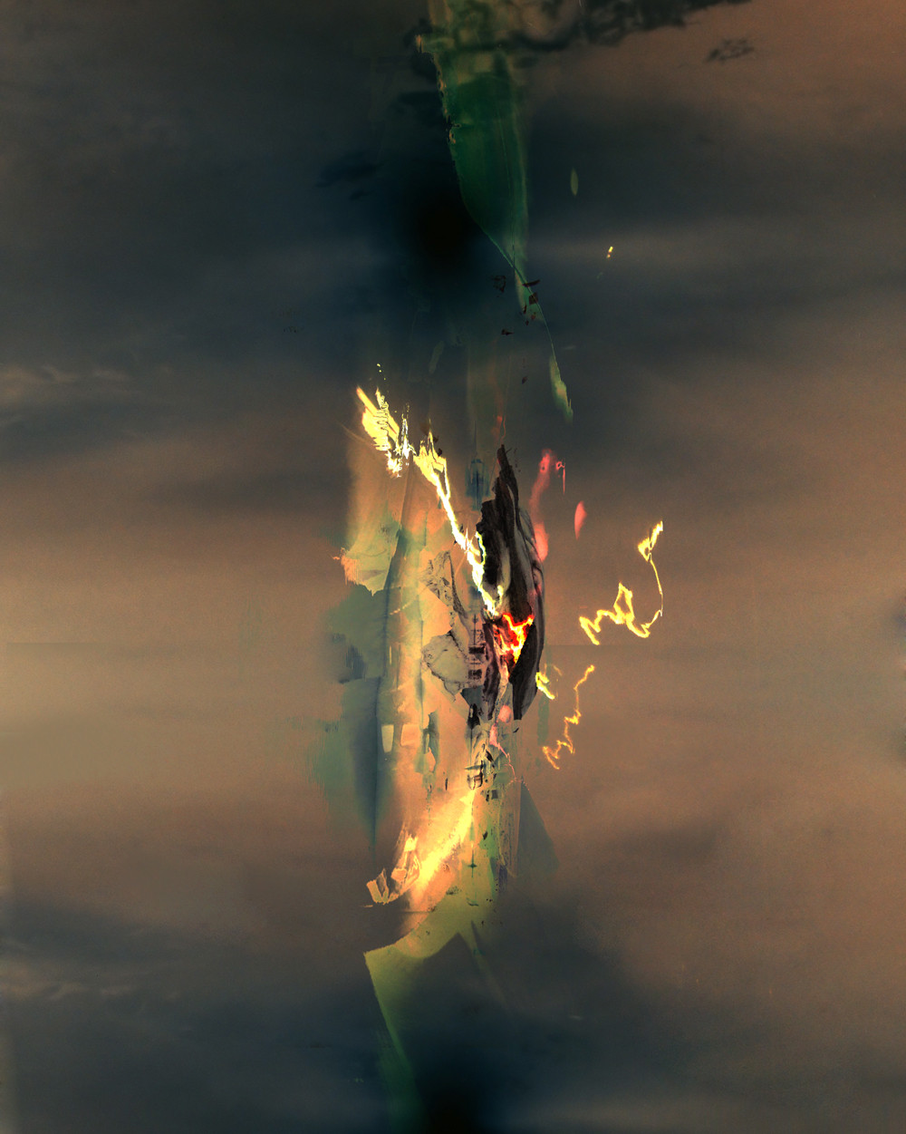
 shocks — De'struc'tion
Published: 2004-08-23 14:43:38 +0000 UTC; Views: 2048; Favourites: 30; Downloads: 610
Redirect to original
Description
\De*struc"tion\, n. [L. destructio: cf. F. destruction. See Destroy.] 1. The act of destroying; a tearing down; a bringing to naught; subversion; demolition; ruin; slaying; devastation.Related content


Comments: 47


this is wicked
ukitakumuki (sp?) + homeworld
nice work
i especially like the relaxed style of the 'fire' and burnination
👍: 0 ⏩: 0

Fucking. $$#()
Finally someone who shares a glimpse out of my own head.
👍: 0 ⏩: 0

"houston, we have a problem"
reminds me of the challenger explostion.
very nicely done. I wish this was a painting hanging on my wall.
👍: 0 ⏩: 1

Your creations are wonderful!!! have you use the photoshop? ow can i learn to make this creations?
i want one of yours avatars!!! ")
👍: 0 ⏩: 0


That is some trippy effect - kind of hypnotising. And thats coming from a guy who had a pair of bouncing boobs that bounced every second as his avatar at one point!!
👍: 0 ⏩: 1

lol, yes boobs are hypnotising, they can mislead you

👍: 0 ⏩: 1
shame i got it removed as my avatar - wasn't suitable apparently - even though i censored it!
👍: 0 ⏩: 1

this is really amazing. makes me want to start creating purley abstract digital pieces again.
👍: 0 ⏩: 0

reminds me of a ships mast , dont know why ... great use of negatives and tones
👍: 0 ⏩: 0

I have nothing to express the excitement I felt when I saw this.
👍: 0 ⏩: 1

very interesting.completely different style in my eyes.
i love it.
looks like a video capture from a scary movie..something creeping out of the sky..or something.
solid bro..keep em coming.
👍: 0 ⏩: 0


oh 
well,..beautiful picture!
👍: 0 ⏩: 0

 (Wink)")


its makes your stare at it, I love it lol. nice work, great colors
👍: 0 ⏩: 0

Beautiful composition of the main shapes. I really like the main
(center) part. The diversity of the colors in that section is
excellent. The background flows great too. all around it is really
nice.
👍: 0 ⏩: 0

I say shrink it down so it gains alittle more quality because right now it looks like a split second of a glitch in Twisted Metal, when you drive through a wall and loose all texture. So you're pretty much ripping off every PS1 game ever made.
👍: 0 ⏩: 1
lol, the original size of the file was 1600x2001 Pixels so i've already shrunk it as much as I could, but indeed it does look like i've ripped every PS1 game including Twisted Metal
👍: 0 ⏩: 1
Twisted Metal 1 and 2 were kind of shitty so I'd say you ripped off 3 or Black.
👍: 0 ⏩: 1

This is really nice work. I wish I could say more than that, but my brain is/has been fried.
👍: 0 ⏩: 1


Plane crashing landing landing we ask for your attention
do you stare at the sunset when your wings get clipped by a bullet ?
do you fasten your seat belt when there is no one around ?
We hijacked the monitors
Hear us stumble and roar
👍: 0 ⏩: 1
i only fasten my seat belt whenever i'm in the front
")
👍: 0 ⏩: 0

really cool.
liking the stark contrasts from the lights to the background and the colours of the lights, matter of a fact. Are they from a street scene? I think i can see reminiscents of a car and the cluster of houses and whatnot.
I commend you
👍: 0 ⏩: 1
yes they are lights from a street scene
👍: 0 ⏩: 0


I think it needs something more, maybe typography? i dont know, but nice design & composition indeed.
👍: 0 ⏩: 1
it's not a design therefore it doesn't need anything more, think of it more as an art piece
👍: 0 ⏩: 1
Then excuse me , i see all more as a graphic piece or design, cause its my everyday work, and i always try to mix typography and all this kind of things , you know what i mean. Btw as i said before good work.
👍: 0 ⏩: 1


Very interesting, i really like the abstract look
👍: 0 ⏩: 0


It looks like a plane craching down from the sky to me.  (Smile)")
👍: 0 ⏩: 0
