HOME | DD
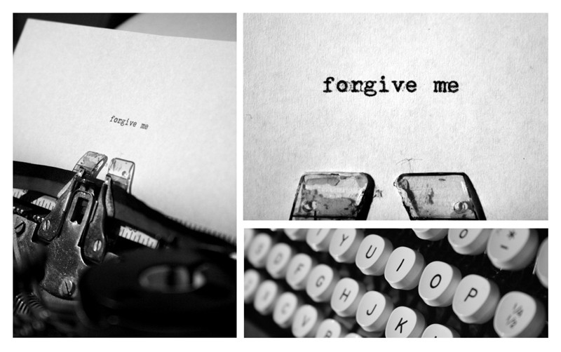
 shutterbug13 — forgive me
Published: 2006-12-31 20:08:11 +0000 UTC; Views: 3246; Favourites: 115; Downloads: 84
Redirect to original
Description
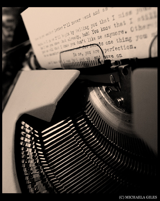
i really love how it came out.c&c would be loved
Related content


Comments: 48


beautiful. and the three images together really add to the composition.
👍: 0 ⏩: 1

Hi,
I'm featuring this deviation in my News Article.
The Article is names 'A Thousand Words' and you can see it HERE .
Thanks so much,
Tania.
👍: 0 ⏩: 0


i love how typewriting looks
so obviously i loveeeee this.
good idea.
👍: 0 ⏩: 1

wow thank you so much I am flattered
👍: 0 ⏩: 1

you're so truly welcome  (Smile)")

👍: 0 ⏩: 0
slightly delayed notice on a feature of this work 
👍: 0 ⏩: 0

WOW. I am pretty much speechless...yet here are some thoughts I still have
This picture is absolutely amazing. Its just perfect and I am so happy I stumbled across it. Thank you for sharing this piece of art with all of us
👍: 0 ⏩: 1

BEAUTIFUL
I love this so much!
It's so meaningful...
Great job
👍: 0 ⏩: 1
thank you
i'm glad you think so
👍: 0 ⏩: 0


a simple message -- always at hand -- like the way you presented the photos -- later days
👍: 0 ⏩: 0


I does look great. Excellent overall composition and good use of small depth of field.
👍: 0 ⏩: 1

 (Wink)")

great association of the images and great choice of colour.. what could i say more?.. i like it so much.. and the focus on the keys is awesome..
👍: 0 ⏩: 1


I love hits. What a unique conceptual structure. Definitely not soemthing I could have come up with... It's also a splendid use of B&W, too...
Excellent!
Bear
👍: 0 ⏩: 1

Love it doll. I really like the shot on the left and the shot on the top
👍: 0 ⏩: 1

the collection of the three photos is really neat but i think i like the one on the left best.
👍: 0 ⏩: 1
yes me as well, but i thought all of them together was a little more interesting
👍: 0 ⏩: 0

WOW. 


👍: 0 ⏩: 1
thank you
that means a lot
👍: 0 ⏩: 0

that's very awesome! is it a really really old typewriter?
👍: 0 ⏩: 1

wow, a real typewriter!
very cool idea, you're awesome
👍: 0 ⏩: 1


I collect typewriters... now praytell, what make is it? Is there a model number? Do you know the year in which it was manufactured?
👍: 0 ⏩: 1
lol i couldn't tell you off hand
👍: 0 ⏩: 0