HOME | DD
 SimbaGirl — HELP web layout
Published: 2009-03-17 15:42:42 +0000 UTC; Views: 1349; Favourites: 31; Downloads: 21
Redirect to original
Description
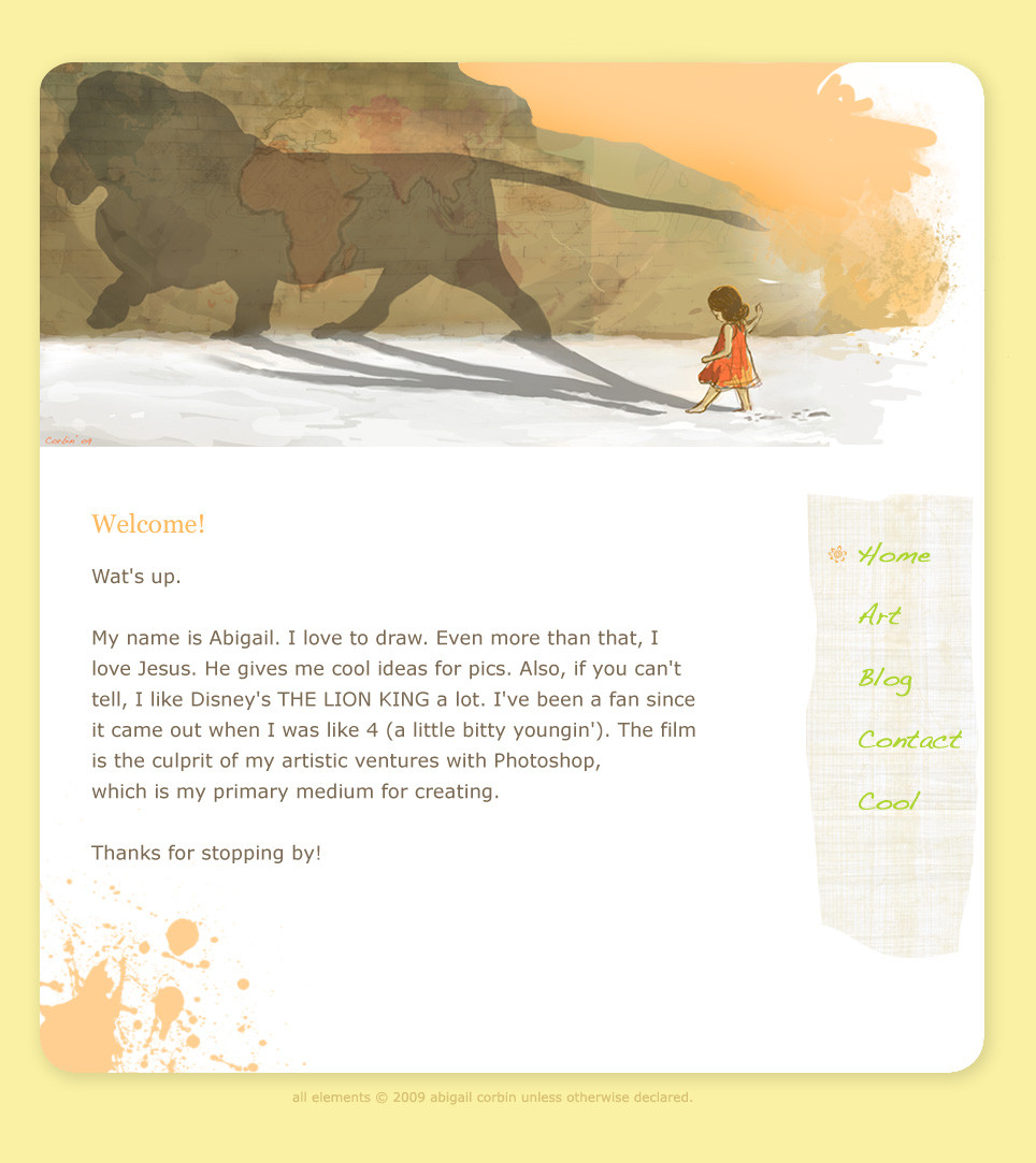
EDIT...Thanks everyone for your help! (Smile)") I was so happy this many people took time to give their input, and I think I made some good changes. I made the bg color a warm yellow/orange and darkened the main text, and bolded the menu stuff, along with a few other little touches.
I was so happy this many people took time to give their input, and I think I made some good changes. I made the bg color a warm yellow/orange and darkened the main text, and bolded the menu stuff, along with a few other little touches.I think it's coming together well! I'll want to trade for some coding to get this thing live, but more on that later.
 (Wink)")
...
I want to make a simple layout like this one. But are the colors good? It's very white. :9
I know sometimes it's easier to view darker themes. I can't decide if I want something clean and bright like this, or more dark...
What do you prefer to see in a page (keep in mind its primary function is to view artwork)?
Related content


Comments: 28


To be honest, I liked the original colours a lot, but this is probably better due to the easier readability.
One thing though: I think the main text is a bit too big, change it down at least 2-3 sizes. Also, after "Thanks for stopping by", you should add a signature or a small drawing of Joy.
Overall very nicely done. And the drawing fits wonderfully as banner for the site.
👍: 0 ⏩: 1

Well this way my grandparents can read it.
I like the sig idea! ")

👍: 0 ⏩: 0


I like the colours and the feel of it as it is now. I would recommend using some text in the top left somewhere to indicate what website this is. You know, the logo type thing. Good luck with it.
👍: 0 ⏩: 1
Oh ok! I actually had some up there but I took it down. 
👍: 0 ⏩: 0

So glad to see something happening with this image, I am still moved every time I see it.
The layout looks wonderful as well
👍: 0 ⏩: 0

I think that the colour scheme is very nicely done, the toolbar has a nice texture to it and it has an interesting look. But I do agree with several others that the main text should be a shade or two lighter. Maybe a shade of brown, to correspond with the lion?
But otherwise it looks absolutley lovely. I adore the banner, it's such a nice picture. Very well done.
👍: 0 ⏩: 0

If you don't mind my giving some suggestions: First of all, I believe many have said this already but, the text should be a few shades darker, especially the grays and greens. Also I really like the font you used for the main body, but the one off to the corner in green is kinda hard to read considering it is thin and against a textured background.
The white background could be perhaps an off white or creamy tone so it's not so stark and could complement more your overall design, which is fabulous I must say. My favorite element is that warm orange you have going on there.
I would however, play more with this orange color and show us a few different shades of it throughout. I feel that the ink splotch and textured corner are a bit on the light side but if you were to pick some oranges from your main picture I think the whole thing would look more lively and intriguing.
Congrats though on a really soft and elegant design, I am amazed! ^_^
👍: 0 ⏩: 0

Looks good
I'm thinking that maybe a creamier colored background and darker text would not cause so much eye strain.
I've heard that dark backgrounds with lighter text is harder to view than plain black text on white :/
👍: 0 ⏩: 0

that's awesome. A lot of my drawrings are Jesus inspired too C:
👍: 0 ⏩: 0

I'd have to disagree on the orange text looking odd. It matches well with the image/banner you have at the top. I also think the white-washed colors match with it, too. I think even with the text being light, it looks fine the way it is but if you're going to make it darker, perhaps tone it to a similar gray of that of the little girl's shadows on the snow...? Aside from that, I think it looks great!
And may I say, the idea for the lion in her shadow is an awesome concept!
I'm sorry if I haven't been around lately, nor commenting for that matter. I haven't been doing the latter because I had no idea you switched back to this account & started uploading again! (I had the 'Show Deviation' option switched off for this account, thinking you were only going to upload at your aCorbin one.) I must have missed the memo where you said you were sticking to this one again.

👍: 0 ⏩: 1
Thank you!
Yeah, haha, I decided to give in to my sentimental side and keep ol' SG. I'm ok with it. And if people think I'm a fangirl, they're RIGHT.

👍: 0 ⏩: 1
Yeah, but since you switched back to this account, I missed out on all of your uploads!
*SAD FACE*
But at least I know now so I can resume watching!
👍: 0 ⏩: 1
")
At least you know now. ^^ And hey, speaking of uploading...how about some Azian art, huh??
👍: 0 ⏩: 1
I have you watched again now, so it's all good! X)
And I KNOW... I haven't done anything major, art-wise, in a long time. Maybe I'll post up some of the better pictures I took when I was in Italy. Most of my 'art' these days are mindless sketches that I post in my LJ. At least one of us is still artistically active, though!
👍: 0 ⏩: 1
Mindless sketches are good.
👍: 0 ⏩: 0

I'm in love with the header! The colors flow well, and the navigation bar is simple and easy on the eyes. Maybe the text just a tad darker? But other then that, I love it!
👍: 0 ⏩: 0

Tone the colors down about 2-3x I'd say. Possibly might want to box some text as to direct the eyes.
Oh annd I like it very much so far
👍: 0 ⏩: 1
And what I ean by "the colors" is the text and maybe the side column.
👍: 0 ⏩: 0


ooooh
gosh i love simple designs but can't make anything for me agh!!
this is amasing!!!
colours are perfect
but i think maybe the hole text about you make a little darker?
but even now it's coool!!!!
👍: 0 ⏩: 0

very very beautiful.
I had a look at it from the distance, right now to me (personally) it seems, as if the orange tone on the right is a bit out of place, to bright, you kind of dont know what its there for. If you leave it I'd say make snow and background blend more, like the orange surface blends into the white.
As for the white, it does not bother at all, in fact its lovely. If you are not sure I'd say give it different color tries, perhaps play with it in photoshop? I've found that random replacements of color shades sometimes can be best solutions.
hope this helps.
I really really love the theme of it.
Perhaps lighten the lines of africa a tiny bit or make them blend more? May be just me but to me it took me a bit to long to find the landscape in it, because I could not figure the top part (with it being open). Dah, but thats just me. But still, really love it. Ok, I'll shut up
👍: 0 ⏩: 1
Thank you! Yes, I want to make the Africa outline lighter, which I'll need to do for the actual pic itself. I didn't mean for that to be so bold, the whole map was supposed to look that way. I just got tired of outlining and stopped. xD
👍: 0 ⏩: 0

I think it's great. It may be white but it doesn't have that freaky contrast that some pages have. So, in my opinion, this kind of colour scheme is really great!
👍: 0 ⏩: 0

In my observation, white is usually the best way to go, it keeps everything else clean.
👍: 0 ⏩: 0

i LOVE the white and the shadow thing. C: and the paint spoltch at the bottom. and the color scheme. leave it the way it is. c;
👍: 0 ⏩: 0

i very much like it ^^ i might make the text a little darker, though, so that it's easier to read. but overall it looks very professional and well-thought out
👍: 0 ⏩: 0