HOME | DD
 simlai — ..on the rooftops
Published: 2005-12-23 03:30:30 +0000 UTC; Views: 219; Favourites: 9; Downloads: 15
Redirect to original
Description
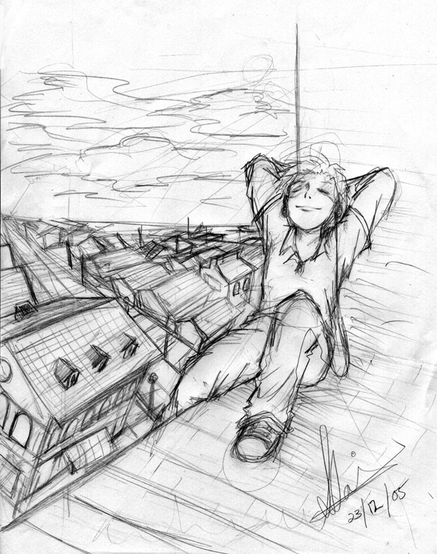
This sketch was very spur of the moment it's still really messy atm, but i'll probably cg it.
well, umm, i need any crits you guys can give me about the perspective or details before i decide to cg it,
so any advice would be helpful!
Related content


Comments: 6

")


HIYA sim!
nice pic!! umm... advice? me? to you? hell no...i'm just gonna say that i can't wait for the cg to come out! I like how relaxed he looks! It's very laid back and i like it!! hehe^^
*poke*!!
👍: 0 ⏩: 1

i'm glad to see you're making use of your time there in hong kong ^^
👍: 0 ⏩: 0

There doesn't seem to be anything glaringly wrong with it...however, here are a few things I thought up:
1) Some of the houses (such as the largest one in the foreground) look a bit off-kilter and of the wrong size/direction. I think that's because the perspective of the houses aren't consistent enough (probably just because it's sketchy, nothing serious). The large house, however, doesn't fit in with the other houses, and looks like it has been tilted around, and not part of the row going towards the left vanishing point.
2) The house in the foreground has a tilt that seems strange considering the relatively normal point of view, and because that none of the other houses are aligned that way.
3) On the opposite end of the street from the large house, the vertical lines on the wall aren't parallel to the sides of the "large house", when it seems like they should be.
So anyway, I think it's pretty much just the house in the foreground that looks dodgy, nothing more. The guy's pose is very well drawn, and so is the expression.
Anyway, great concept, and I hope you get around to coloring this! XD
 (Smile)")
👍: 0 ⏩: 1
thanks, i needed some confirmation about the perspective.
Your gallery is pretty awesome!
👍: 0 ⏩: 0