HOME | DD
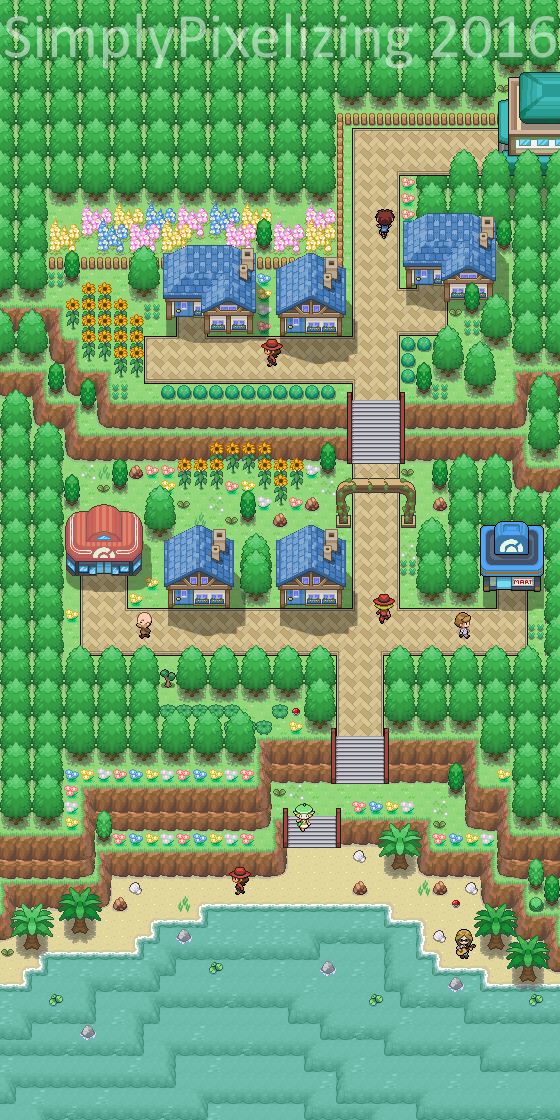
 SimplyPixelizing — Humhill Town

Published: 2016-07-25 16:16:42 +0000 UTC; Views: 829; Favourites: 26; Downloads: 15
Redirect to original
Description
Just a little town map I made. Still trying to find some sort of "style". Used some more tiles in this one. I'm pretty happy with the outcome! Tried something different with the trees. It was really time consuming, but it looks really neat, though I'm not sure if I'll continue to do it.Anyways, I haven't felt like spriting lately.


 But I'm having a lot of fun with maps so I'm going to continue uploading those, then I'll probably do a mix when I start making some more things.
-------------------------------------
Tiles can be by any of the following artists :
Kyle-Dove
SailorVicious
WesleyFG
Iametrine
Zetavares852
XDinky
Newtiteuf
Alucus
Erma96
Hydrargirium
Poison-Master
Thedeadheroalistair
Shutwig
Asdsimone
Xxdevil
Steinnaples
Hek-el-grande
sylver1984
NikNak93
Cuddlesthefatcat
Magiscarf
Gigatom
The-Red-eX
ChaoticCherryCake
Evolina
Sora-96
TyranitarDark
Gallanty
BoomXBig
Ultimosprite
ThatsSoWitty
Sagaxxy
EpicDay
Thunderdove
Special thanks to Phyromatical & ChaoticCherryCake for putting together the tilesets I use!
-------------------------------------
Thanks for checking out my art!
Related content
Comments: 14

Is this only the second map you've made? It's actually really good. You've got a good mix of tiles going on, and you've used fences, bushes, flowers and so on well to separate out the areas and keep it all looking interesting. I like the top and middle areas of the map the most, and there isn't much there you could improve mapping wise.
The beach area is also nice, but I think it'd be a bit better if it was a couple of tiles taller. Right now you wouldn't be able to walk along it with that person in the way. The sea itself is nice, it's always cool to see transparent water tiles, but I think it would be even better if you added some detail under the water such as coral and seaweed. The sea also looks a little green to me, but that's just personal preference.
Re the style you've used, it all goes together pretty well apart from the buildings. The houses, Poké centre/mart and gatehouse are all in slightly different styles. I think the houses match the rest of the tiles the best, so if you changed the outlines of the other buildings to match those they'd fit in more. I also agree with what Midnitez said about the size of the doors. On the centre and mart they're too small for the people to fit through. If you made the proportions of those about 10% larger this would be fixed.
But overall really good. It's rare to see someone come out from the start with good mapping skills, so good job, and make sure to keep it up. I'll look forward to seeing more in the future.
👍: 0 ⏩: 1

Thank you for the critique! Very much appreciated.
Yes, this is the 2nd Pokemon styled map I've made. I've attempted in the past but was never satisfied. I've made maps in the past, but have since taken them down since I didn't really like them much.
Most of the issues you mentioned mainly come from not having my own personal structure tileset to fit a Gen 5 mix style. I'm currently in the process of making a compilation tileset a la Pyromatical's Taragonia Mix (but for buildings) to use for my maps, because I'd love to put something together to use.
Also, starting to use Tiled over RMXP helped boatloads. I must say that it definitely helped to elevate my art.
👍: 0 ⏩: 1

No problem!
Well you definitely seem to have a knack for it. This looks like it's more on the level of someone who's been mapping for a couple of years already.
That's a good plan. Putting them all together will allow you to create your own style to work off.
So many people use RMXP but don't realise how much it's holding them back. I used it for years and then just recently switched over to PhotoShop and it's become so much easier to make maps and opened up a whole load of other possibilities.
👍: 0 ⏩: 0

O 0 O What program did you use?! Is there a version for mac cause I have always wanted to make stuff like this! QuQ
👍: 0 ⏩: 1

Tiled!
thorbjorn.itch.io/tiled
👍: 0 ⏩: 1

Besides the obvious issue of sprite size, it looks very nice!
👍: 0 ⏩: 1

The trainer sprites?
👍: 0 ⏩: 1

Yeah, how the fact that they aren't the correct size for the buildings.
👍: 0 ⏩: 1

I think it's an issue with the tiles, not necessarily anything on my end. It's really just for ambiance over function. However, I'll try using DPPt next time to see if that makes a difference.
👍: 0 ⏩: 1

Yeah, the doors are for maybe gen3 or gen4 so your people sprites as I'm sure you can see are too big.
👍: 0 ⏩: 0

2 hours on Thursday, then I did the second half yesterday, which took about 2 hours, then I did the tress for an hour right before I posted.
👍: 0 ⏩: 0


