HOME | DD
 sinan — Teckolate
Published: 2005-06-25 20:15:51 +0000 UTC; Views: 1563; Favourites: 6; Downloads: 409
Redirect to original
Description
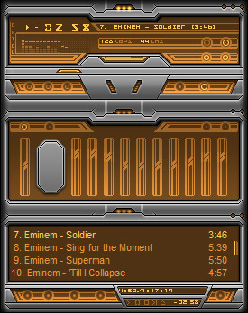
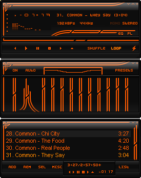
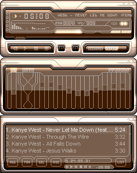
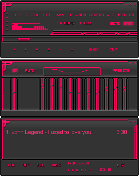
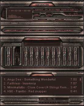
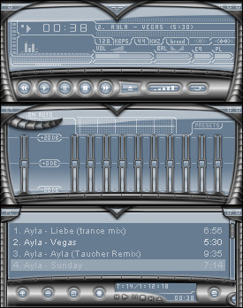
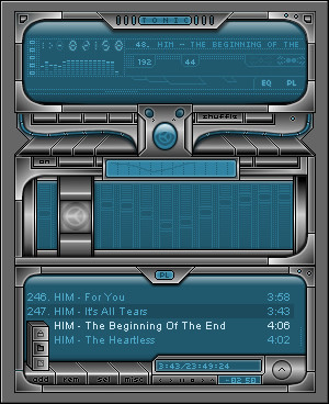
A dirty silver and chocalate brown skin.100% Photoshop as always
I've been working on this on and off for ages, and I really like some elements of it. I know some of the buttons are missing. This is a form over function skin, hence why none of the buttons are labelled. So dont bitch.
I may do some colourthemes later on.
Download and Comment. Fav it if ya like it. Tell me what you think
Related content


Comments: 19


Thanks  (Smile)")
👍: 0 ⏩: 0

Thanks
👍: 0 ⏩: 0

Actually this one is really nice ")
that's all for now...

👍: 0 ⏩: 0


Using it...
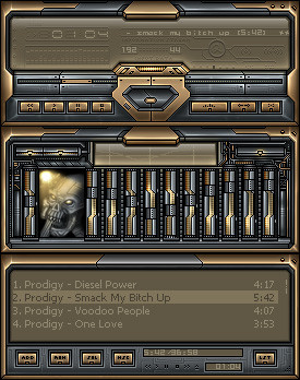
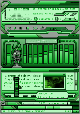
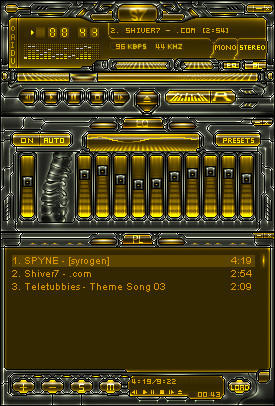
Good skin m8,yes it has some nice elements,colorsheme++
Could really be an awesome skin with more work.
👍: 0 ⏩: 2

Thank you for the comment
👍: 0 ⏩: 1
hum...i suck at commenting and you do skins better than me but let me try:
If you could do what HH said abt darker areas combined with some little highlights here and there,that will make the metal more realistic.
[black gradients with lower opacity ?,then using burn and dodge tool]
Doing this will also help you to add more volume to the shapes.
there is also some useless black lines,you could try to remove them and make more connections instead of separations between the shapes (on the main).
[smudge tool]
The three little balls on the titlebars use nice glow,you could put more of this glow on other parts.
And off course you should try to make the vertical rectangle on the eq,more detailled,something unique and eyecandy (some inner 3d or an orb or whatever...)
That's all think for now,hope it helps.
👍: 0 ⏩: 0

very nice work
couple of tips - i would make it so you can see the screen glow onto the metal, and also add some more darker areas to make the skin more defined
👍: 0 ⏩: 0

awesome use of color and design, what i don't like much is that gray block in the "equalizer" (i'm guessing ")
👍: 0 ⏩: 0

")
👍: 0 ⏩: 0

very clean and crisp.....and being as ive used winamp so long i dont mind the lack of labels...works for me. but yes, i would have to ask for some color variances, as this one is pleasant, but it would be uber groovy to have more to choose from. and being the type of skin it is, it could be matched to many a different color scheme. rock on fella

👍: 0 ⏩: 0


oh, and its ALMOST AS HUMPABLE AS YOU! (sorry to leave that on your comments)
👍: 0 ⏩: 0