HOME | DD
 SiZNArt — :: Alice in Tokyo Wonderland ::
Published: 2013-05-31 23:17:41 +0000 UTC; Views: 9068; Favourites: 353; Downloads: 298
Redirect to original
Description
Commissions OpenMy gallery
Need Watchers?
My Facebook fanpage
My Tumblr
Other works,
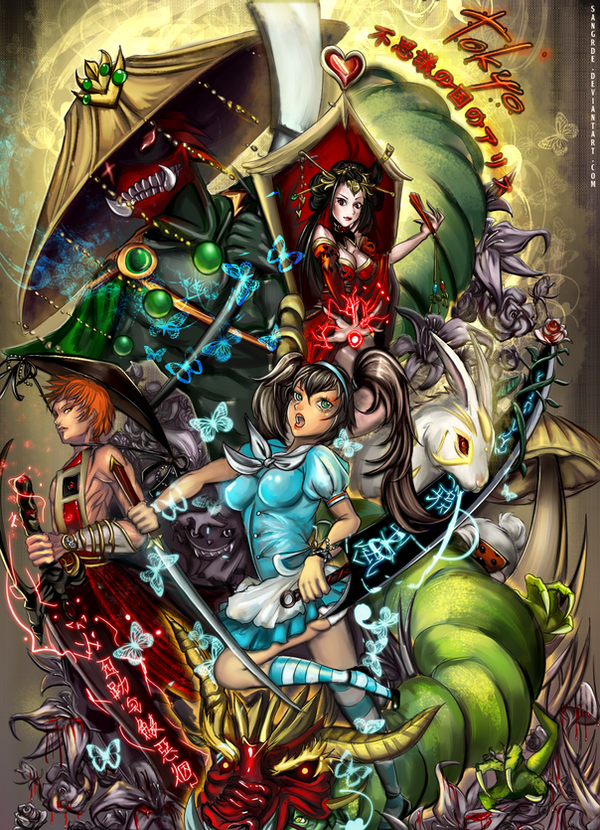
Contest entry for *PresidentNelson 's contest=his video game Alice in Tokyo wonderland fanart
I really love Alice in Wonderland, i guess oriental version of Alice in Wonderland would be something interesting to see right? I gotta love those characters ... Dragon masked SEXYcatapillar and red queen and the knight..cute bunny..etc.
I enjoyed working on this concept ,,but i wasn't sure if i could finish this in this year xD ; i'm glad i'm finally done. It took me around +50 hours. I was drawing this on Join.me so you might notice this drawing
")
and I hid the cheshire cat behind the background.. Go find it xD
[Around 200 layers (50 of them took for the sketch o_O
 (Wink)")
Sai for 90% of the painting, effects on
Download for the full details > ㅂ < ; !! ]
Related content


Comments: 79

thanks for the fair and detailed critique, pretty sure it will be helpful in my future works ^.^!
👍: 0 ⏩: 0

Overall

Vision
Originality
Technique

I really like this painting. The colour palette, composition and lots of details are so much Alice in Woderland and so asian at the same time. It's interesting that you combined elements of modern and traditional oriental culture (pantsu detected : D). And this is one of few pictures where writing actually looks good. I also really like those shining butterflies.
You did quite good job with anatomy, I don't see major mistakes with proportions, but Alice's legs are a bit strange. They look too short and even if you wanted to draw a short girl, they become thinner at the bottom and that's definitely weird. Especially the completely visible foot, it really should have been bigger. Also Alice's breasts look unrealistic: They're too big for a little girl and they shouldn't have had such a clear shape, since she's neither naked nor wearing a swimsuit - they should have been covered and not, um, divided. And I don't see where the light comes from, but I'm not sure whether it's a mistake or just lighting is too complicated and some objects are just glowing.
But overall, this artwork is still very good, and I'd say your way of interpretation eastern Alice is quite creative C:
👍: 0 ⏩: 1
thanks for the great words c: ! yea I fixed the legs a bit after your critique c: I still think the legs are still awkward, but I will try to redraw it after some time later ..maybe next year --when I get better ahaha
Oh and I was kinda trying Kim HyeongTae stylized anatomy there [link] as someone pointed out the picture itself looks like his style, yea I know the anatomy is overly exacggrated x)
I noticed the light source is not certain..but as you see every character has different perspective and angle so i decided the light source won't really matter whereas the perspective is all different..
My first attempt drawing is many character.. x_x I will try to draw more focused drawing next time, and thank you for the critique! I will ref your critique for the next time I draw complicated pictures with multiple characters ^-^ 
👍: 0 ⏩: 0


Love this! the concept is freaking awesome and the execution is killer! I want to see this movie!
👍: 0 ⏩: 1


I have included this wonderful artwork in the new feature for July 2013 on the front of the journal. Please 
👍: 0 ⏩: 0

wow this reminds me of Alice Madness Returns :3
👍: 0 ⏩: 0

Comment on behalf of #ProjectComment
Firstly i really like the idea and the colours. The colours may be a bit out of harmony but they make the drawing very colourful and eye-catching. I think you might want to try working with less colours but with more contrast.
For me it looks like some kind of card and has definitely something unique, especially since i like those kind of works where you squish many characters into one work. I would only add that perhaps you added too many things and there is a "line" missing in the work,something that would connect all the little pieces together and create a shape or symmetry but it also makes the work very interesting to look at of course.
I do like the idea of this work since it reminds me on the film Sucker punch. The whole Alice with a sword idea just reminds me on her, i believe there is a whole bunch of Alice with a sword drawings and perhaps even a story or something but i cannot think on anyone else but on that girl xD
I believe you made a great job with the colouring of the cloths and with the shading/painting of the skin. I cannot say much about it since i am more an anime artist than a painting semi-realistic artist but from my perspective the colouring part looks very good. I would suggest trying to use a bit less grayish colours and perhaps the shadows are a bit too hard. The front alice girls skin is very dark around the linearty,but i do realize most painters have a gray tone. However since this might be a style i don't think it is really to be called a mistake anyway.
In my opinion you have a great talent but you should really work on anatomy. Many things are quite off in this work.
The queens hands,but don't worry we all know hands are terrible hard. The soldiers hand is too big compared to his body,also his muscles look a bit wrong,however i am not experienced with drawing males so it just might look odd to me.
There are many mistakes on the alice girl, which stand out even more because she is in the front and so i believe improving anatomy with some practise would make your works really awesome. What i mean is that her body looks twisted. Her breasts are standing out too much,they seem to be too round like her outfit would is made out of armor and not cloth,her right arm looks painfully turned too,if you would try to turn around like this it wouldn't work and her butt line is way too low. I know you wanted to make it look sexy but it should be higher up. Also her legs are very thin and her feet are odd, but i think the feet are some type of style to some artists and so you can probably leave them.
I do love all the items,the flowers and the sword and the butterflies. They are coloured extremely well and some of them fit greatly in the work,while like mentioned i miss the connection. You got me with the cute bunny and the shiny butterflies i love shiny things.
The work is as said very good and you do have a great talent. If you keep practising and drawing you will get even better and i really suggest working on anatomy. It would be good to use references sometimes or to try drawing bodies in different perspectives and positions. I am practising on this atm too. You already got a great colouring and with a better anatomy your works would be greatly improved.
I hope my critique was helpful just keep drawing and practising ~
👍: 0 ⏩: 0

Hey dear, I'm here on behalf of !  (Smile)")
However, please consider the fact that adding very many details can also harm your picture by distracting your audience too much and making your centre piece of the painting (in this case Alice), drown in the scenery. It's not easy to dose the amount of elements in your composition, I know, I tend to do the opposite and draw too few details, so I know the feeling. But I'm sure you'll find the right balance very soon - just have confidence in your beautiful central character, don't hide her too much by including an ocean of tiny little elements around her!
But all in all great work, you are a very talented artist indeed!
👍: 0 ⏩: 0

An interesting concept. I'm not too keen on Alice's expression - it makes her look like a sex doll - and did I have the skill to draw something like this I'd have made the Cheshire Cat a grinning flamboyant crossdresser. But! It is well drawn; love the Red Queen and the overall style of the piece. Pretty cool.
👍: 0 ⏩: 0

Putting too many characters in one single illustration can be pretty intimidating, but i think you managed to fit everyone nicely. The picture is dymanic and full of energy. Now, i think there are a few things you could improve to make your work even more dynamic.
First of all, it seems like the characters have their own perspective, like we see everyone up front. Now imagine looking someone standing much higher and further than you, you'll see that the figure would look disorted. This could be applied to the hatter and the queen like if their 'lines of action' met at your focal point, in this case the girl. You managed that with the guy on the left, and it would be interesting to see the same for the rest of the characters, especially with the hatter who is such a big character in size.
Secondly, as far as lighting is concerned, you did a solid job shading every character and all their details. But what i think is missing is unity. This could be achieved if you put a pale gradient on overlay or soft light in photoshop (in general play with the layer setting you can have some really interesting and unexpected results). Furthermore, it is important to keep in mind the overall composition and how you want to lead the watcher's eye through the picture. For example, the girl could be ligther than the rest, leading the eye gradually to the top, the main lightsource.
Overall it is an awesome artwork. And again, i know how hard it is to put that many characters in a single image. I hope this helped you and good luck with your future illiustraiotions !

👍: 0 ⏩: 0

i really like the concept and how you conveyed it!
👍: 0 ⏩: 0

For
Warning! I may be frank so please don't take this personally.
I watch you, I believe, and you always produce such wonderfully detailed works, whether traditional or digital. I have to say you are very skilled when it comes to color choices, shading and making the most of whatever digital drawing program you use. Everyone who have previously commented here, I will agree with in terms of the praise your works are worthy of
Some of the things I found that bother me about this work is the foot and the hands of the girl in blue and the hands of the boy and the girl in red. Her foot is too stylized in my opinion (rather, the style it's in doesn't match how the rest of the girl was drawn). Her hands have awkward shading that looks as though her metacarpals bend the wrong way or something (sorry, it just doesn't look natural :/). The boy in red has this same problem. As for the girl in red, her hands look so unnatural. With the hand that's splayed out, I can't tell which is her pinky finger and which is her thumb, not to mention it looks a bit impossible to do with your own hand. With the hand holding the fan, it looks flat and I almost thought she was missing a finger.
You give great attention to the details of all the other aspects of the work so I'm quite sure you're capable of giving just as much attention to these little details as well.
Good luck on your future endeavors!


👍: 0 ⏩: 0

Hi dear,
I'm from !
I have to say that this is one of the nicest digital drawings I have seen recently!
I love the vibrant colors and the composition that looks varied, and very well organised. Every part cannot be "cut out" of the picture but they are all perfectly distinguishable. It's not easy to create such an effect!
I just have to little "critiques":
The first concerns the girl in blue. It was amazingly drawn but I think that her foot looks too long..
While the second one concerns the boy on the left. I think there's something strange in the shadowing of his face.. It looks like it is divided into two sides, a light one and a dark one. I don't know wheter it was made on purpose or not
This is definitely a deviation worth faving!
Good job my friend

👍: 0 ⏩: 1
thanks! i like how it looks not so -cut out- because I failed the last time x0
for the critique -- yea i was thinking i see something odd on her feet, changed her legs bit. and the boy's face -- i meant the other side to be darker since his face is like turned off the one side but fixed the skin bit. Thanks for the helpful critique
👍: 0 ⏩: 1
I'm glad you found it helpful
Have a lovely week my dear ^^
👍: 0 ⏩: 0


thanks ~ well I do like HyungTae Kim's style to be honest ^ㅂ^/// you are the second person told me that ahha i might get influenced although my original style is semi-realism than anime xD
👍: 0 ⏩: 0


You are welcome! Have a great night!
👍: 0 ⏩: 0


you are so creative so skilled and so kind!!!
👍: 0 ⏩: 1
👍: 0 ⏩: 1


| Next =>