HOME | DD
 SiZNArt — :: Progress steps of Painting Phoenix ::
#progress #progressshots #artsteps #progresswip #paintingsteps #progresssteps
Published: 2015-07-13 02:11:00 +0000 UTC; Views: 14543; Favourites: 607; Downloads: 391
Redirect to original
Description
Commission info! Need Watchers?Instagram Facebook page Tumblr Twitter Q & A
'
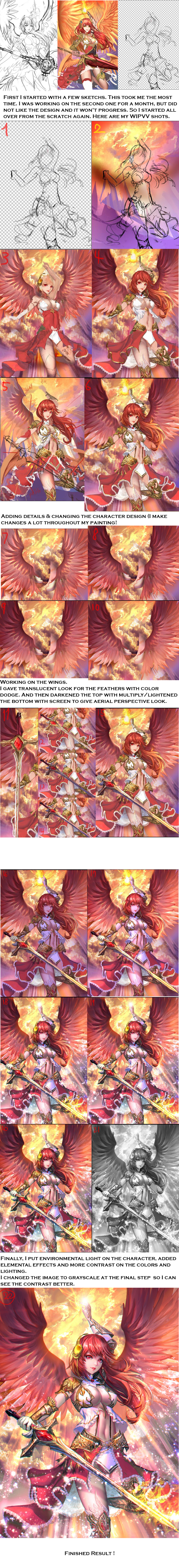
Not exactly a How-to but I tried to my work in progress as detailed as possible @_@
If you have a question, just comment and I'll reply.
full picture here :: Rise of Phoenix ::
Related content


Comments: 33

Makes me want to draw something and get better right now!
👍: 0 ⏩: 0

This is just wonderful, I can't even find right words to describe it! I can feel how fast my heart is pounding when I look at this! This is amazing, wonderful, georgeus, marvelous! I just love it love it so much!!! The second version is just perfect, the light and everything.....I'm crying, too beautiful!
👍: 0 ⏩: 0

Process steps are always impressive  (Wink)")
👍: 0 ⏩: 0

I am so blown away right now is this real life...Thank you for letting me sit next to you in class LOL.
👍: 0 ⏩: 1

lol your style is rlly nice btw seeing your gallery you kinda have similar taste as mine xD
👍: 0 ⏩: 0


i love seeing the processes of awesome artists like you  (Smile)")
👍: 0 ⏩: 0

You're getting better and better every day! I'm actually happy to have witnessed you growing and still grow more. Even as I look at this, however, I still see some couple little things you still need to work on a little bit.
Think of the light source when you start working on the painting, before you start shading. The light sources seem to be above her head and on her sword. Yet, all the shadows make it seem that the light is coming from the left of her, from the front. The left hand is a little bit awkward, looking like it's meant to be going in front of the girl, but painted like it's just going down, but a little shorter. Here, I would advise to use references of people who's hands are in front of them (Photo references are best). Also, think of secondary light. The light would most likely bounce off of her hair, onto her right hand, kind of making the shadow be somewhat red. Same thing with the rest of her clothing and so on. Think of the color of the light source and think of every object that has been illuminated as another light source. However, every new illuminated object wouldn't be illuminated as bright as the light source is. I'm not that good at explaining light sources, you might want to look up a tutorial on that.
The yellow thing on her head (headphones?) would most likely also reflect some of the yellow onto her hair.
I would also advise thinking of the focal point of the painting before you start laying down the details. One way of pointing the viewer to the focal point, or making it known is putting more attention in detail to that spot. The rest of the painting could literally just be blurry, but I see that's not your style. Whatever you took the most time to work on will be the most noticeable part.
I'm actually quite glad that you're paying attention to the gray scale as that does help a lot, but I think you might want to consider adding more darker tones in this painting to increase the juxtaposition (which would make the painting more interesting). The wings are the darkest point in the painting, placed right against the bright background, making it the focal point (or so I think) of the painting.
I also think it would be interesting to experiment of the point of view of the character, as most of your paintings are head on, a little from the side. Same with the positions, as there isn't much variety there (I'm guilty of the same pleasure).
I really think juxtaposition of dark and light would help you a lot in your paintings.
All in all, I think this really looks great. The focal point of the wings makes me look at the face of the character, which I consider the most important part of this painting. I really love the fact you don't shade with black, but choose a color to go with and play with that. Also love your attention to detail.
You've really grown!
👍: 0 ⏩: 0


I love that you did a little I guess play by play. A lot of these step by step WIPs are cool to see but if you're trying to learn something (which every artist should be) then information is always good. Lovely finished product as well!
👍: 0 ⏩: 0

AH!!!!!!!! have u ever thought of making a speedpaint?
i wanna color as good as you! BRUH!!! XD im coming over to your dorm and gonna watch u draw! while eating sweets with you.
👍: 0 ⏩: 1
I'll make it sometime~~ ouo
Oh are you going to ASU? not sure if you mentioned it o.O~~which major?
👍: 0 ⏩: 1
i am picking between ASU or U of A! probably an art major with something else as a back up
👍: 0 ⏩: 1
ASU >>>>>>>>>>>>>>>>>>UoA
ANYHOW
you are graduating in this year or next year?
👍: 0 ⏩: 1

Really interesting to see the process of this beautiful painting. Thank you for sharing!!
👍: 0 ⏩: 0


please don't take offense but this picture is far more beautiful without the RGB splitting in my opinion
👍: 0 ⏩: 1

I can only concur. It makes the entire image seem busy and makes it very hard to focus on details, or indeed any part of the image.
👍: 0 ⏩: 0


Thank you for sharing, it's great to see your progress!
👍: 0 ⏩: 0


Very well done! This is very educational also!
👍: 0 ⏩: 0

Oh, nice. I like how you described your step by step. It helps me understand it better.
I also like the way it turned out.
Thank you for sharing!
")
👍: 0 ⏩: 0

While I really like like the final picture, I absolutely cannot agree with the chroma bleeding (chroma plane shift?) that was added between step 17 and 18. It makes it really hard for the eyes to focus on fine details, for example the seam of the dress, large parts of the sword, her eyes and all parts of her armor with fine lines.
I do not know why so many artists recently insist on using this effect, but in my opinion it really degrades the image quality, like a badly calibrated CRT screen.
👍: 0 ⏩: 0


I tried photoshop's free trial, i really need someone to teach me hands on, i used only manga studio for the coloring but photoshop looks better. But as always good work
👍: 0 ⏩: 0

Gorgeous work! What program do you use, and how long did this (excluding sketch) take you?
👍: 0 ⏩: 1
i use adobe photoshop cc,
and it took me a couple weeks to do the sketch and rough coloring (the second pic), but then i didn't like how it came out and i started over, and it took me 3 days to finish including the sketch and coloring.
👍: 0 ⏩: 0