HOME | DD
 skullmage550 — Hatching and Cross-Hatching
Published: 2007-11-03 14:33:16 +0000 UTC; Views: 3113; Favourites: 8; Downloads: 0
Redirect to original
Description
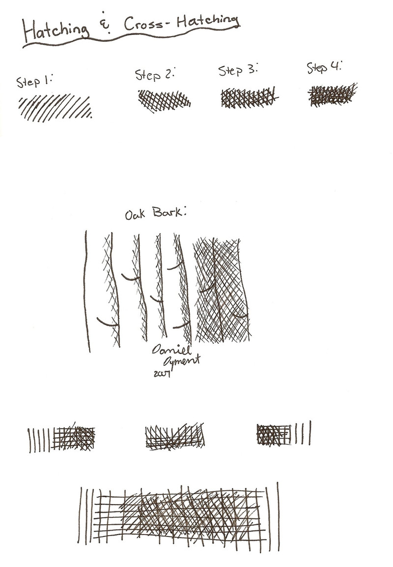
Hatching and Cross-Hatching tests in my 8.5x11 sketchbook with Staedtler Pigment Liners (0.3 mm, 0.5 mm, 0.7 mm). This took about 45 minutes.I used two of *robertsloan2 tutorials. This one [link] and this one [link]
This is just some testing. The top shows the steps in the first tutorial. The middle is oak bark from the second tutorial. The bottom is just some random ones. The really big one on the bottom screwed up, it was supposed to get darker towards the centre but it didn't work out that great.
Related content


Comments: 19

The fact that you are showing us your practice work is truly call for celebration of your determination. I can't tell you how many times I would get disappointed when someone that has a bit of talent, just doesn't follow up with practice. You sure get the practice. I can see that in what you keep posting. Good for you.
I'll not do much commenting on this particular worksheet, as you seem to have had much said already. I may post an ink project in my scraps though, and show you what I have done with cross hatching, and maybe you will get an idea of what to do.
Keep pluggin along!
👍: 0 ⏩: 1

I want to do more pen and ink stuff. I want to get some dip pens, ink brushes, and india ink too.
I like doing practise things like this. Today I took my new Bienfang Brush Pens and wrote the colour and did a block of colour for reference. The in did a goldfish with them for practise.
👍: 0 ⏩: 1
I like your eagerness to learn. We should all be so eager.
 (Smile)")
👍: 0 ⏩: 1
I want to learn lots! lol I love trying new mediums... like these brush pens! I just did another drawing, ACEO, red clownfish. I screwed up but I fixed it and it made it look better, these things if you screw up it is easy to fix or sometimes you can incorporate it, like I did.
👍: 0 ⏩: 0

I think the only problem with the one at the bottom is just that it's relatively narrow, so it's hard to see the gradient. It does get darker toward the center. I like the crosshatching patches you have at the top, very neatly done, I could use that as a demo itself!
Your oak bark sample is interesting. It's obviously from the middle of the tree, in the tutorial I pointed out that the lines get much closer together at the sides as the tree curves around and you're looking at the sides of bark sections rather than their fronts. Coolness!
One fun thing to try is to take a set of fine point colored pens and do crosshatching in different colors, overlaying it to create mixed colors. It helps to do the crosshatching fairly fine on a drawing and leave large white areas and black areas to contrast with it, so that in a gray area with only one layer you don't have just two or three lines to denote the gray area but seven or eight or more.
Here's a thought. Mark off a long bar, say half an inch tall and seven inches wide. Do your gradient crosshatching on that, trying not to go outside the penciled lines but go right up to them. Make sure you have at least a dozen lines an inch on it, and make sure the bar is at least seven inches long. This should give you a nice smooth gradient as you do the first bar seven inches wide, the next five, the next three and the last just the center inch. You can put more lines than that per inch, but make sure there's at least nine to a dozen so that the gray area is clearly gray and the space between the lines is only one or two line widths. Two line widths is good for creating the lightest gray scale short of doing broken lines.
I know if I need to go to lighter gray values I will do dotted or dashed lines in the lightest area, only one layer and break up the lines. Or use a thinner pen. Practice crosshatching often, because once you get used to it that is one of the most useful techniques you'll ever use with a pen.
Antique engravings, etchings and pen drawings often have curved hatching lines that follow the rounded shape of the object, say, a guy's leg in knee breeches and silk stockings will have curved hatch lines to shade around it and each line trail off into dots as it nears the highlight. Look at old fashioned postage stamps, the kind that are engravings rather than the modern full color ones -- antique stamps are cheap in sacks of common ones from stamp stores, and I always found them useful as something to study for art technique! Pick up a magnifier and look closely at how the faces and objects are shaded. It is incredibly delicate hatching and crosshatching usually.
Or look at money. Most currency is still drawn in that curved hatching and crosshatching style and achieves remarkable realism with one monotone ink color.
👍: 0 ⏩: 1
Thank you! After I did this I did a pen and ink eye. It was stipple and some hard lines (like eye lashes and eye brow). I will get it up soon!
👍: 0 ⏩: 1
Oooh looking forward to seeing that. It can be fun to do a subject entirely in crosshatching without outlines. The easiest way to do that is to pencil it, shade it, but don't ink in the outlines even though they're penciled, then when it's entirely done erase the pencil lines out. It can look very dramatic and keep people scratching their heads on how you did that.
👍: 0 ⏩: 1
That is what I did with my stipple eye. I didn't stipple pencil in though. I am going to upload it right now. I bet you will like it!
")
👍: 0 ⏩: 1
I loved how smooth your stippling was. I posted a long critique to it because I saw some other problems, notably the eyebrow placement and inaccuracy in how the eyelashes were drawn as well as the incongruity of outlining the eye at all. I would love to see you do one entirely in stipple shading.
Try turning your reference upside down when penciling to stipple. Sketch the values of the areas you're doing, then stipple in lighter or darker on that sketch still working upside down. I think you'll have less trouble with proportion that way. The eye itself was great and shaded and realistic, but surrounded by symbolic eyelashes instead of accurate ones.
I liked how you stippled the eyelid too, I could see that even through the fringe of eyelashes.
Go take a close look at the eye of my portrait of ~alilone for the angle and curve of lower eyelashes, duh, there's an example of a lady's eye with lower lashes. There are more of them but they flick out more and form little pointy clumps wider at the base than at the tip. That also shows the thickness of the eyelid like I was saying in the critique on your stipple eye.
👍: 0 ⏩: 1
I like the eye lid too!
👍: 0 ⏩: 1
It's cool.
One thing that stippling helps with is that unlike cross hatching, you can carry it to much lighter values. Putting the dots very far apart but still using some works as part of an overall texture of dottedness.
👍: 0 ⏩: 1
Yea, I think I like stippling better because you can get lighter values but it takes forever unlike cross-hatching and hatching.
👍: 0 ⏩: 1
That's the trade-off. The one combo that works is crosshatching and then at the light end extending the single layer hatching into dashed and then dotted lines. It progresses smoothly from middle value to light that way. I've stared at postage stamps for fifty years figuring that out, lol.
👍: 0 ⏩: 1
Seriously, study money under a magnifying glass. Try using the kind of curving hatching that leads off into dots. There are other techniques for hatching that are more refined -- like doing lines that are thickest at one end to make darks and each line narrows as it moves out toward the dotted line to become lighter. That takes real precision of hand though, it's an engraving technique. Common on postage stamps.
👍: 0 ⏩: 1
Haha, I may actually look at it eventually!
👍: 0 ⏩: 1
It's fascinating. If you get an old old stamp and put it on your scanner, then turn it up to maximum resolution and scan the stamp area (should be a relatively small file for a max resolution scan at the size of a stamp) and print it out, blown up like that, you can see the quality of the line and what happens with the thick-thin and the trailing off into dots, the way the curves and light and dark lines wind up describing roundedness perfectly and creating shading. I've been in awe of old stamp art all my life.
👍: 0 ⏩: 1
Hmmm. That sounds neat. Maybe I will try it.
👍: 0 ⏩: 1
It's great. And it's a type of art that I could not find any books on how to do, anything about it. I guess it gets taught by apprenticeship engraver to engraver, because I have not seen anything like it in anything but stamps and currency.
👍: 0 ⏩: 0