HOME | DD
 Skyder117 — Art Challenge! Zeimyth
#dragon #field #zeimyth #digitalpainting
Published: 2014-09-28 16:05:52 +0000 UTC; Views: 953; Favourites: 26; Downloads: 2
Redirect to original
Description
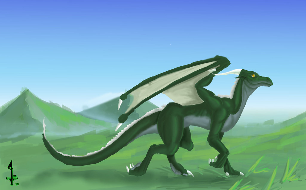
So me and mah bud here, we got to talking at one point, and decided we needed a way to encourage each other to do some art, and improve while we did it. So we went for an art trade- BUT, as a challenge, we both had to stick to 2 hours countdown, then drop our pens and show what we got done. This was as much as I got done before them two hours was up. So now I need to learn to speed up when I paint, not spend so long getting the shading right.fav.me/d80u9tz Here was Z's pic. Hooopedully this kinda idea is something I can do regularly, so I can gradually speed up and improve as I go. That'll mean new pics of course, we're still discussing what to do there.
Related content


Comments: 19

I gotta say, the fact that you did not apply any highlights to the green skin has really allowed the white to pop! From far away, it actually produces an extremely sophisticated lighting condition, where the white mane and claws are misidentified as light reflecting off of the surface of Zeimyth. Very very awesome condition indeed! It really harkens to Khyaber's lighting techniques for their images (an example of such:
Keep up the awesome work! ^^ <3
👍: 0 ⏩: 0

 (Smile)")

A very cute dragon! If he wasnt called Zeimyth, I'd call him Mittens
👍: 0 ⏩: 0

thats the rumour going out these days
👍: 0 ⏩: 0

WOW! I would be still sketching in 2 hours. That looks really good green dragon!
That background is good too from the green mountain shading.
👍: 0 ⏩: 1
its not hudson river standard background, but its what I could do in 15 minutes
👍: 0 ⏩: 0

And here I come! No, just looking. (")
For two hours you did a good job. Sometimes we set ourselves goals that are not easily reachable in the amount of time. So maybe only the upper body next time? I am merely suggesting. Or you could keep it more like a watercolor painting: loose, less focused on detail. So, well, you are heading in the right direction with this idea. Thanks for submitting, and well done. Is this a character by any chance?
👍: 0 ⏩: 1
er, yus, it's 's character.
Ill consider your advice next time we get on to doin it, maybe just do a bust sketch or something
👍: 0 ⏩: 1
You know what? I think you are improving, even if you don't see it. But name one artist who was ever able to criticize his/her own work. If you wanted, and I am humbly asking, you could try to find every possible flaw in that drawing I did. Bash me to dust. I want the (negative) opinion of somebody I can trust. All just keep saying it's so good-except my teacher, so I'm really concerned. Only if you want of course.
👍: 0 ⏩: 1
link to drawing, and only on the understanding that I am an artist in training, so all I can offer is my opinion, with no offense meant, but to be taken with a pinch of salt. So dont rage at me if you dun like what I gotta say, but dont roll over and take it if Im not making any sense. Sound fair?
👍: 0 ⏩: 1
I am sorry for no skills with my computer - so no short awesome tidy links til sometime in the future...I tried as instructed and didn't understand a word. Mneh.
So well, I didn't and don't expect you to suddenly produce wonders. I don't expect you to make me better, that's my job. I used a photo reference so I'll just include the link....
www.eigen-art.com/files/shambe…
Hopefully it works for you. I'm such a noob xD
I would never rage at anyone except my mother. I'll just upload a poem about her. I didn't do one in ages! Used to be a very promising poet until... well that's not a story for now.
So well, I excuse for all time taken from you by this.
*Gulp* DAT LINK. I will try someting....
invengefulembrace.deviantart.c… " berserker="" iii"<="" a="">
Did that work?
👍: 0 ⏩: 1
it worked, now lets see....
- shadow down the bottom could use a lilt smoothing out. You got the tone right but the floor its on is reflective, so the shadow should be as smooth a gradient as you can make it.
- You get the chance, look into noetic space. If you wanna pull the subject from the scenery and give it depth, its a good idea to leave a miniscule bit of white in a border around the shaded part of the subject,, and light (very light) shading around the light parts of the subject, get that displacement and distance. fav.me/d6xtro4 would be an example of how to do it. Bonus side effect is it makes dark parts of the subject look even darker
- You got the values more or less done well, but looking at the head for example, the detail could be refined a little, a few lines to accentuate the darks and lights of it. Inherent problem there is you refine it too much and the whole pictures a bust, so it comes down to luck. Given the time you spent on it, id say not to refine it now. buuuut bear it in mind for future pictures.
...and yus next time use something darker to do that writing. graphite will disappear.
All in all it is a good pic, beyond my current capacity to perform. Buuut you asked me so I've critiqued as best I could. Kinda admirable really, so many artists will only learn from professional sources, when we should be willing to learn from anywhere and anyone.
👍: 0 ⏩: 1
Phew, sorry, there was a birthday to be had yesterday and a party the day before so I was in a lot of trouble the entire week and it all got kinda complicated so this really is the first time in days I can reply to you.
First of all, I have to thank you very much for your effort. I will put to use each one of the tips you gave me in future works from imagination. Since it was drawn from reference entirely however, I couldn't put lights where there were none. This whole thing was a value practice more or less, and I find that I really need to look deeper into it. However, you are right, what you described is known to me as reflected light. It makes things so much more realistic. I really tried to go for the shapes and values as I saw them, so if I missed them, I need to look out for them. I just can't make things lighter anymore, it's fixed AND in the hands of my school.
On the other handside, you are right with the head problem. I wish I had been harsher with the lines, I mostly used the col-erase there which is extremely light. But don't think the values are 1:1 on the photo as they are in reality, somehow the entire upper half is much lighter than it actually is.
The writing I also did with the col-erase (why did I, it makes no sense, it's as light as a 3H! And then I established a darker background tone and all went to hell xD)
You aren't as bad as you think. Before I did this picture I had nothing to prove my skill. (and I haven't even reached the potential, the medium just kicked my face and time was running short at the end but there is no excuse right? Thanks. So much.) Have you had any experiences with paper stumps? Mine sucked.
👍: 0 ⏩: 1
Havent used paper stumps to any real extent. I know how to make them but never really get around to it.
er, well glad to be of some help I guess. You're welcome
👍: 0 ⏩: 1
Well, thanks a lot. What I experienced with the stumps is that they take a lot of graphite and charcoal off the page, get really dark and then lose it elsewhere, it's too messy. I can't recommend them. All help and every comment is appreciated.
👍: 0 ⏩: 0

It looks like the link didn't work. Try fav.me/d80u9tz here.
👍: 0 ⏩: 1