HOME | DD
 skythlee — SWiSHv1

Published: 2003-08-27 09:29:59 +0000 UTC; Views: 11382; Favourites: 55; Downloads: 7299
Redirect to original
Description
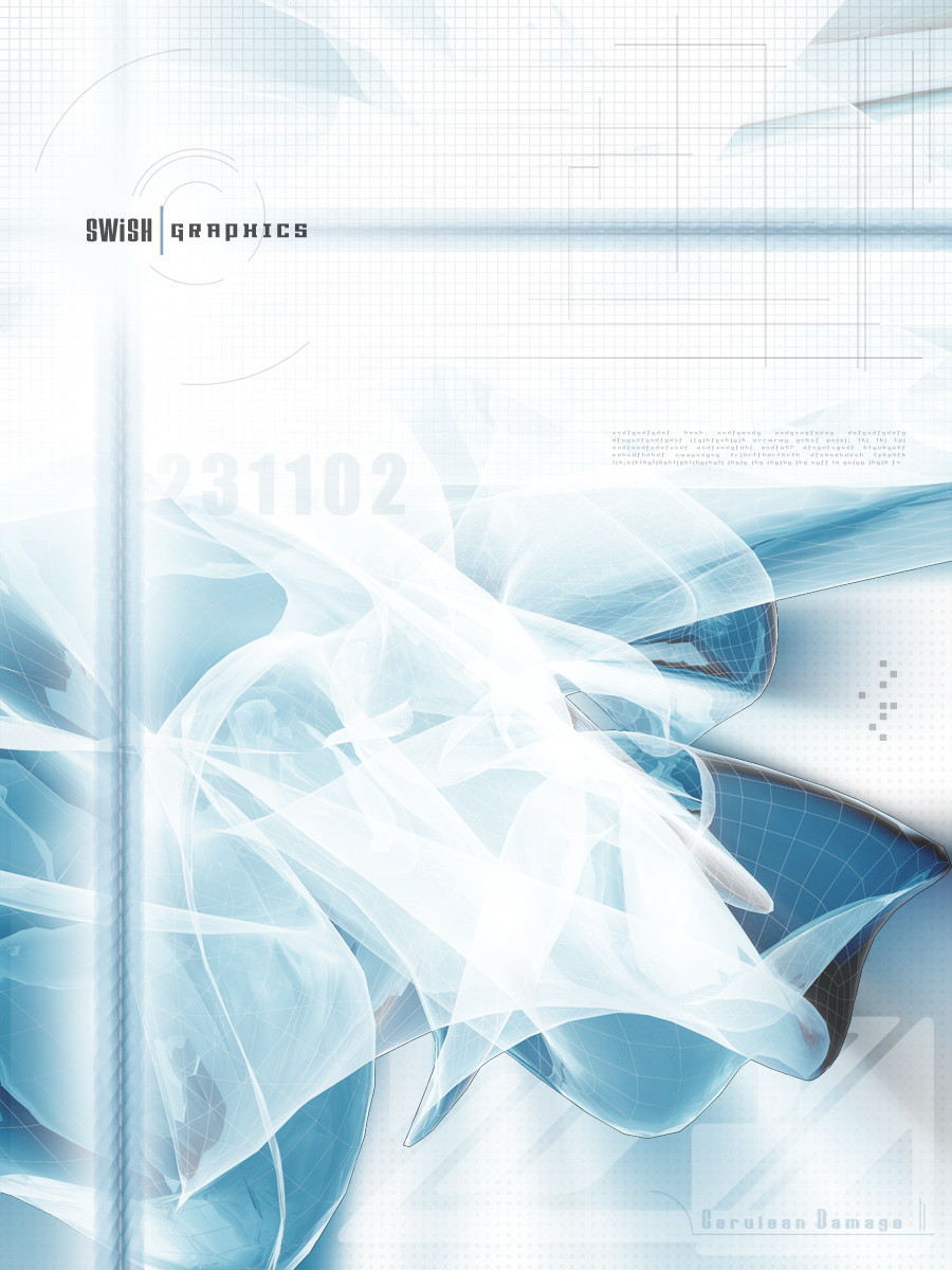
This is the interface I am working on for my online portfolio. Trying to go the whole 80's futuristic style. The menu will be constructed in Flash whilst the whole thing will just be put together as plain html.Let me know what you think. Any feedback, criticism, ideas are encouraged.
Cheers.
Related content


Comments: 56

Damn I'm 7 years late. Do you still have a live demo of this?
👍: 0 ⏩: 1

Sorry dude, this one's long gone I'm afraid...
👍: 0 ⏩: 0

nice style, but what are you gonna do with scrolling? stretch the whole mid-section to fit the text? if you're gonna make a seperate scrollbar in the content-area, there will probably be two scrollbars, and that's not very nice
")
👍: 0 ⏩: 1
This design is like 3 years old, I'm completely over it, lol!
👍: 0 ⏩: 0


")

it looks very clean but i think u should work on the blue stuff , specially at the bottom of ur interface m the lighting etc ain't good there , keep up the good work
👍: 0 ⏩: 0


it looks great, but try using another font for the menu, maybe a condensed one
👍: 0 ⏩: 0

SOrry disregard my comment above clicked wrong button selected todays favorites instead of the browse web interfaces. SORRY
👍: 0 ⏩: 1
no worries dude. Thanks for dropping by!
👍: 0 ⏩: 0
It might be me but I have seen this design somewhere before a while back.
👍: 0 ⏩: 0

Nice. I like the cleanliness of it all.
I'm takin' some notes...
👍: 0 ⏩: 0

really cool man i think is a good job
check this out [link]
")
👍: 0 ⏩: 0

thats looks very nice, but is that the bottom of the container where the wire plugs in? i think it would look more realasitc if you up a shadow under it but not too much since you also have the refoection going.
👍: 0 ⏩: 0


Very slick mate! Nice clean feel; excellent splashes of color.
👍: 0 ⏩: 1


Thanks man, not sure if it's the best though.
")
👍: 0 ⏩: 0

wow, very unique. kind of reminds of my wacom tablet. it looks great. just make sure when you make this site that this part should be a borderless pop up window thats not resizeble. great job.
👍: 0 ⏩: 0

uhhmm wow...
that must be one of the best web layout idea's i've ever seen.
👍: 0 ⏩: 0

fo' schnizzle work man, this is clean and simple and you have deffinately achieved the look your were going for.
👍: 0 ⏩: 0

As always, you grace us with your great talent. I must say that I'm thoroughly impressed with this one. The idea for flash as your navigation will definitely match the overall idea.
Once again, I'd like to say that the design is well thought-out and implemented. Good work!
👍: 0 ⏩: 0


....
...
:0
love it. mmmm plastic, like the refleced buttons images...
keep it up. i wish i could imagine similarly to yourself at times
")
👍: 0 ⏩: 0

why, I do believe that's what you kids today call " bicthin' " awesome work ")
👍: 0 ⏩: 0

not sure about anythings 80s, but that's definitely an amazing design...great work
👍: 0 ⏩: 0

sorry man, the interface is amazing. which is what I meant to say. with some humor.
👍: 0 ⏩: 0
If by 'bottok' you mean bottom section, or footer, then yes I am pondering whether or not to make it interactive.
👍: 0 ⏩: 0

i like it, but maybe you should do something with the bottok in flash. i dunno, just a suggestion
👍: 0 ⏩: 0

I like the little details, such as the wires going in & out of the interface, and the headphone jack  (Wink)")
👍: 0 ⏩: 0

Definitely cool  (Smile)")
A Photoshop job?
👍: 0 ⏩: 0

It looks good in general, but i think the buttons are too mate. They don't fit with the shiny rest of the interface. Nice work though
👍: 0 ⏩: 0

not bad... i like this kinda design lately... whitish and reflections... good job
👍: 0 ⏩: 0

Looks super-awesome. I think you totally nailed the design you were going for.
However, I issue the following challenge: Make it (the "plain html" version) standards compliant. ( [link] )
If you use valid, standard code, it will look awesome in any (modern) browser on any platform.
If we all start designing with standards, the world gets easier. (You asked for ideas, that's what this is.)
👍: 0 ⏩: 0

Very cool work, looks good. Can't wait to see what it'll look like when you have the flash working.
Should look good from what I can imagine. Keep up the good work.
👍: 0 ⏩: 0

wow thats awesome! i really like the highlights and how the colours play with together!
👍: 0 ⏩: 0


WeLL! I love the colors and Bewels and ALL! 100% BEST layout ever seen in here... so if you wanna teach me then come to #nebulous-art (my company) @ quakenet and talk to me ( idEfix aka lune365)
👍: 0 ⏩: 0
| Next =>