HOME | DD
 Snowlily32 — Crystal Drops [Contest Entry]
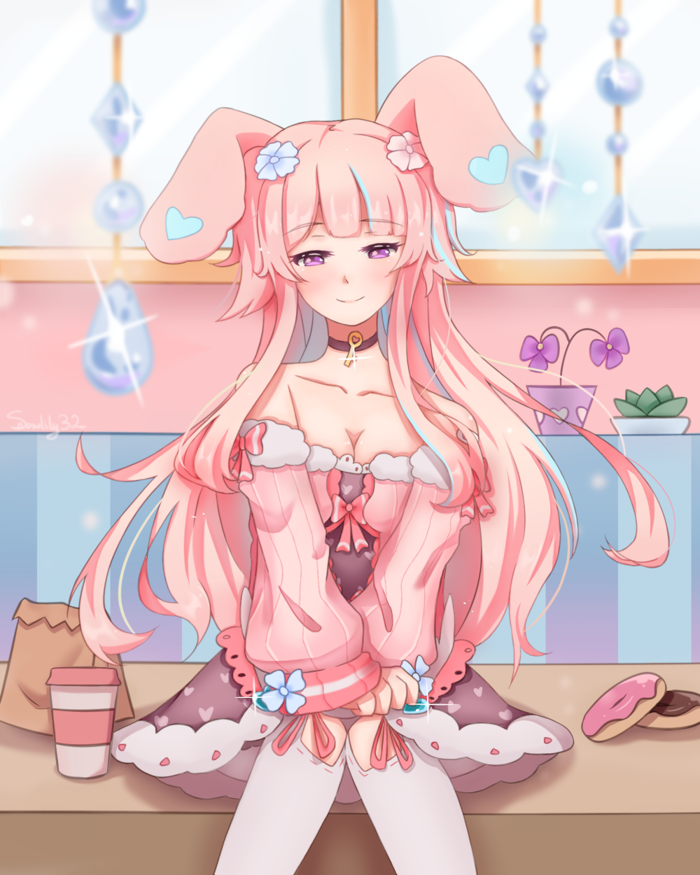
#animeart #artcontest #bunnygirl #crystal #digitalart #kemonomimi #kawaiianimemanga
Published: 2019-03-24 06:43:58 +0000 UTC; Views: 594; Favourites: 113; Downloads: 0
Redirect to original
Description
My entry for 's art contest! I had so much fun drawing Fayre, her design is so beautiful! (^ w ^)*Had more fun with backgrounds, I think I find art contests a good place to experiment with them (- v -)
There's still some time if you want to join as well! Here's the journal link- fav.me/dcxnlae
Good luck to everyone else joining the contest! \(> v <)/
Edit: kinda changed up the colours because for some reason my monitor was being dodgy...(= v =' )
I also tried fixing up the coffee cup. I'm not sure whether it worked or not, but in my opinion I think it looks a bit better
Related content


Comments: 20

OHAYO! I'm from ProjectComment ! I'll review!
OK, so here is in general, I like the cuteness, how the hair flows and how well made u designed the dress. Pretty kawaii cute!
OK... specific time! Fayre looks pretty with that cute dress of hers. It's fluffy, pinkish and having the feminine feel to it. Especially the skirt part where there are full of hearts there. like a sugar cute girl! Next is how u designed her hair. I love shoujos with very long hair, and giving the feminine feel, it stands out nicely. Lonf flowing hair, and those bangs and pigtails too, looks unique to me. And those cute flower hairpins as well! Just so kawaii!
The background... I like those desserts around her. Happy as she is, like a sweettooth. The bunny ears also just add more kawaiiness to the kawaiiness!
My concern... speaking of bunny ears, the bunny ears look like it's behind her head. Isn't it suppose to be on top? Also a very minor one. There isn't some plate or at least a piece of tissue to place the donuts on? Don't get those germs! Teehee! That's all my concerns, but hope they would help u become better.
So bottom line, this is a very very happy artwork, draped with lots of cuteness, sugar and high spirits. Keep it up and u'll one day become a better artist. Never give up! I hope my advice can help u become a better artist.
👍: 0 ⏩: 1

Thank you for commenting!
Thanks for pointing out the ears! Since I don't usually draw bunny ears I guess I just slightly stuffed up I guess...? Better pay more attention next time... (0 v 0)
And I guess a tissue would have been good under the donuts. Can't forget sanitary issues...
I'm glad you like my work, and thanks for the advice! *(> v <)/*
👍: 0 ⏩: 0

Hi, I love the colors in this art. The crystal drops look magical but in my opinion you should not blur them.
The only thing that I think needs work in your character are its shoulders and let me explain myself:
The arms perspective is fine but the shoulders still look like she were not extending the arms and also dont be shy with the hands, the one you drawed looks fine but I think the other one would be a perfect complement.
The brackground needs more perspective too, the color and objects are fine but you can also add shine and some texture in the furniture. In that way the background wiont be flat.
Also I noticed you wanted to add some sparks around your character. If you want to make the noticiable, I recommend you to use the glow effect in the layer and use the blur effect with a lighter color.
In general, it looks great, keep practicing and you will improve more and more.
And the shadowing looks so nice, you create an effect that is hard for me to get when I am coloring the sking of my character and the eyes look so vivid, how you do it?
👍: 0 ⏩: 1
Thank you for the advice!
Thanks for the tips on the background, it's something I'm still trying to improve upon! I also appreciate the tips on the perspective, another thing to work on... (= w =' )
Also thanks for the tips on sparkles! Layers are still something I'm experimenting with, so that advice was really helpful!
As for shading, I tend to use multiple layers of shading, and I also go over some bits with an airbrush that's roughly the same colour as the blush to give it more "life" feeling so it doesn't feel flat... hopefully that makes sense...? (- v -)
I honestly don't have much tips for the eyes though, I usually just pick a couple of colours that look good together. However I feel that the more saturated the colour the more it stands out, which might help you create that more vivid look that you want
Hope this helps, and thanks for the help!
👍: 0 ⏩: 0


OMG what's not to like?
You have cute + pink + hearts + crystals + donuts + coffee + cleavage (hehe)!
I hope that on her choker is the key to my heart.
If she's single and wants to go on a date for dinner... then this is truly a perfect picture.
👍: 0 ⏩: 1
I'm glad that you like this! (^ w ^)*
However if you want the actual details I think it's best to go ask the person who actually created the oc ^^
👍: 0 ⏩: 0

Thank you so much! *(> ∀ <)*
👍: 0 ⏩: 0


I’d agree with you that Fayre has a dazzling design.
👍: 0 ⏩: 1


GASPS
THE COLOUR, THE POSE, THE SHADING, THE BLURRING OF THE FOREGROUND!!!!!!!!!!!
A+++
EXPONENTIAL IMPROVEMENT!!!!
One thing I would try to improve is the perspective of that (coffee???) cup! It kinda looks like its floating???
👍: 0 ⏩: 1
Thanks! *(-^ v ^-)*
Tried changing the coffee cup? Not sure if it still looks dodgy though...
👍: 0 ⏩: 0