HOME | DD
 Sparkleswords — Spiral Wolves
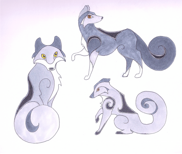
#celtic #celticish #spirals #wolf #wolves
Published: 2016-05-26 14:27:49 +0000 UTC; Views: 400; Favourites: 22; Downloads: 0
Redirect to original
Description
Tada!These aren't actually in a Celtic style, but they're definitely inspired by it. And OH SO MANY TANGENTS
Related content


Comments: 25

I like this sort of style, the way it sort of blocks out the details
👍: 0 ⏩: 0

Hello from ProjectComment !
This is a very beautiful and creative concept!! I really like the variety you implanted in the pattern for both the fur design and body structure into each wolf differently, creating unique designs for each wolf. It’s very well done. You applied the spiral pattern it in such different ways that the pattern works very well to show different personalities for each wolf as well: the one on the left looks curious and a bit mischievous, the one on the upper right seems like a type that would only pay attention to things that interest it and ignore everything else, and the one on the lower right looks tough and strong. It’s nice to see how simple differences like this in their faces can create a completely different character! The grey and white tones for the fur work well together and also make the wolves appear strong and independent.
The only thing I was going to suggest to experiment with was using different line thickness in some places (like making the parts that outline the white hair thinner than the rest), but the previous commenter already explained it well^^. That being said, because you use very thin lines already, the design still looks solid and lines don't distract or clash with the colors - so keep doing you!
It was fun looking at this piece! Keep up the great work!

👍: 0 ⏩: 0

Hello, led me here.
I don't really know anything about celtic styles, so I can't comment on similarities. However, I think your style looks very nice and refreshing. It looks simple on first glance, but looking closer at it shows that you really know how to work with shapes. I think you placed the different shapes just in the right positions, adding interesting contrasts that add to the whole impression. For example, I really like the swirls on the wolves's tails.
My favourite wolf is the one in the lower right corner. I love his design, both because of the shapes (I especially like the paws and the spiral on his shoulder in this regard) and because of your choice of color. While all three wolves have the same colors, I think they look a bit better placed here - the fact that it is a mainly light grey wolf with some dark accents here and there makes it look more appealing to me than, say, the one above, where the dark colors are more gathered in one area and thus the contrast between dark and light grey isn't as striking. This might be a matter of preference, though.
A thing I have to say about all three wolves is that their poses are very beautiful and cute.
As for some critique, well I don't have much, since the picture already looks good to me.
However, I think that you could make your line art look a bit more interesting. Your lines are very thin and even right now, varying the line thickness a bit can help breathing life in a picture and giving the eye some subtle variety. I'm not sure if the thin lines are part of your style, but I recommend giving it a try. Even very small changes, like making lines a tiny bit thicker at the edges, can make a huge difference.
👍: 0 ⏩: 1

Thanks for the comment! ")
👍: 0 ⏩: 0

Hello
While I am not completely familiar with the Celtic styles, I can definitely see how this was inspired from it. The way you have the curves, and how they intertwine into the bodies drawn, definitely speaks to where it has been inspired from (for those who are familiar, and or for those who aren't and just make a simple google or bing search). Many times, when I think of spirals, I either associate it with Mathematics, or Zentangle, so it's kind of nice change to me personally to actually see with my eyes where they are applied. I mean, I know they can be applied anywhere, and are everywhere especially when you look, but yeah, I found it kind of nice to look at this piece.
Among the things that I appreciate about this piece is the variety you give us. You don't just provide a stiff form, no, you show it to us in a verity of poses. Even down to colour, be it of body or eyes. I believe you have the basic anatomy down where it comes to wolves. I mean, I know what a wolf looks like, and I can bet anyone who looks at this can definitely see that these are wolves.
While you say this was inspired by the Celtic style, I feel like I can see other styles (be it intended or non) incorporated in this piece; namely the similarity to Egyptian hieroglyphics. This is especially apparent (to me at least) with the upper right and lower versions of the wolf. They seem to be able to belong on a wall of an ancient Egyptian temple wall if they wanted to.
All in all, this is pretty good. I found myself absorbed in looking them for a while there. One more thing I'd like to mention is that the purple in the upper part of the background really goes well with the entire drawing, and if there was an atmosphere to set, it would definitely do a good job (in my opinion). I also feel it brings character to the drawing as well (maybe it's just me, though).
Keep up the great work
👍: 0 ⏩: 1
Thank you for your thoughts! I'm glad you like my use of spirals.
As for the purplish part...that's just a shadow ")
👍: 0 ⏩: 1

Hello, I found your deviation through ProjectComment /#projectcomment
First off, cool, Celtic inspired wolves!! Many of my ancestors came from Scotland, Wales, England and Ireland, so I'm kind of instinctively drawn toward things that are Celtic inspired.
The shapes you've given them and the curves that extend into the body are much like the Celtic style from which you've drawn inspiration. You can look at them and know with a glance what style they were inspired by. They could have been a study of a stone megalith. Nice job with that aspect! Keep it up! You've also done different poses, which is nice to see as this shows you're experimenting and learning. It also gives the viewer something new to look at as they gaze at the different sections of the work. The other nice thing is that the seated wold has yellow eyes and the others have orange eyes. More variety, yay! I'm not sure if you did that on purpose or not, but I'm pointing it out. You may want to use it in future works or you may decide that you want more uniformity, in which case you would want to give them all the same eye color. I'm personally all for variety, but if your'e, say, doing a border piece and you want everything to look more or less the same you would want to pay more attention to keeping everything uniform as opposed to if you wanted something more chaotic with a surprise in every section. Right now you have a simple yet elegant drawing and that's perfectly fine! I'm throwing this out for what it is worth.
Okay, there are a few things you could improve upon in the future. What mainly jumps out at me is the lower right hand wolf that could be either sitting down or starting to get back up. The tail is more like a squirrel's than a wolf's. You want to see some lines of the behind coming up toward that tail so it doesn't look so thick. Also, the spiral of the tail is pinched off. A little more attention to that would vastly improve how that wolf looks even if the base of the tail is too thick. The seated wolf on the other side of the image has very flat ears. If you add some shading to indicate that the ear goes back, it will look better while still being true to the Celtic inspired style. The upper right hand wolf has a bit of a pinch in the spiral of its tail, but not as bad as his companion below him. His raised leg looks a bit funny. Wolves have long legs, and although it looks like it would be the right length if he lowered the leg, I think the lower part of the leg could probably be a bit longer in future. If you were to see a wolf in the wild, you would probably notice the long lanky legs. I have seen wolves in the wild a couple times before, and that is what stood out to me and told me that the animal was not a big husky but a wolf. It might help to find some good reference photos of wolves so you can get an idea of how the body should look.
All in all, I like your image very much. I hope you found this comment somewhat helpful. Keep on drawing!
👍: 0 ⏩: 1
Thanks for your thoughts! This was definitely pretty experimental, so I'll be sure to keep your suggestions in mind if/when I go a bit further with this style.
👍: 0 ⏩: 0

Although it's acually not the Celtic style as you said. Each drawings are actually fine. First, I need to say that the wolves look cute to look at due to the eyes shapes. Also it was a nice effort to do the lines that look like celtic art, even if you inspired of it.However, there something that it's better to improve. It`s about the curves themselves. It's just that they feel a bit broken. It's like if it took just one try do make them, especially on the tails. I understand that it may be hard, but it will look nice if the lines were very smooth. In short, although the curves are a bit off, it was a nice effort. At least, the colors are nice.
👍: 0 ⏩: 1
Thanks for your thoughts
👍: 0 ⏩: 1

I've never seen wolves like these before- they're very beautiful
I like the colors you've used for them
👍: 0 ⏩: 1

Omg this is adorable. I love the design it's so original. I've never seen anything like it
👍: 0 ⏩: 1
Thank you! They aren't completely original in style, but I did try to give them my own twist.
👍: 0 ⏩: 0

These are wonderful! Look kind of like what you'd see in a midieval manuscript (although much less slender)
👍: 0 ⏩: 1

Hi from #Projectcomment ! These are awesome! You can definitely tell that they were inspired by Celtic designs! The color combination is so very well suited for these guys! The only critique I can think to make is that the wolf on the bottom right corner doesn't look like he has any ears. This may just be from the angle you were drawing at. These are so very awesome and I hope to see more soon!
👍: 0 ⏩: 1
Thanks for your thoughts!  (Smile)")
👍: 0 ⏩: 1
Ahh! Ok! Of course! Glad I could help!
👍: 0 ⏩: 0

I like what you did with the Celtic inspired style. They look like they could me made of swirling smoke
👍: 0 ⏩: 1
Thanks! They kind of do, don't they?
👍: 0 ⏩: 0