HOME | DD
 spiceofdesign — Tablet OS Concept V2 preview
Published: 2011-09-16 19:00:03 +0000 UTC; Views: 3826; Favourites: 23; Downloads: 103
Redirect to original
Description
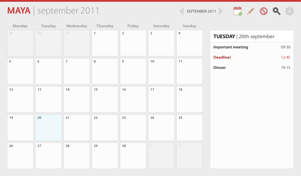
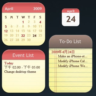
To celebrate going over 10,000 page views, here is a preview of my new tablet OS concept.The concept consists of the stripe at the top, which is a just a notifications bar, which appears when the user swipes down a the top of the screen. Then comes the main interface bar, which contains the application name (in this case Maya) then the current view (for example Inbox view), then the action icons, such as new, open and save. The colour of the notification bar and application name is dependant on the icon (Midori for example would be green).
Rather than providing a search box, I have changed it to an icon instead, as starting search would move it to a new view, so the search field would take up the whole bar. This helps to free up space for other icons.
Also options like open, save and export would simply switch view rather than opening a new window or showing a dialog. This is partially why the current view is shown.
The rest of the space would be take up with content, such as a website in the case of Midori, or the calendar, as shown here.
This is really only an initial idea, and things like spacing could be changed (not super consistent at this point - like the boxes are spaced at multiples of 5, whereas the icons are at multiples of 6). Also this is not related to Elementary or Maya, I have only used it because their applications have ditched menus, which is better for tablet devices and my concept layout. The Maya layout will be updated to a full month, it only shows 7 days because I am lazy.
Another thing I am not sure about is typography. One I will probably change is the application title/view font size, since it currently takes up too much space. If i do that it will actually take up less screen real estate than a regular app.
The font is Vegur, and this was made in Inkscape 0.48.
UPDATE
Made the font size smaller on the top bar and made it a full month rather than a week. This should be more like how Maya actually is. Another advantage of the reduced font is there is more space on the bar for icons. I also fixed most of the spacing to multiples of 6 instead.
Related content


Comments: 18

If all applications use the same toolbar structure wouldn't that limit the application's potential to maximize its efficieny? I mean on tablets which have such limited screen size would it really be efficient to use such a large application title and does all applications really need "views"? How would midori's address bar and and tabs fit into this design?
 (Smile)")
👍: 0 ⏩: 1

Midori is actually the next preview to be released
👍: 0 ⏩: 1
Sweet! I'm really looking forward to see your design!
👍: 0 ⏩: 0


Very nice! Only thing I could think of is that maybe make the icons in the top right corner colors match or all different colors. Something with the colors on the icons seems not to fit- as well.
👍: 0 ⏩: 1
I am still not sure about the icons myself. The more important thing at this point it the layout, so all the syling in regards to colours is not set in stone.
👍: 0 ⏩: 0

I think Pantheon with all its apps will make a hell of a tablet OS
👍: 0 ⏩: 1
Note - this is not pantheon or linked with elementary
👍: 0 ⏩: 1
I thought maya was the calender app for elementary?
👍: 0 ⏩: 1
Yes, but I am saying that this is not really linked with either project. Maya is only and example application.
👍: 0 ⏩: 1

Thanks, although this is only a rough version at the moment. I will probably release a newer version by the end of the weekend.
👍: 0 ⏩: 1

Still better than anything I can do ")
👍: 0 ⏩: 0
