HOME | DD
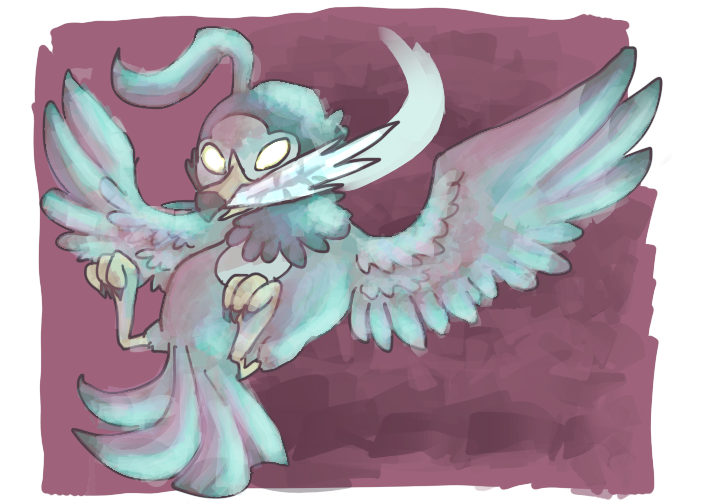
 starlingnest — Quill used Steel Wing!
Published: 2013-10-09 14:27:47 +0000 UTC; Views: 632; Favourites: 19; Downloads: 0
Redirect to original
Description
I was enjoying the pose and then I started to colorI hate it now
Related content


Comments: 11

Oh... and back to the color, it might help to start on a light gray almost white midtone
👍: 0 ⏩: 1

I did try with a grayish-blue, but making it lighter is a better idea.
👍: 0 ⏩: 0
For a polished steel, use highlights of the same color. Then go back over it with a very very light touch of the light's color.
If you hate the pose, then I'll critique it's position.
Really the pose is fine. However the way it looks right now he/she is supposed to be flying forward with her talons outstretched for a landing or an attack. I'd say lean her head back a bit more, and pull the wings further back. If she is moving backwards, then the wings should be tilted in some while the head's position is fine. Her feathers also look very bouncy, rather than stiff, so it may help to curl the tail feathers out a bit rather than pointing into her line of motion.
👍: 0 ⏩: 1
That's actually a good idea. I'll use that. Thank you!
I didn't mind the pose as much as the colors. It was supposed to look like she had just attacked, and was in the middle of getting her balance in the air again. It is a little funny-looking, though. Thank you so much for the critique! o:
👍: 0 ⏩: 1
Not a problem. I am teaching myself how to draw. But unfortunately I see things on a very technical level :< . I can see problems with perspective and dynamism... but I can't draw worth a crap right now.
👍: 0 ⏩: 1
Oh, I feel you. Sometimes, I feel like my art is worse than it was five years ago. It does make it a little easier to be aware of that, though... rather than learning everything from the beginning, once you've gotten good. Art is just blood, sweat, and tears :c
👍: 0 ⏩: 1
It really is... and unfortunately for me... I have been rewired for technical drawing. Meaning, I do a schematics, maps, isometric, and perspective. But Creative drawing with organic figures is a hell no.
👍: 0 ⏩: 0

I like the colors! I can see it's not what you had in mind, but it certainly looks not bad! It's just blue lighting now.
Maybe a tip: if you want to have that steel effect you might want to use sharp shadows and highlights.
I even think it can still be done. Just with a very light color (or maybe even just white) in a hard brush accentuate the places you want to reflect the light. And if you want it you can also add some additional sharp shadows. Hope it helps! ^^
👍: 0 ⏩: 1
Thanks! I was aiming for bluish steelishness, but... eh.
The famous Luminosity layer mode gave it the steely look I wanted, but it still looked too harsh... haha, oh well. I'll try to use that next time. Thanks for the tip!
👍: 0 ⏩: 0

i was trying to go for "polished steel" and got "candy pink and blue" instead :c
👍: 0 ⏩: 0