HOME | DD
 starshock12 — Painting practice
by-nc-nd
starshock12 — Painting practice
by-nc-nd

Published: 2008-07-14 01:03:01 +0000 UTC; Views: 2583; Favourites: 96; Downloads: 0
Redirect to original
Description
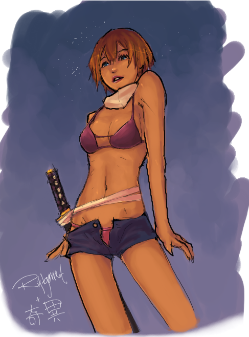
HMMMMMMMMMMM. I went lazy on this after I've finished detailing the face LOL OTL *needs to work on that aspect*I really love Airbrush Hard Round tool on Photoshop. After almost a year of absence, I decided to pick it up again when I felt confident enough to wield it. I'm still a long way to go in improvement, however, but I think I made a ton of progress throughout a year. XD;;
Gonna put on the Critiques Encouraged thing for comments, even though I'm tired of working on this pic, I want to know how you guys feel about it. :'D
EDIT: THANK YOU GUYS FOR THE SUPPORT AND CRITISISMMMM <3 I've read over every person's comments with care and tried my best to edit the picture as such. If there's still something wrong, please point it out. ;__; Thank you guys so much, again
Related content


Comments: 37


oh my gosh this is spectacular, though confusion about pink under lighting arises.
I must admit the work on the arms and chest musculature are my favorite, for they fully imply that crass roughness as to be expected with meek people in general
👍: 0 ⏩: 0

HELLO!! Your drawing is awsomes and all, but plz... Can you help me with a problem I'm having? [link] It's not as bad as it sounds... honestly.
👍: 0 ⏩: 1

Thank you!!
You can just reply here with your problem and I'll see what I can do to help XD
👍: 0 ⏩: 1
I've got it worked out now. Thanks for the offer though! ^^
👍: 0 ⏩: 0

The baggy pants look amazing :'D I like the touch of blue.
👍: 0 ⏩: 0

dang this is awesome. I love the details to the face and the hair, but since you've got crits encouraged I'm gonna nitpick. It could just be my personal opinion, but the details of the facial area and hair seem to be absent in the rest of the subject, particularly the clothes. It just looks like you could take the texture of your painting style to a new level.
👍: 0 ⏩: 0

What I've seen since the updates has impressed me very much.
I REALLY LIKE THIS PIECE.
The pose, muscle/foot anatomy and the pant folds are really well done.
However, to me the face looks... a little odd, the way it's so jagged on a female.
But that's probably a little hard to fix, so...
Again, really well done!
👍: 0 ⏩: 0


Uhm wow... That is one piece of sexy girl with sexy perspective and sexy coloring.. I can't really see any anatomy problems, sorry.... bu I really love this picture a lot. I'm a major sucker for paintery styles. The character design, may she be an OC or a random character is superb. I hope you draw more of her soon.
👍: 0 ⏩: 0

I'd leave advanced critique like I normally do, but then I'd just be a broken record after what everyone else has said. 
 (Smile)")
")
Great work there.

👍: 0 ⏩: 0

Oh geez you people! -_- even with all your criticism. I could probably say the same thing from your artwork's. It's not like everything is so perfect!
I think it looks great!
👍: 0 ⏩: 1
LOL Yeah, I can sort of agree there but sometimes people want to learn through their errors themselves, they can't handle critique as well. XD I understand them. I just wanted to know everyone's general opinion on what I draw, because it might help me further express on drawing.
Thank you so much <3
👍: 0 ⏩: 1
awwww im such an idiot (facepalm) I need to remind myself the difference between flamming and critque! But yeah
And no problem ;D
👍: 0 ⏩: 0

Can't find much to critique that hasn't already been mentioned, but...
For the reds in her skin, most of them seem really out of place because it's bright and saturated and in the shadows.
Looks like the colour of your shadows is green, so it should be fairly grey in the shadow areas, and a warmer peachy red in the light, redder in midtones.
The pants are also very baggy, but fall a bit unnaturally methinks on the raised knee. There should be more pull of gravity, so it'd be a fair bit smoother on the top and bunchier on the bootom.
Overall though, I really adore this picture. I like the play of colours you worked in the shadows and the skin.
And the hair and hand are really awesome.
👍: 0 ⏩: 0
Looks very nice. I almost thought it was a guy! DDDD:
👍: 0 ⏩: 0

I'm godawful with giving critiques. So I'll just point out the good things like how awesome the shading is in her hair and face. <3
👍: 0 ⏩: 0

Well, I'm not much of a critique, and don't really know much about art style and other techniques, but I'm posting here anyway.
(I'm in your comments, posting on your picture... Made no sense, I know.)
I especially like the way you shaded this picture, it enhances the colors of the pictures and gives it this certain look that makes it full of color even with it might not be.
Her face expression coupled with her hand motion looks like she's expecting something or maybe someone to say something she wants. And if she doesn't, she looks fit enough to at least beat some sense into that person.
As said before, your sense of anatomy is terrific, and the picture has a sense of realism, coupled with a small sense of fantasy.
I really enjoy the pictures you post up of styles like this, and it makes me happy that you are able to draw various styles as well.
")
👍: 0 ⏩: 0

The anatomy of this image I am totally in love with! The colors for the skin tone are amazing as always. Although, I'm not sure how I feel about the uber bright red for highlights. I remember you telling me you use reds for shading, but...for some reason it looks like there's like a red light source or something but it's also hard to tell where the light source would be coming from if that was the case. It also reminded me as if she got injured too ;; 👍: 0 ⏩: 0
I like how you also used green for the shading in the pants too. Although...I think it needs either another color in there for shading...or something. I can't put my mouth on it. Maybe like a dull blue or gray? My teacher taught me to try using complimentary colors when painting. You can get some really cool effects so you should try that too ^^
The hair shading is amaaaazing though. I love the dark blues in there. And it's probably because her hair is like an orange/brown color and so the compliment would be like a dull blue :3 Very nice work though Starry 

Nooo you're not going to do anything else with this? D: It's really well done so far. I'd love to see more done with it!
The shading is very interesting, I like that you pick some of the strangest colors to do your shades with and still pull off a look that we can assume as natural. If I had to make any critique, I'd think there are a few too many folds in her clothing, like you got a little detail-happy there 
👍: 0 ⏩: 0


Your anatomy is really good, especially on feet and hands! And your colouring gives a great feeling of the texture of the pants and belly.
I'd have to say that her right shoulder seems a bit to high or maybe it's because it's too far from her neck, but I'm not sure.
👍: 0 ⏩: 0


O-Oh gosh this is beautiful. I'm a horrible person to ask when it comes to critiques - probably because I doubt myself so much, and I fear I'm wrong ha ha - but then again you wouldn't want me to critique in the first place! so! let's move on with the praising, yeah?
This is very, very lovely practice. I love the hair. Very much. I wish I can pull that soft look one day. I can't exactly figure out how people do it! and I'm not sure if it's some sorta ~*special feature*~ of the tablet because I use a mouse orz.
Mm the colouring is really soft... and the baggy pants looks splendid! in my opinion. The colours you used are very nice. Very much so. And that checkered top is very nice~ /jealous
👍: 0 ⏩: 0

I love your style, and how you draw feet XD Feet are so hard to draw!
👍: 0 ⏩: 0
XD She's come to smother Tokyo! I love the hair, and the coloring is really smooth. ='
I just think the green is a weird shading color for the pink pants. XD
 (Wink)")
👍: 0 ⏩: 1
Hmmmmmmmm, you think so? :0 I'll edit that then!! Thanks for your time Maya! <3
👍: 0 ⏩: 0

Long time no see. Awesome work on the detail. I can learn a lot from you work. I'll need some lessons once I get a tablet... whenever I get one. -_-; Still awesome work. Favin' it!
👍: 0 ⏩: 1
Eh?! You poor thing, you don't have a tablet? ")
Thank you very much!!
👍: 0 ⏩: 1
*uses big orphan eyes.* Thanks *sniffs* nice lady. *wipes tear*
Your very welcome.
Plus I'll probably get one in August.
👍: 0 ⏩: 0

Add more subtle shadows to her pants will help as well, some part is flattening.
👍: 0 ⏩: 1
Yeah, I think I hate baggy pants now LOL *shakes fist*
[link]
Made the reds more subtle and tried my best to fix the pants OTL
👍: 0 ⏩: 1
u just need a bit more gray tones for the lighter area for the pants, no need to tone down the shadows that much. ^_^
👍: 0 ⏩: 0
the reds on this one is kinda scaring me a bit. Perhaps you want to vary up the colors in both the red highlight and the shadows, and a fitting lighting background would be a nice addition to this piece.
👍: 0 ⏩: 0
Y-YEAH.... OTL... *goes read your other comment*
👍: 0 ⏩: 0