HOME | DD
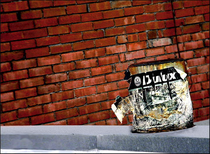
 Static-Imagination — Watching the Paint Die
Published: 2005-07-15 11:02:11 +0000 UTC; Views: 428; Favourites: 3; Downloads: 97
Redirect to original
Description
In this photo I wanted to play around with opposing angles.The horizontal version was to plain.
-----------------------------------------------------------------------------------------------------------------
Please note that I don't reply thanks to every message, as I don't like to clog up the comments list.
All comments I receive are greatly appreciated,
And that if there is a question I will always respond to those.
Related content


Comments: 40

Wow, the colors really stand out. o.O
Sorry, I can't give a more intelligent response than that. >.<
👍: 0 ⏩: 0

I really like the intense red of the brick and the angles. but something about the grey seems out of place. Too flat compared to the red. But a really nice shot on the whole.
👍: 0 ⏩: 0

Very interesting concept. The shot is also interesting in its near matte feel. I feel however that the white space at the bottom left of the image detracts from its essence, drawing attention to the wrong focal point. The small blotch of grey behind the can to the right has a similar effect, but it is too near the subject to be a valid concern. Possibly recropping the picture to eliminate the aforementioned white space will help the entire composition of the piece. Otherwise great work!

👍: 0 ⏩: 0

an old dulux can
the colours are great... placed the can very good
 (Smile)")
👍: 0 ⏩: 0

hmmm. I'm curious what the horizontal picture looked like. just to compare. that little strip of white at the bottom is a little distracting, but i guess it fits into the whole theme of contrast of angles/textures. One thing that might make the picture better would be a darkening of the brick background to bring out the paint can as the subject, if in fact that's what it is. either way, nice job.
👍: 0 ⏩: 0


I love all the textures. The 'opposing angles' kind of make me dizzy. n_n Very good contrast!
👍: 0 ⏩: 0

opposing angles eh? sure did a good job at making it an abstract sense of direction. i like how the rusted can sort of 'breaks' the direction of the lines. gives sort of a comfort from all the moving and continuation developed all the lines you see. good job!
👍: 0 ⏩: 0

Very interesting indeed. I love how mangled the paint can looks, and the slant of the wall. Very unique indeed.
👍: 0 ⏩: 0

wow this is awesome, it took me five minutes to figure out it was a paint can and not a poster on the brick wall, it's so rad cause you dont know what direction or angle it's from cause it could be so many different things.
👍: 0 ⏩: 0


Great concept, dont know how u thought it up. Love the slant of the brickwork in background!
👍: 0 ⏩: 0

Very nice! The angles really give it a very eye-catching off-balanced look.
👍: 0 ⏩: 0

The awkward tilt on this images creats some peculiar lines that send the viewer in many directions at once. I found that, when I looks at it for the first time, the paint can was actually the last thing that my eye saw. Of course, the questionability of my sanity is also a factor, but I just thought that it was interesting. What I noticed most were the blues and reds, good contrast there. Nice picture overall.
👍: 0 ⏩: 0

I like the textures and the colors. I think the diagonals work to create some intrest. But it is tough to get to the paint. The eye goes to the brick wall and follows the lines right out of the photo. I think more experemintation is needed.
👍: 0 ⏩: 0

well that photo is pretty unique. the perspective really adds somthing to the weird feeling you create with that photo.
i think you could cut a bit from the bottom and add a little space to the right.
hope that helped.
👍: 0 ⏩: 0

I love the contrasts in this and i do think maybe a little graffiti would set thsi of even more
👍: 0 ⏩: 0

Very interesting juxtaposition of angles. The surface that the paint can is sitting on looks new and clean and out of place compared to the can and the brick wall. Is this intentional? In any case, I like it.

👍: 0 ⏩: 0

I like this one
👍: 0 ⏩: 0

I definitely love the angles, and the title is great!
The bucket looks 2D...is it just me?
👍: 0 ⏩: 0

uh.. at first i thought this was a manipulation but then i figured it was the angle.
hm.. this isn't a great concept. yeah i understand the the paint can is rusting
and the label is peeling off.. but eh.. it's a great shot, though.
👍: 0 ⏩: 0


Wow, I love that title ")
But why is the stone slab on the left side so... blurry? ")
👍: 0 ⏩: 0

It took me a minute to get the title but i got it now. Good concept and colors. Nice image!
👍: 0 ⏩: 0

How..that's somewhat bizarre and a tad abstract, but I like!
👍: 0 ⏩: 0


nice idea.....but I think the wall looks sorta plain
👍: 0 ⏩: 0


Interesting piece, a clever play on watching the paint dry. Ha.
👍: 0 ⏩: 0

hehe.. makes sense about the opposite angles. Looks really odd, but yet interesting.
👍: 0 ⏩: 0

I like this. But I also agree with some other things said. If the wall had graffiti on it, or the cement and can weren't as bright it would probably be better. But I love it nonetheless!
~Gilly
👍: 0 ⏩: 0


Well accomplished with the angles, and the vivid colours are just brilliant!
👍: 0 ⏩: 0

god do I love you...I love when photographers play around with angles...this is a beautiful shot!
👍: 0 ⏩: 0

Great contrast and very vivid. Except for the top of the concrete where the paint can is sitting. I find it a little too bright and white and it really distracts me from the rest of the picture.
👍: 0 ⏩: 1

I notice this to now.
I will have to correct this later.
Thanks for pointing it out

👍: 0 ⏩: 0

great shot
did a good job on the angle... I like it!
👍: 0 ⏩: 0

I like the idea of this.. the title, and the paint tin, but I think the wall behind, it might look better if it was graffittied?
Would add more character
👍: 0 ⏩: 0