HOME | DD
 stev0 — juniper and south
Published: 2004-11-05 00:53:12 +0000 UTC; Views: 1065; Favourites: 17; Downloads: 101
Redirect to original
Description
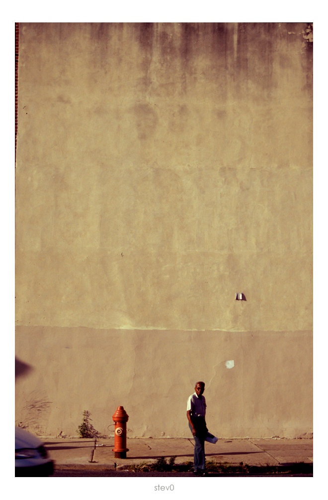
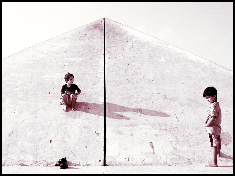
taken at the corner of juniper and south street. I've been in love with ths wall for a long, long time.Related content


Comments: 22

that wall seems to be mimic-ing [i don't know if that word exists...] the man. i see a very distinct outilne of a figure there..
beautifully done. I like everything about it.
the cropping is excellent, in my opinion..
👍: 0 ⏩: 0

I like the massiveness of the space behind that man. Did you try this image cropped at the left to see what it would look like to cut out that bit where the building ends? Not sure if that would work or not, but it's such a small sliver...Anyways, quite a nice shot overall
 (Smile)")
👍: 0 ⏩: 1

Thanks for the comment and yes, I actually spent a great deal of time playing around with that small bit of building. I tried cropping it, which I didn't like at all. So then I just got rid of it with the clone tool, which looked fine but I liked it a lot better with the sliver of the building. I think it works with everything else that is creeping in on the photo.
👍: 0 ⏩: 0

wow you got great space for observation in here !
👍: 0 ⏩: 0

excellent !
everytihng is ok but the black line at the top left of the shot is not good to be there i think

👍: 0 ⏩: 1
look a little closer, its actually bricks. The more I looked at it the more I liked it.
👍: 0 ⏩: 0

Very intruiging photo! Colours fit toghether perfecty and the composition's good too! The wall looks like it has been painted instead of photographed.
👍: 0 ⏩: 0

Excellent composition. I like how you used so much of the wall in the picture.
👍: 0 ⏩: 0

that wall has such crazy texture. makes me think of some far off planet.
i like the composition of this and the man that seems so lonely.
👍: 0 ⏩: 0

that is a great wall indeed.
i love the fire hyrdrant and the mans expression.
solid capture as always. you are a rock my man.
👍: 0 ⏩: 0

the best parts is the "unexpected": the bricks and the minivan.
i think without those elements, the photo would seem too slick, too already seen before.
but the unexpected elements is everyday life....
it grounds me, and reminds me of the times we live in.
these types of shots are my favorite....
where bits of the ordinary make the photo extraordinary.
👍: 0 ⏩: 0


i like the (what other comments seem to think) extraneous elements. it really puts the image in a place rather than just a man on an interesting backdrop. very real-worldly.
and of course, i'm infatuated with portrait format with low low or high high horizons, so this is great.
👍: 0 ⏩: 0

it looks awesome, but i get a sence of old times and it makes me feel nice. but then i see the dodge minivan and it takes me away from this pleaseing sensation. crop?
👍: 0 ⏩: 1
That’s what I find interesting about the picture, about how it pulls you back and forth on focusing just on this one guy, and then reality is creeping in on the edges, but his face keeps trying to hold your attention, but the car is speeding into frame, a shadow is poking in and the bricks are holding in reality at the top of the frame. I appreciate the comment though, helps me realize what exactly it is I like about this shot.
👍: 0 ⏩: 1


I can see why. Looks great. The dark line in the top left is a little distracting (the diagonal piece where it's dark..edge of something perhaps?). Might suggest a wee crop on that side. Other than that, this is wonderful.
👍: 0 ⏩: 1
Actually, I purposefully left those little trinkets in the frame. The shadow was intentional, as was the car and the bricks at the top was something I wasn't expecting but loved when I saw them on the frame. I did think about cropping it for quite some time though. I appreciate the comment; I just didn't want you to think those things were not thought about.
👍: 0 ⏩: 1
Ah I see. I assumed the others you addressed were purposely, it was just the bricks that threw me off. Cheers
👍: 0 ⏩: 1
I completly understand being skepitcal of the bricks and not even liking them, however their is something about it that I really liked so I decided to leave in. I'd say its the fact that the top of the shot is so abstract that I like the bit of reality creeping in on the side.
👍: 0 ⏩: 0

9th and hennepin. wow, what a wall. and photo. this photo is like, hey, photo guy, with your exact symmetry and long exposure, look at this, look at the van, look at the bricks peeking out. look at this.
then they look and scoff. but we all look and love. and love. and love. and. forever.
👍: 0 ⏩: 0