HOME | DD
 stratkat — Optical Distortion
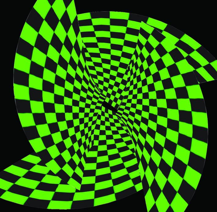
Published: 2008-05-08 22:00:46 +0000 UTC; Views: 2881; Favourites: 40; Downloads: 83
Redirect to original
Description
Looks better small or far away. So I'd leave it small a move away from the monitor to get the best effect.Made using:
Photoshop CS
Indesign CS
and Adobe Illustrator
Related content


Comments: 13


would I be able to use this for my yearbook?  (Smile)")
👍: 0 ⏩: 1

It looks cool...though I think it might look better with the edges smudged out or something...you know some surreal kind of effect..
")
👍: 0 ⏩: 0

thats freaky cool. that lime green i dun know for some reason the Joker comes to mind.
You think if you matched the blacks it have a better effect?
👍: 0 ⏩: 1

hm...idk, it's a bit of a pain to keep the colors consistent when switching between programs.
👍: 0 ⏩: 1
that is true. but for the final you could always do clean up.
for example in a photo editing program raise up the contrast to darken the image.
👍: 0 ⏩: 0

