HOME | DD
 swan-swan — Kataango
Published: 2007-03-23 23:00:52 +0000 UTC; Views: 1350; Favourites: 20; Downloads: 16
Redirect to original
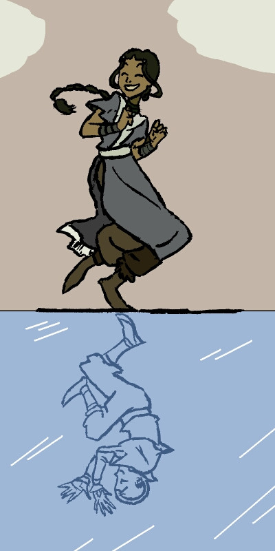
Description
You probably don't need me to tell you this, but rufftoon and the administrators DO....the lineart is NOT MINE. It was drawn by the fantastic , the legendary diva of Avatar fanart. This isn't my actual submission for her contest, it's just a part of it--I'm wondering how to fix up the ice reflection to make it look better.Should I color in the whole Aang reflection somewhat, or can you tell that it's supposed to be a reflection? Should I get rid of the clouds, or add in more details to them? Should I add ice skates to Katara's feet? What should I do to make this look its best?
I had to print Rufftoon's lineart out and re-ink it and then scan it, but it turned out pretty well....it's amazing, tracing over her lines....I have to say, you feel the ease of those lines, and yet see that it is turning out the way you want. Incredible, really, kudos to you, rufftoon!
This will probably end up on the scrapheap once I submit the whole shebang, but for now, I want some heavy review. I haven't really shaded it, either, that might help, ultimately, but I just want tips at the moment.
Review and comment, and remember that the lineart is NOT MINE!!! I just inked rufftoon's work and colored it. The whole concept belongs to her.
The characters, though, belong to Nickelodeon and Avatar: The Last Airbender.
The coloring and concept are mine....if someone else did the same thing or does the same thing from their own mind, it is a complete coincidence. Okay? ^_^
Yes, this is Kataang. The SHIP NEEDS SOME LOVING!!!
EDIT: I fixed it up, thanks, lepheonee!
Related content


Comments: 16

wow, never seen this one before! the idea's so cute, even tho i'm a zutara...

👍: 0 ⏩: 1
 (Smile)")
your welcome, she does indeed

👍: 0 ⏩: 0

Kataango? I officially love you! 
👍: 0 ⏩: 1

I'd say, smooth out the lines, ad detail to the clouds, no to the ice skates ('caue she'd have to be up on the toe pick, and that'd be an odd position). You can tell that it's supposed to be a reflection, but I think something's a bit off in terms of the angle/perspective, though it's hard to put my finger on it. It's hard to draw floor reflections. Also if you're doing coulds I'd think about a differant colour for the back ground. Though, blue sky and blue ice would be a lot of blue, so I dont know about that...
👍: 0 ⏩: 1

Yeah, blue didn't work out so well....
👍: 0 ⏩: 0

Tell rufftoon I think the lineart needs to be better. It looks a bit sloppy. Color-wise, the picture is fine, although Katara is a bit dull.
It's funny, because I actually thought this was going to be a Tango: Maureen based pic when I saw the name. xDD That'd end the war between Kataang and Zutara! A Tango picture, with Kat as Maureen!
👍: 0 ⏩: 1
There are actually two music vids about that on LiveVideo, and there will probably be a third (by yours truly)....
They were quickie sketches, you need to check out ruffy's gallery!
The flaws with the lineart are mine, probably....
👍: 0 ⏩: 1
I KNOW most of rufftoon's gallery, it's really cool.
Really? Linkplz?
👍: 0 ⏩: 1
[link]
[link]
Lineart was good enough to get her hired....^_^
👍: 0 ⏩: 0

Lines need to be rather smoother, I think...You should definitely go for the reflection shading. You've seen my ice statue, and you can tell it's ice, I presume? It just the very simple shading and shining--just a few strokes will do, and wala, you have ice! xD
That huge thick line on the ice should go, I reckon...It's not very, well, icey.
The blues are too vivid--You need to use the dustom colour. Double-click that blue and make it pale royal blue--that blue is too eye-hurting. Paint's pallet is bad! You really need to dampen and soften it.
Overall, AWESOME
")
👍: 0 ⏩: 1
Thank you very, very much. ^_^
I'll study your ice pic--thanks!

👍: 0 ⏩: 1
Oh, don't study my sucky pics! You can search for some ice tuts
👍: 0 ⏩: 1
Okay, so, I made it all lighter...and it looks much better...I have the lines converging on the center, and it looks really cool....
Changed the sky....
👍: 0 ⏩: 1
