HOME | DD
 Synfull — Revamped icons + usable script
Published: 2009-08-22 03:16:27 +0000 UTC; Views: 9088; Favourites: 83; Downloads: 210
Redirect to original
Description
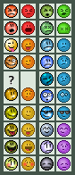
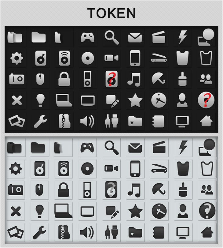
For the last 2 days i've been working on redesigning the buttons seen on dA and i decided to upload what i have so far.I decided to update a few of them partly because i either disliked the design or disliked the shading and then felt if i was doing some i might as well do them all.
They have all been copied from the 'more' drop down list so there are a few duplicates where they double up on those lists.
For a comparison the old official ones are on the left and mine on the right. I've struggled to come up for a friends and portfolio one so far so i've left them blank.
All of these are hand pixelled and shaded except the heart
") Alot are based on the originals so i don't take full credit for drawing the oes that have just been reshaded.
Alot are based on the originals so i don't take full credit for drawing the oes that have just been reshaded.I would love to see these being able to be used (even if it was just a script) but unfortunately i don't have the knowledge to make that possible
")
Anyways i'm proud of what i have done so far
And on a side note, i dislike the new journal icon dA has recently stuck up. It looks radioactive Edit: The awesome ~trezoid has created a code to allow you to use these icons. I currently have it installed in Stylish and it works nicely.
You can grab a copy here . We are aware ot all of the icons are working at this time. It is a WIP.
I take no credit for the coding, all coding credit goes to ~trezoid
Related content


Comments: 177

hey man! can you like make a script to use these in gmail!? that would be awesome! 
👍: 0 ⏩: 1

Sorry, but i don't know how to code that D:
👍: 0 ⏩: 0

I really like the new icons. Many of them are much more understandable and they all look much better. The colors look better, more vivid.
I know you're probably not the person to ask, but for some reason it doesn't work: even after trying to install it several times, the new icons still don't show up. v7 maybe?

👍: 0 ⏩: 1
It is most likely a V7 issue. i'll have to poke the coder to see if they can update it
👍: 0 ⏩: 0

The random deviant button is a clever idea. I like that one. And I like the devWear shirt better, as well as the calendar sheet for today - makes more sense.
But in general I find your shading much to dark for me (missing the brighter edge on the left), it doesn't contrast well enough with the background.
As a result some of your icons are hard to identify at first glance. Examples: your Browse/Gallery icon (a frame? The Mona Lisa is a good symbol to represent Art in general, imo), Manage Deviations (the screwdriver could also be a candle/stick/..?) and also Channels. The Chat & damnIt originals are just bigger and brighter and have more contrast. I can easily identify your versions but they seem much smaller than the originals...
Also I think some of the dark outlines present in the originals are needed to clarify: e.g. the yellow star in critiques bleeds to much into the blue bubble to be easily recognized for what it is.
I'm very sorry for this negativity - this must be very off-putting. But I hope you can take this as constructive or ignore it and not let it get to you in a bad way.
Jakob


👍: 0 ⏩: 1
I don't actually take the comments negatively. After using them on the script for a while i have come to the same conclusion as many of your points. Despite black outlines being a big no in emotes i've come to realise why they exist on these icons as they do make them look alot more defined.
I agree on your points re the mona lisa. I prefer my frame style but the image dA has makes more senes. I just didn't want to copy it for these.
I agree on the screwdriver too. I'm not sure what the old one is meant to be but i see in such a small amount of pixels its not always easy to identify items.
I prefer the shading i have used throughtout however agree that at times the exact colours used are too dark and i need to adjust them. Some highlights are also needed in places.
In short: i know i have some work to be done before these are really up to site standard and people confirming my thoughts encourages me to get back to these and build on the comments.
👍: 0 ⏩: 1
 (Smile)")
(btw, the Manage Deviation tool is a wrench )
👍: 0 ⏩: 1
Ahh ok. Wrenches are usually not yellow handled
👍: 0 ⏩: 0

I'm ot happy with all of them, but didn't want to just copy the originals
👍: 0 ⏩: 1

Portfolio, Shop, and Notes icons are really well rendered. And the Today you made is more logical than just two people!
Also, the Update Journal one is more recognizable. I also like your Random Deviant much better.
However, the News, Forum, and Browse icons are more recognizable and better-looking in the original, although I think you could elaborate on them all and surpass the others.
Finally, I do think the dAmn It and Chat icons need a bit of work, and I think having them face elsewhere than forward helps.
All in all, excellent!

 (Wink)")

👍: 0 ⏩: 1
I agree the news and forum are't quite as good as they are darer, but i will try messing with them. I prefer my frame on browse, but i agree it needs some sort of image inside - i've just not managed to make that yet.
Personally i prefer them forwards but i guess thats a difference in opinion
👍: 0 ⏩: 1

I really like the revamped icons of yours. dA Should use those, especially i like how your revamped "chat" icon looks so cute :3
👍: 0 ⏩: 1


Nicely done both of you 

👍: 0 ⏩: 1

they look too flat, some highlights would help.
good job anyway
👍: 0 ⏩: 1

The new icons look great ^_^ they work very well! Plus the new journal one is a but funky :/
👍: 0 ⏩: 1

Personally I prefer the site ones.
I find that the deviantart colour scheme is one that works well with "washed out" colours and im more of a soft tone setup.
Looking at your icons (And i tried the script to see how they looked in action) I find that the buttons seem to pop out from the rest of the site.
I myself did not come here to stare at the icons and so I think that the mellower shades are a more background freindly option.
On the other hand your icons have good design and are well thought out. A creative way to update the site for those who like them.
👍: 0 ⏩: 1
👍: 0 ⏩: 0

Hmm...I like the script, but I'd love it to be transparent
Because it looks tacky on my dA, since I use scripts that change the colour of the site, cause I can't stand the bright Green-grey it usually has
It'd be nice for people who use scripts like that, to be able to use the great icons you made
I probably should have commented yesterday, but I think they're coming along quite nice c:
👍: 0 ⏩: 1
")
👍: 0 ⏩: 1
Well, when I tried it, it just showed up with Grey squares around them D:
👍: 0 ⏩: 2
Not too sure why that happens
👍: 0 ⏩: 0

mine works great! Wonder what happened to yours
👍: 0 ⏩: 1
")

The user-script is missing the new Update Journal icon D=
That was the one I was looking forward to the most :\
But I'm still using it xD I love the new icons~
👍: 0 ⏩: 1
A few are missing right now as its a WIP
👍: 0 ⏩: 0

I do really like your revamped icons better than the left side.
Your's are more vision-friendly and not as bright and obnoxious as the other side. :3
👍: 0 ⏩: 1
no prob! ^^
Your icon is moving to the beat of my music X'D
👍: 0 ⏩: 1

Awesome! They don't work for my dropdown menu though. D:
👍: 0 ⏩: 1
Yeah, just in the more menu right now
👍: 0 ⏩: 0


maybe i dont like that flatty old look *thinks* but hey, yours are more retro!
👍: 0 ⏩: 0


| Next =>