HOME | DD
 SystemOverload — Aeovin Website
Published: 2007-08-31 06:31:03 +0000 UTC; Views: 1279; Favourites: 4; Downloads: 69
Redirect to original
Description
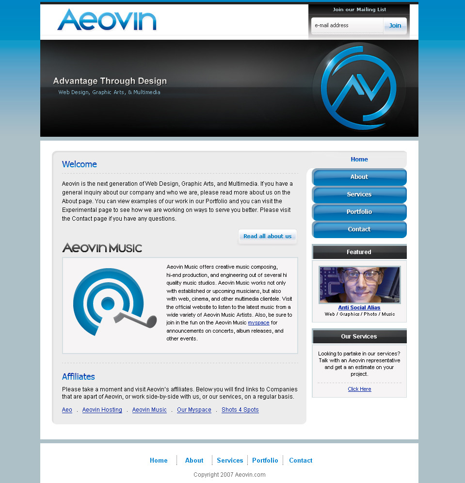
layout for the Aeovin websiteaeovin.com
give me lots of critique
thanks!
Related content


Comments: 6

hey now the logo looks a lot better  (Smile)")
👍: 0 ⏩: 0

Logo is excellent, not sure about the navigation though.
👍: 0 ⏩: 0

good looking - just dont like that input in mail-letter..
👍: 0 ⏩: 0

Negative:
- IMO i think the Aeoven text are to big, maybe 5-8 smaller size..
- to big input, max 24 px height.. :S
- padding between the banner content and bottom..
Positive:
- The way you point out your logo..
- Very good logo - Good dynamic
- Good looking content - Often when you have used a lot of time on the design you dont spent a lot of time on the content, but you did very well here.
- nizzle way with the navigation points.. do every button have that "effect"?
Comment:
Very good overall idea.. Like it..
👍: 0 ⏩: 1

thank you for the great reply! refresh, i have made a few changes. yeah the navigation is kinda like "tabs".
👍: 0 ⏩: 0