HOME | DD
 taintedsilence — contest complex

Published: 2006-07-09 03:06:29 +0000 UTC; Views: 2754; Favourites: 166; Downloads: 131
Redirect to original
Description
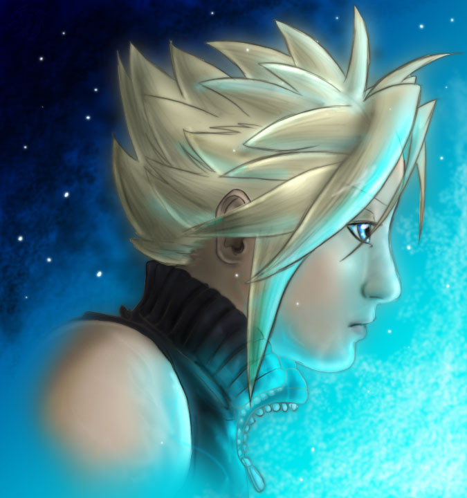
Yes, I have a complex. Well, I have many. But I specifically am referring to my contest complex. I enter contests. Insanely so. Especially kingdom hearts contests. And I don't even always want the prizes (thought sometimes I do) . . . . I guess I just want recognition.Anyway, yes, this is for a contest. In fact, its for the kingdom hearts ultimania contest [link] It was supposed to be illustrating your FAVOURITE character, but more than I like sora, I like the relationship between sora and riku - they're two sides to the same - darkness and light, or whatnot. Yknow, before all that roxas crap came along . . . . oh well. (actually I like roxas too. But I liked sora and riku being opposites more.)
I haven't actually entered this yet, so I want feedback from you guys on what would make this contest-winning-worthy. Because somehow, I just don't have it in me. I enter all these contests, but I never win. Sometimes I get the consolation prize (like, last place), but . . . I never win.
T_T I wanna win.
P.S. partially because I wanna see if I actually have enough watchers to get a top favourite, and partially because I think the front page needs some new faces . . . . so . . . . if you think its worthy of such an honor, please favourite it *can't believe she's asking this* But I'm tired of the same people getting the front page exposure, regardless of how sucky their art may be . . . sometimes just because they know someone (coughsnapesnoggercough) or photograph naked people or something . . . . (I also hate that 'unknown artists' and 'daily deviation' crap too . . . *had a daily deviation at one point*)
*sigh* I'm such a loser. Sora and Riku belong to squeeeeeeeeenix
Related content


Comments: 38


really awesome,love the effects.
--X--
Its hard to wait around for something that you know might not happen but its even harder to give up,when you know its everything you ever wanted!!


👍: 0 ⏩: 0

it saddens me to say that at some point I lost the file for this . . . all I have is this jpg now.
I could do it again, though, theoretically. And it might even look better now . . .
👍: 0 ⏩: 1

Can I send you a note?
👍: 0 ⏩: 1
sure, I wouldnt' see why not. Unless your fingers got cut off and you couldn't type . . .
👍: 0 ⏩: 1

i love the effects you put into this
the bullet hole,
shattering glass,
it's all fantastic
👍: 0 ⏩: 0

")

This picture is great, the colours really give it a tragic sort of mood. And i agree with you on the front page thing, i also wish i could get more recognition ")
👍: 0 ⏩: 1
meh, the only people who get 'front page recognition' are people with enormous fanbases - people who draw naruto and stuff all the time, or chibis or scantily clothed girls . . . . . yar. Oh well.
👍: 0 ⏩: 1
Yeah i know, it's sometimes almost tempting to draw that stuff and see what happens hehe, but i won't bring myself to that just yet!
👍: 0 ⏩: 0

oh.
my.
god.
this is THE most AMAZING thing for KH i have seen in a long long while!
Wow
this is literally jaw dropping!!!
wow....
👍: 0 ⏩: 0

I love the color schemes you have going in this pic. beautiful shading & detail, too.
👍: 0 ⏩: 0

wooooohoooo...that's sooooo wicked amazing....I'm stealing it. Stop getting better....
👍: 0 ⏩: 1
. . . . you jinxed me. YOu should see the suckness I was working on today. It was sucky.
👍: 0 ⏩: 0


I like the way the cracks are. it remindes me of a shatterd mirror. Very cool effect.  (Smile)")
👍: 0 ⏩: 0

I don't know, but Riku's nose and the mouth really stand out to me. It's that textureless, thickness of it that bothers me, I guess, since the chracters themselves have thinner noses. I think you should be a lot looser with coloring your noses and mouths, because the tightness of it is starting to take away from your faces a lot.
Sora looks good, though like someone pointed out above me, the edges of the glass shards don't look 3-D at all. The glass shards around the bullet hole do look good, though, because it looks like the edges are caving inward. Also the white space above Sora does look unfinished because it doesn't flow into Rikus side like the other part of the picture do. Actually, lightening up the clouds around the heart shaped moon a lot might help it flow into that top area a little better, and even create some contrast in Riku's side. Right now the background isn't very engaging, so I think that might help that out a lot.
It also feels like Sora has waaay too much space in the picture, and the composition suffers for it. I think bringing some of Riku's side (jaggedly) though Sora's chest and pointing towards the bullt hole will help lead the eye around, because it doesn't look like anything is really connecting the sides at all. Which is, I guess, contradictory to the meaning of the picture.

👍: 0 ⏩: 1
its not contradictory at all - they're both seperate and connected . . .
Anyway its TECHNICALLY too late to make the changes cause I submitted it to the contest, but I may make the changes for my own personal benefit . . .
I need to learn how to draw real people. Or, because drawing is the art of seeing, I need to learn how to SEE real people. Yes, my life is that sad.
Thanks for all the feedback, btw!
👍: 0 ⏩: 1
Mmmyeh but you do need to work on a style of coloring too. What I've been doing is going through a TON of tutorials online and paying attention to the techniques, and playing around with the techniques until I find a coloring style that I like. (I have a ton in my fovorites, go look at them.) The linework isn't bad at all, because you have a cool style to begin with, it's the way it's colored that's taking away from it.
Besides, they look like the chubby little boys they should be, and I like that better than the thin, anime-ish look.

👍: 0 ⏩: 1
one of my friends said it though . . . there's a difference between 'style' and 'workflow' . . . . I can use all kinds of different workflows, but yet it can all be my style.
👍: 0 ⏩: 0

awww it's ok luv, you keep at it!!! You are never a loser for trying, only a loser when you give up <3
👍: 0 ⏩: 0

I like the idea, I like the hole on the right, I like the top shattered piece of glass piercing the heart-moon. The only two things that seem kinda off are 1) the glass on the top where the Sora background is white, it seems unfinished there, and not like in a style way, like in a 'I haven't gotten to the top part yet' kinda way. And the second is the places where we see through the glass, where the shards are covering, they seem off, I dunno if it's cause they're not 3D, or what it is really, it seems more like someone put two layers of paper over each other than a layer of glass over one, not sure why tho, it just stands out to me.
Outside of those two, good stuff. I like the idea behind it a lot, and it's a nifty way of representing it.
👍: 0 ⏩: 1
Forgot to say, good luck with the comp!
👍: 0 ⏩: 0

Personally, I think this is one of your best pieces in the Kingdom Hearts regard yet. The fact that you used only two colors seems to bring out the natural, dark undertones and mood of the picture better than any combination of all cool and neutral colors could have.
I love what you'd done with the shattered glass effect, especially with the bullet hole on Sora's side.
I think this is worthy of the front page, and I can agree with you. It's long overdue that some fresh talent get the exposure it deserves, and I've been a fan of your art since I first viewed it on Elfwood a few years back. I've been missing from the DA scene for quite a while now, but since I'm back now, I'm so happy to see that you've added to your gallery here since I've decided that Elfwood is bad for my health.
I can't promise that I'll get to commenting on everything you've done in my abscense, but I'll try.
And happy be-lated birthday as well. ^^
👍: 0 ⏩: 1
my goodness, I post quite a lot, so I don't expect you to comment on everything. But I do appriceate the feedback on this pic - thanks!
👍: 0 ⏩: 0

 (Wink)")

Wow, such a stunning contrats and colour! Truly beautiful! The heart moon just seems a little lobsided, though.
👍: 0 ⏩: 0

o.O
this is totally amazing. i luff it to death. the contrasts, the expression, the shattered glass effect...beautiful!
👍: 0 ⏩: 0

Love the effect and how you put Riku and Sora like that! Very neat. I love the idea of them being opposites to, and you hit the nail on the head.
I do hope this gets on the front page. My goodness I agree with you on the same people being on it all the time
Wonderful job!
")
👍: 0 ⏩: 1
I would have liked to do a more 'mirrory' thing with the shattered glass, but I suck at things like that.
👍: 0 ⏩: 1
I like the effect you have down, though!
I was wonderin'... doesn't Riku have lighter eyes then Sora?
")
👍: 0 ⏩: 1
yeah, but I"m only supposed to use 2 colors . . . . so brown and blue it was.
👍: 0 ⏩: 1
Ah, gotcha! Just making sure I'm not insane or I am totally oblivious to such things.
Well awesome job on using just two colors!!
👍: 0 ⏩: 1
*thinks about it and makes the eye lighter anyway* still two colors, right? X_X
👍: 0 ⏩: 1
Well, it is still two colors! Just differnt shades
👍: 0 ⏩: 0

I really like the shattered glass glass effect...and the little hole on the right.
👍: 0 ⏩: 0