HOME | DD
 talldarkngeeky — Bike

#bike #drawing #gears #graphite #portrait #risd #risdbike #surrealism #art #collgeapplication #risdhometest
Published: 2016-02-15 15:39:47 +0000 UTC; Views: 697; Favourites: 33; Downloads: 0
Redirect to original
Description
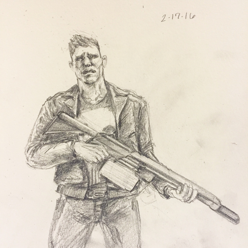
This is one of my special RISD drawings I submitted for my 2016 application...fingers crossed m8sRelated content


Comments: 23


Found your work through ProjectComment . I’m not the sort of person who likes this sort of work, but this is too fantastic to pass up. The incredible skill displayed is enough to turn my head.
The gears- First thing that drew my eyes were the gears in the chest. The details you labored over paid off well. Not only is everything proportional, perfectly shaded for the type of material it is made out of, and well designed, the placement of each gear in the chest is sophisticated and intriguing. The spikes on the gears have some inconsistency in length and sharpness. Nice touch with keeping the spine in his chest cavity. Well done, kinda gross. I love it.
The hands-The hands are lovely with lots of detail especially in the right side’s shadow on the shirt. The right side hand is a little bit larger than the left. The fingers have a bit more meat on them and are longer. Both hands are proportional on their own though and the angles are good; it’s just the right is a little bit larger than the left.
The shirt- The shadows and folds of the shirt give it the feeling of a crisp work shirt ironed with starch. The folds are realistic and well shaded. I’m glad you aren’t afraid to use a darker line on a white shirt because it seriously keeps me interested in this work. The right side under the hand to the hip could use just a tiny little fold. It seems a bit straight in comparison to the left. I know the man is holding it taunt but the left’s fold gives it more depth compared to the right’s smaller barely there fold.
The bike- Once again the shading of the metal is on point. It is impressive the amount of detail put into the breaks and handles. The length of the handlebars is just right for the size of the man. Right handle bar is higher than it should be at the curve making it seem a little larger than the left.
Details in the pants-Even the pants are lined with detail. The folds do make the pants seem a bit baggy on his person however that could just be my imagination filling in since it cuts off before we get to the thighs.
Background: The shaded background works well with the subject and helps keep your attention on the gears and handlebar with the exception of the right lower corner. Although I like it (maybe I’ll use that shading on a portrait of my own) it seems a bit busy and keeps pulling me away from the focus. The left is much better in keeping my attention away from the background with a smooth dark against a white shirt.
I think I covered it all. Was I fair?
👍: 0 ⏩: 1

Ah thank you so much the kind words and the critique! Like this comment made my morning when i woke up lmao
👍: 0 ⏩: 1
It was my pleasure. I'm happy I made your morning.
👍: 0 ⏩: 0

Commenting for Project Comment:
Let me begin by saying I'll gladly cross my fingers for the success of this application submission.
As for the work itself, this is some very well done linework and shading. It's rough and faded at points, but this also really adds to the style of it. The degree at which you focus on details like creases and wrinkles on the clothing and faces actually somewhat reminds me of those old plaques and advertisements that would have incredibly stylistically detailed depictions of people on them in brighter than normal colors.
There's certainly a lot of details to take in in the piece, but not so much that its detracting from the work or hinders it. Quite the opposite I think.
I also really like the way in which portions of the bike are embedded within his chest, almost to imply the idea of a bike or riding a bike is imprinted deep into his very heart. But, if I had to point out any discrepancies with the artwork it's the inconsistency at times with proportion. It's nearly unnoticeable, but both the hands do seem to be different sizes despite seeming to be the same distance from the 'camera,' and his ears, and the head size in general, seem slightly off as well.
That may of course just appear that way due to his head being so far turned upward though of course.
Overall a very wonderful piece, and definitely something to look at in appreciation and even use to spur ones own attention to finer details and shading.
👍: 0 ⏩: 1
Oh man you'll have to tell me about those plaque because they sound really interesting. And thank you! I appreciate this critique a lot!
👍: 0 ⏩: 1
You might be able to find plaques akin to what I described if you look into american artworks made around the 50s and 60s.
I know a good few were made around that time, but am otherwise unsure when they first started or when they fell from popularity among artists. I couldn't say what each one's premise or design would be though, they had a pretty wide variety, from public service messages, advertisement, to just being whatever they wished to be.
I just remember my father had and still does have a soft spot for them, and he has so many antiques and items like that that or ranging from old appliances or furniture and decoration. He even opened a shop upon retiring just to pass the time more or less.
👍: 0 ⏩: 0

")

wow very very good one ! really good shades and lightsm specially this on his face, hands and blouse.
i'm not sure about his ears..one looks litle weird for me (i mean this left), for me it is too much down.. lol i hope u undretand what i mean ? right ear is ok
what is the best in this work ? hm.. i think the middle 
about handlebars..it isnt too small ? or maybe its just my feeling, becouse i cant see it in all  (Smile)")
anyway its really nice work keep it up !

👍: 0 ⏩: 0


Thankss i appreciate it!
👍: 0 ⏩: 0


Thank you!! and thanks again ahah
👍: 0 ⏩: 0